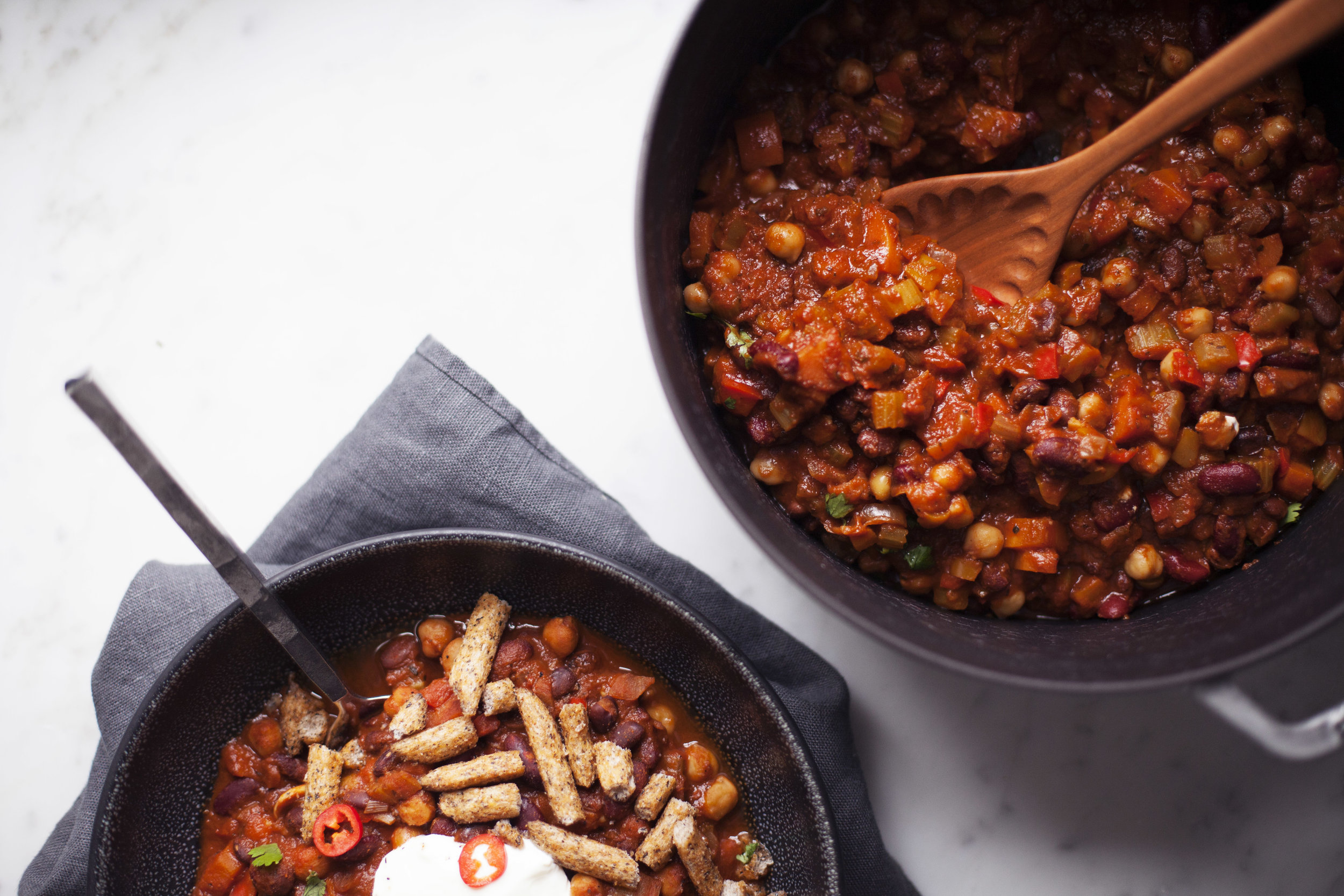
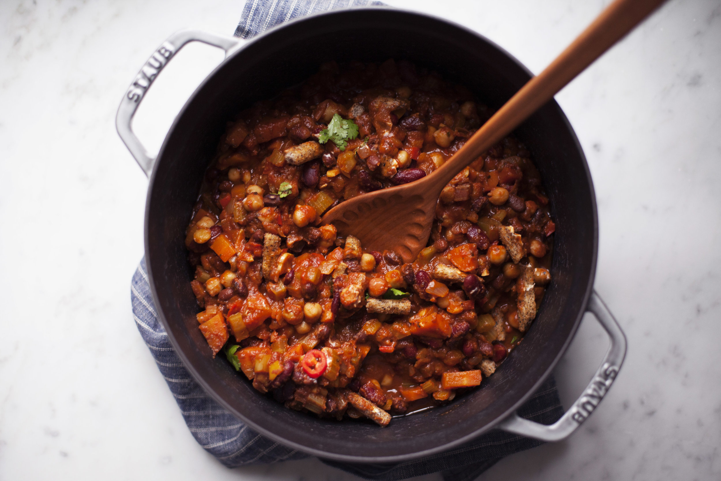
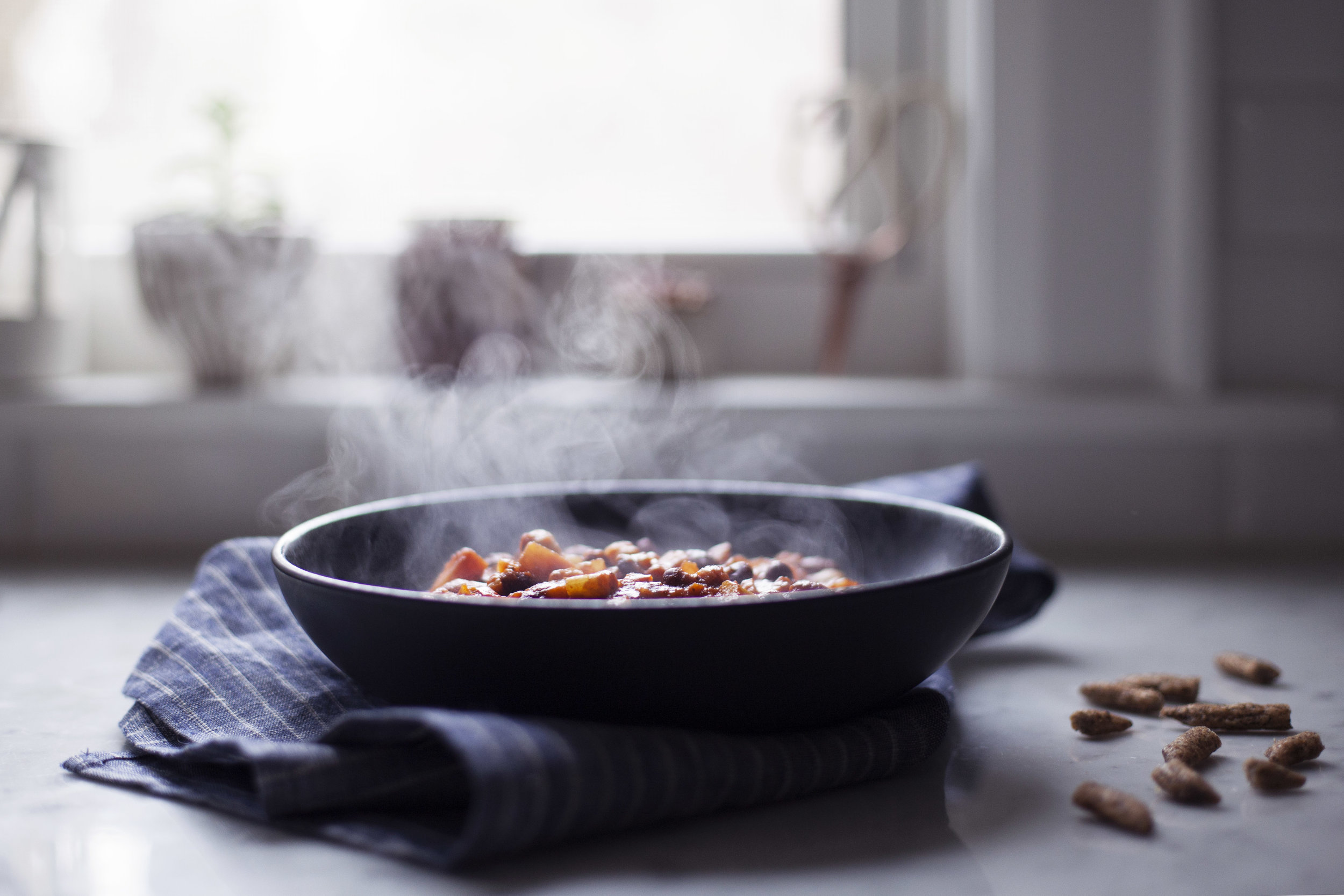
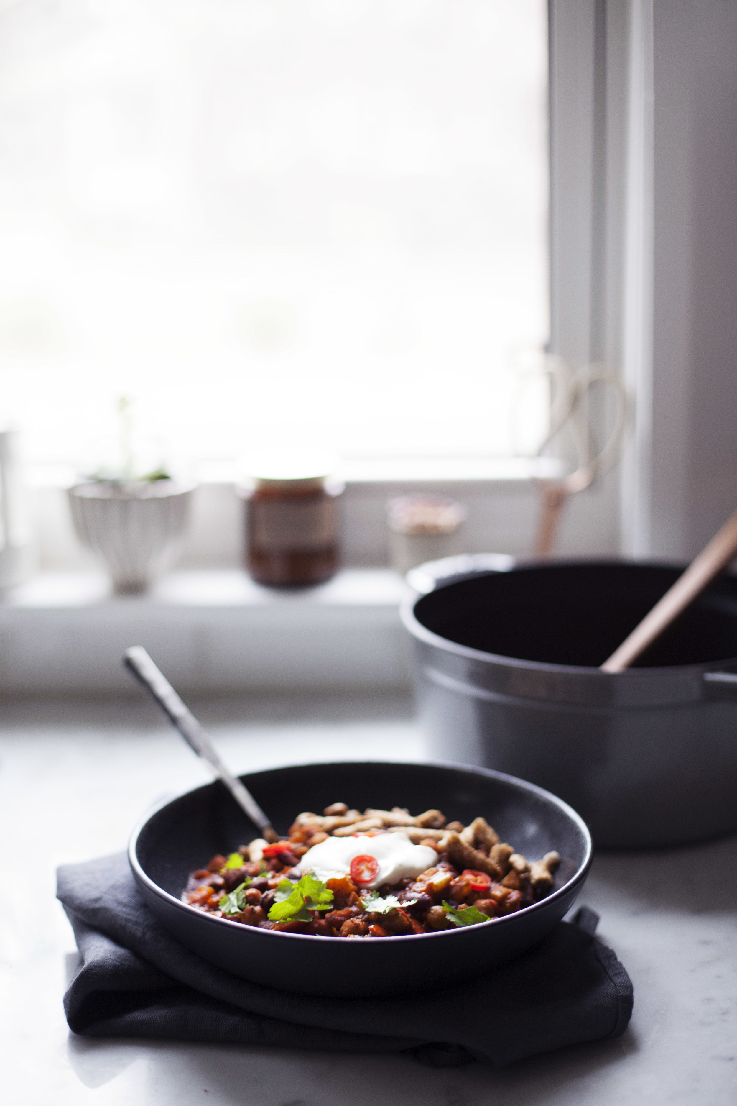
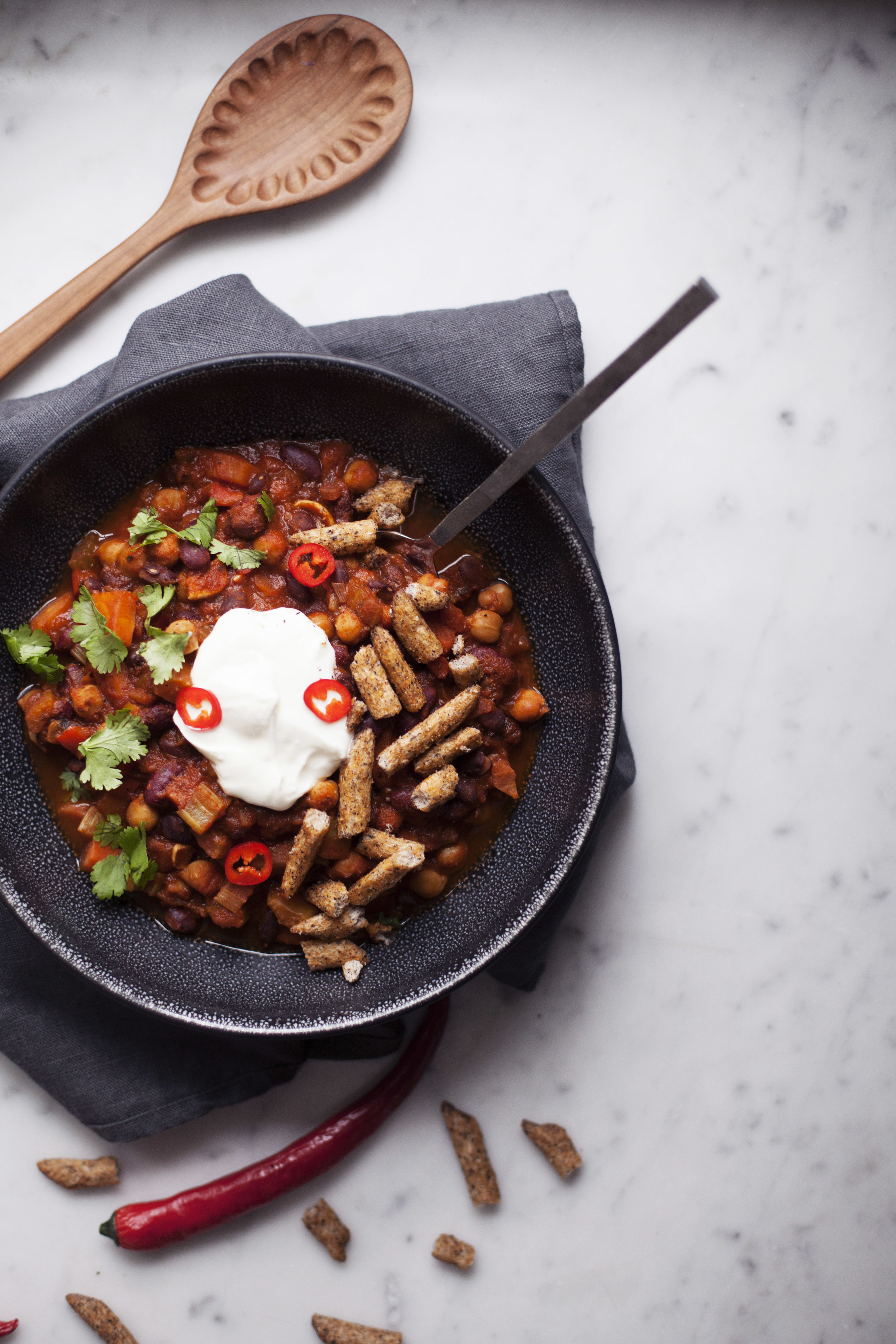
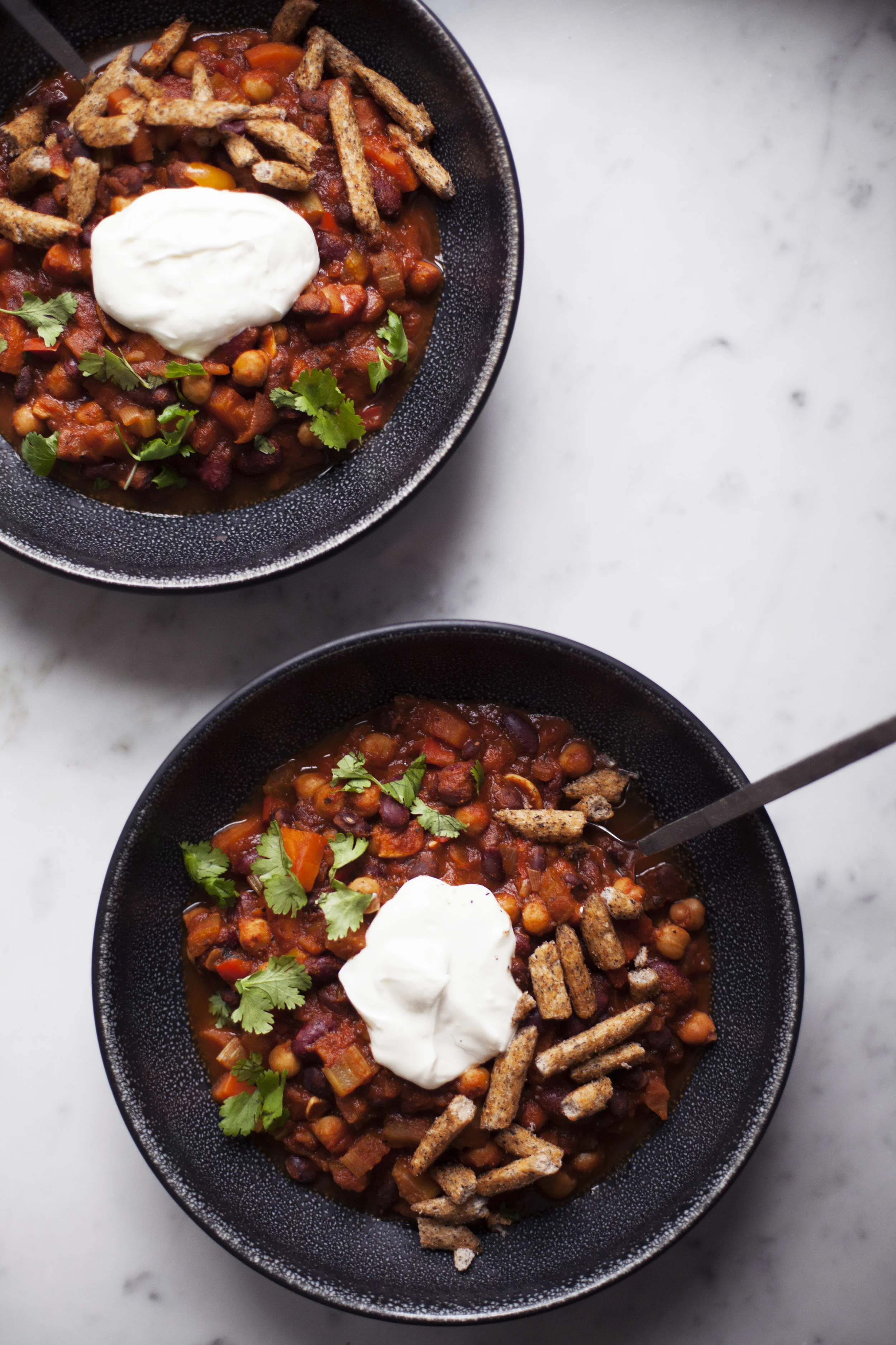
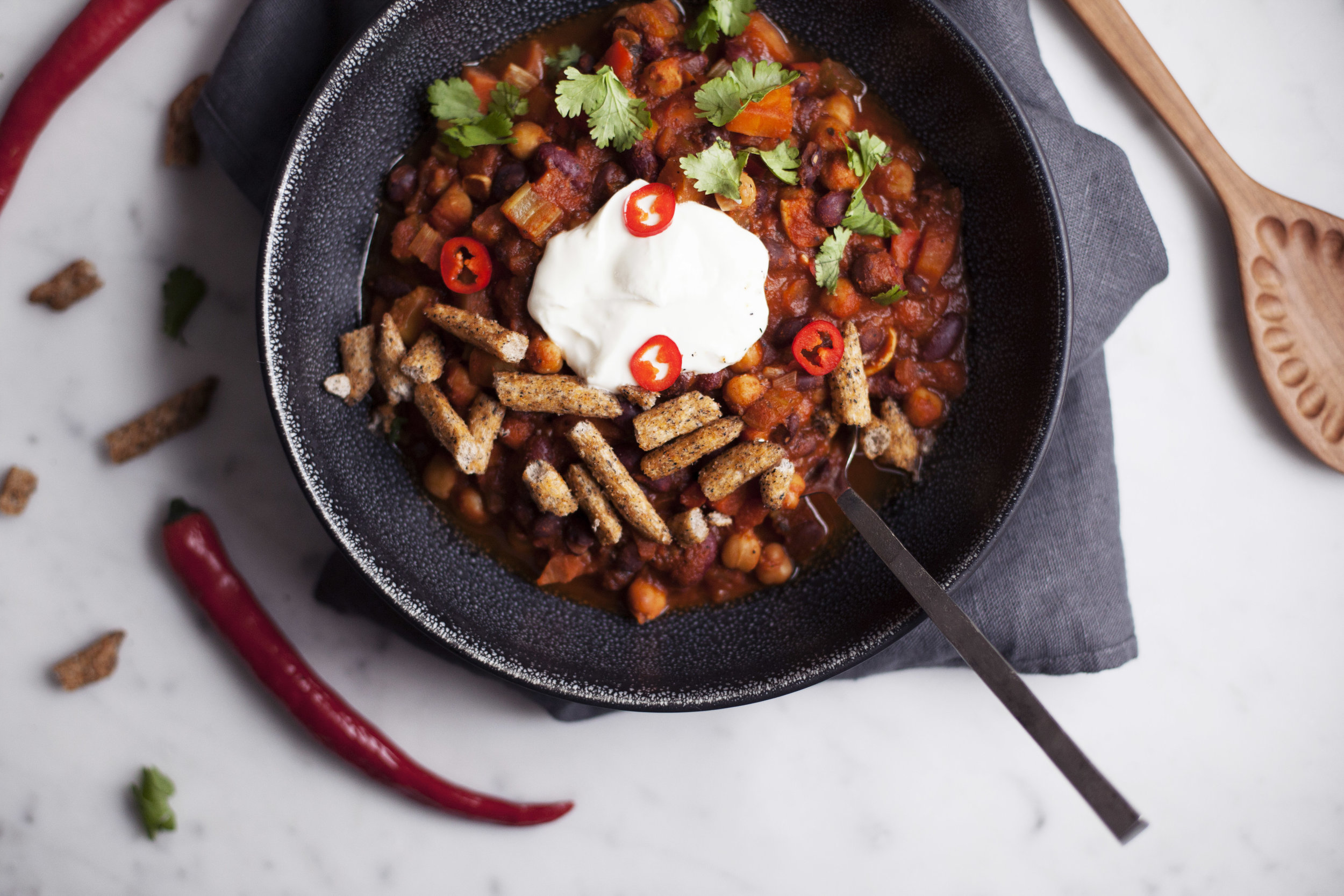
three bean vegetarian chili


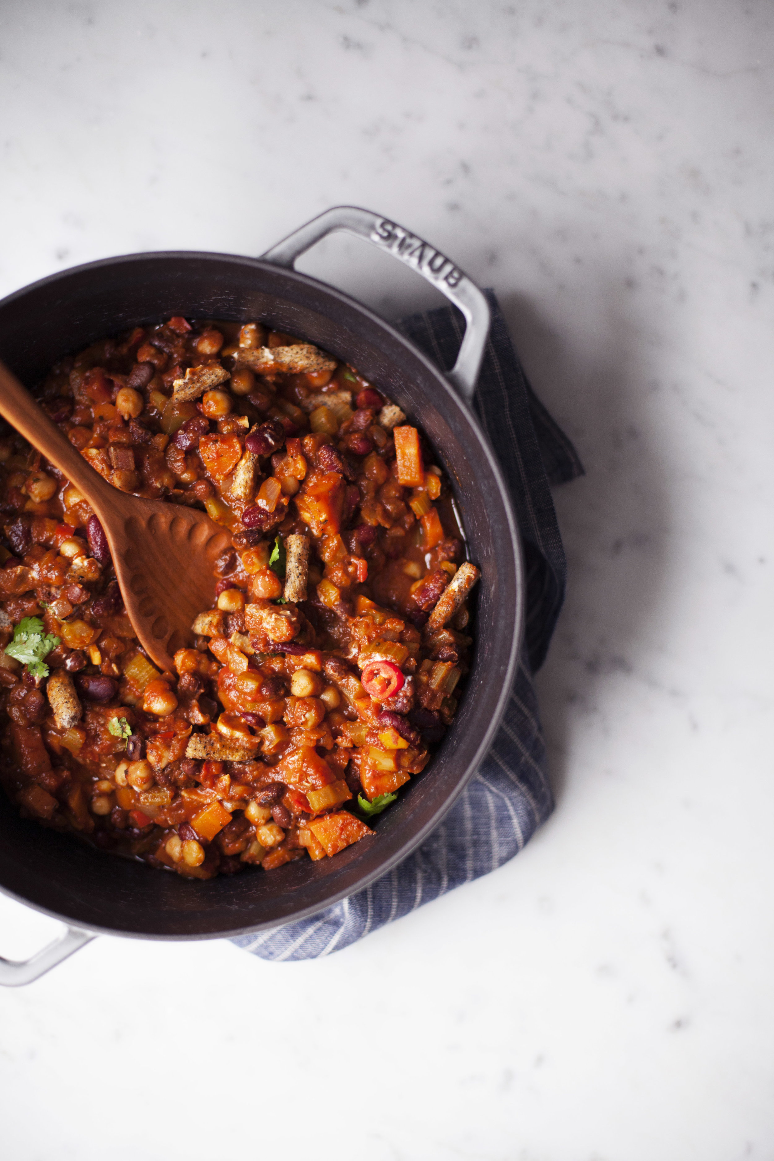
it is game day weekend!!!! you know what that means? endless amounts of the BEST kind of foods.. chili, nachos, wings, pizza. i mean, football! it means football. okay, but let's be real here, you don't need to be a football fan to enjoy the superbowl. host a party & whip up a killer spread! i will be spending it in toronto this weekend & i can't wait to be back in the city. it feels like it has been forever! but before i head off to my weekend away, here is the recipe for this three bean vegetarian chili.

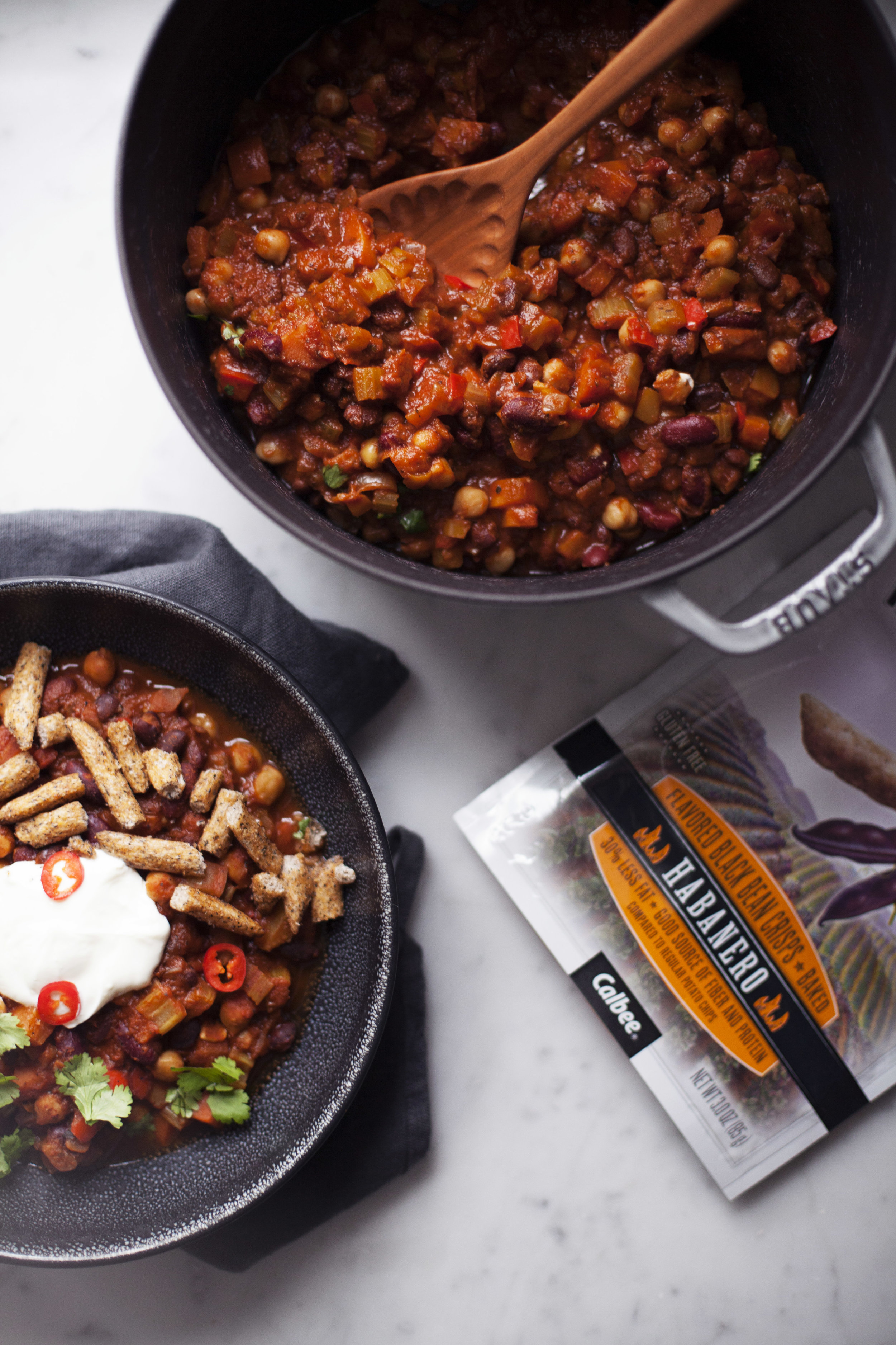
when hosting parties, there are SO many dietary restrictments you have to be cautious of. so leave the meat for the sliders, burgers or wings & keep the chili meatless. i love setting up a little station with various toppings for chili. i usually do cheddar cheese, guacamole, sour cream & something crunchy. i served this chili up with black bean habanero harvest snaps! they have the perfect kick of spice as i tend to make the chili a bit more mild for people who can't handle spice as well as others. for those who LOVE spice (cough, my dad) they can pile on as many habanero harvest snaps as their heart desires! they are even gluten free incase you have a gluten intolerant guest as well. this chili is seriously for everyone! so happy football weekend. i can't wait to see what everyone is cooking up.

go broncos!!!!! errr i mean patriots?

ingredients

  • 1 red bell pepper, chopped
  • 1 yellow or green bell pepper, chopped
  • 4 stocks of celery, chopped
  • 2 large carrots, peeled & chopped
  • 1 large red onion, chopped
  • 2 cloves of garlic
  • 1 tablespoon chilli powder
  • 1 tablespoon oregano
  • 1 teaspoon paprika
  • 1 teaspoon cumin
  • 1/4 teaspoon cayenne pepper (adjust this based on your spice preference)
  • 1 cup chickpeas, rinsed
  • 1 cup black beans, rinsed
  • 1 cup red kidney beans, rinsed
  • 2 cups of low sodium vegetable stock
  • 1 jar of crushed tomatoes
  • cilantro, to garnish
  • sour cream, to garnish
  • black bean habanero harvest snaps, to garnish

directions

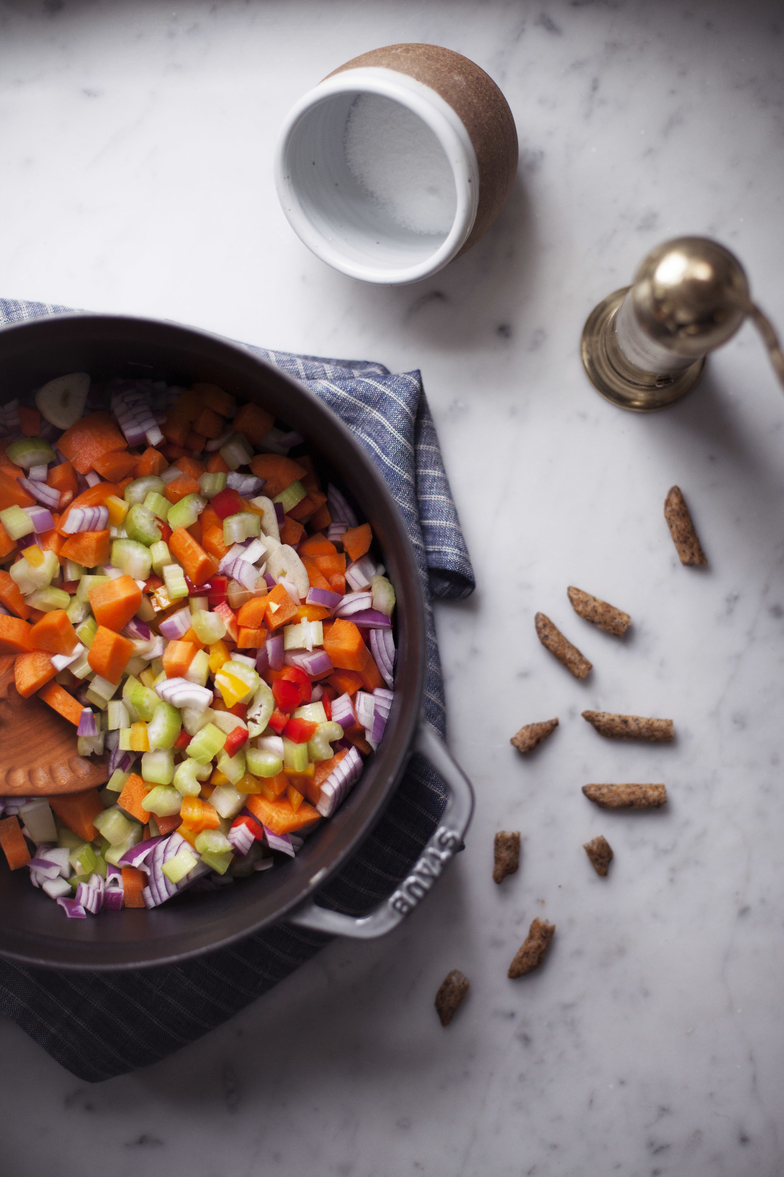
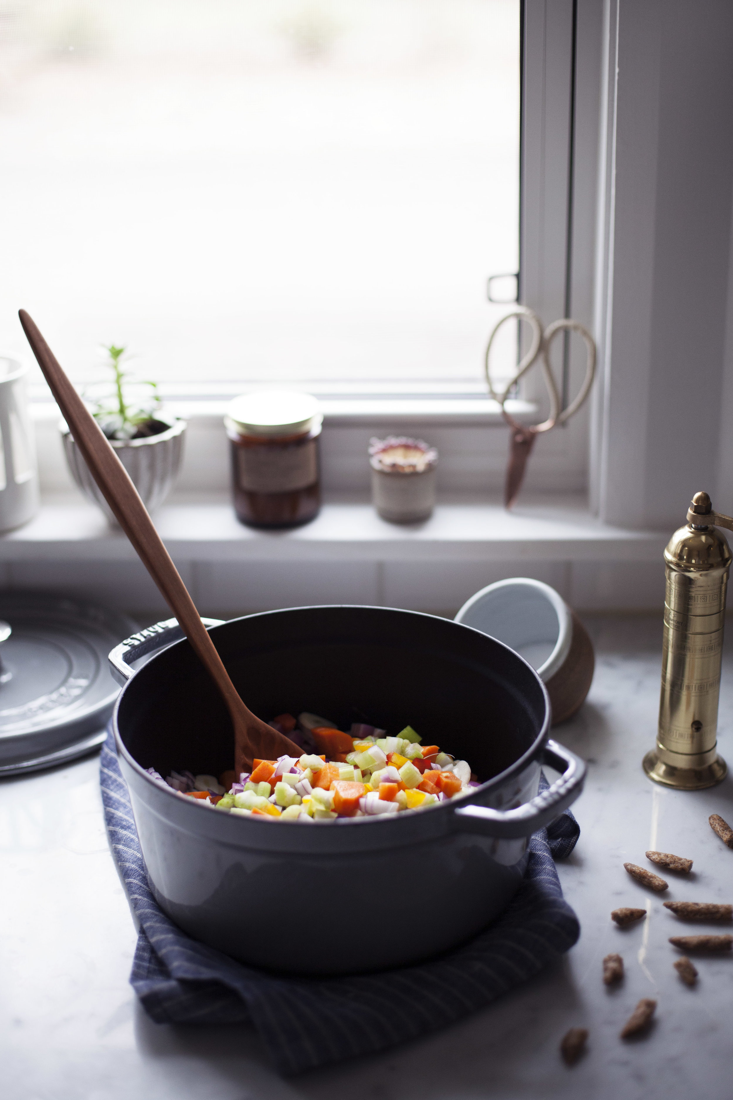
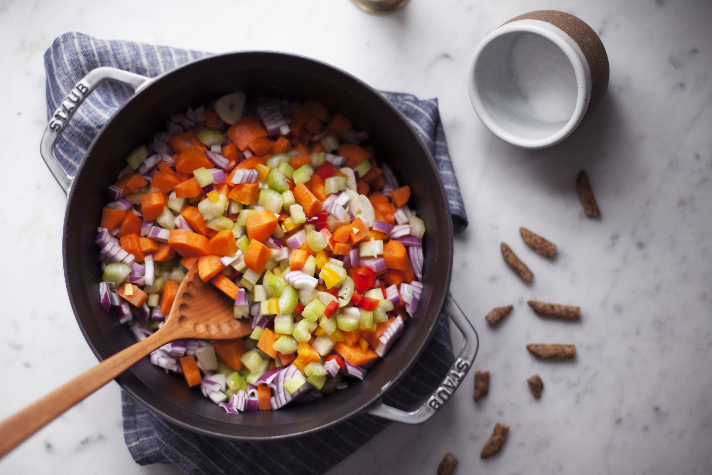
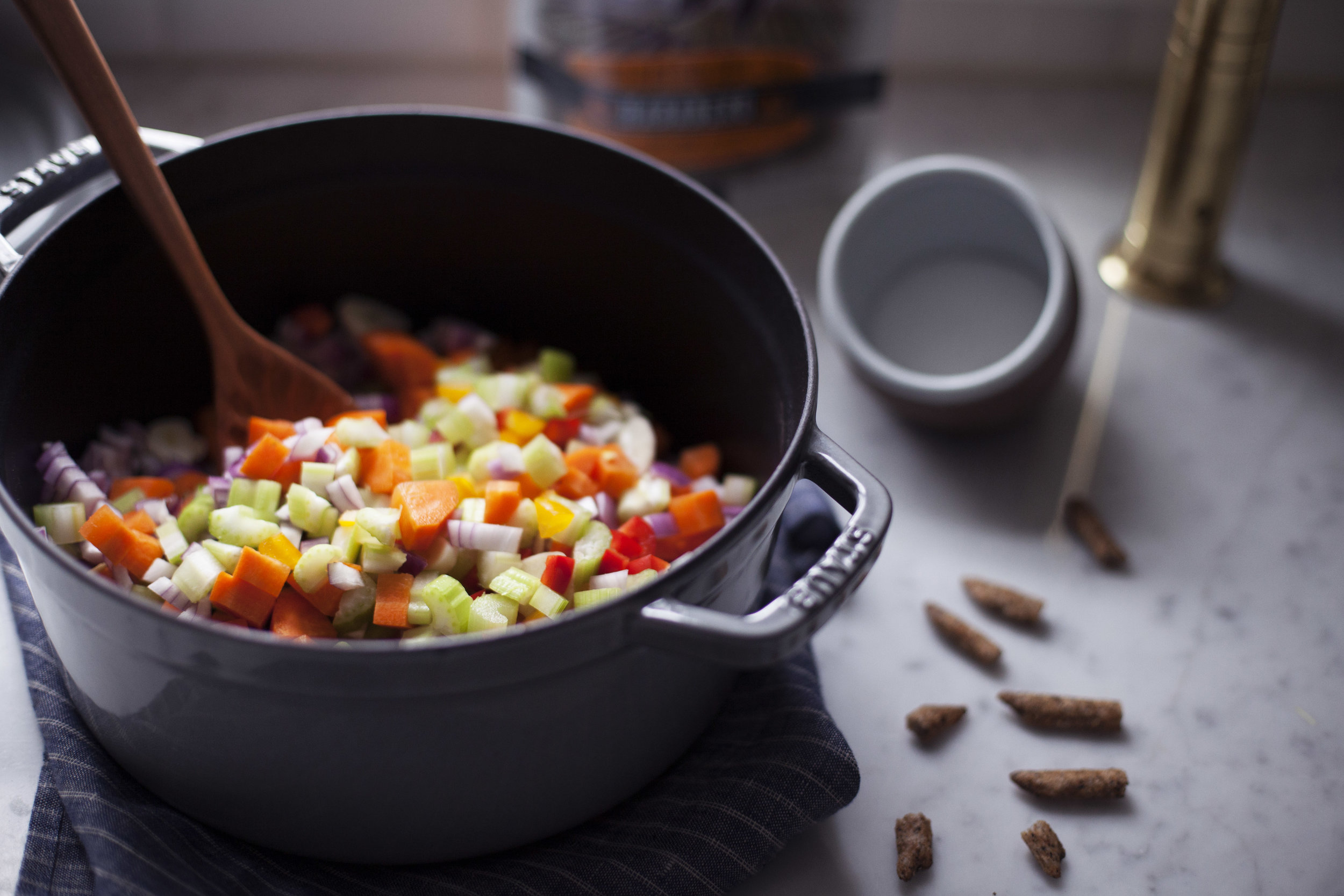
  • in a large pot over medium heat add the red bell pepper, yellow or green bell pepper, celery, carrots, red onion, garlic, chili powder, oregano, paprika, cumin & cayenne pepper. cook until onions turn translucent, about 15 minutes.
  • add in the chickpeas, black beans & red kidney beans. cook for an additional minute or two.
  • pour in the vegetable stock & crushed tomatoes. stir until the two are evenly mixed in.
  • bring to a boil & then reduce to a simmer. cook with the lid on for one hour.
  • remove from heat & serve hot!
  • top with cilantro, sour cream, habanero harvest snaps & whatever your heart desires!

this post was created in partnership with harvest snaps! thank you for supporting the brands that keep me doing what i love. xo
dessert chocolate + cheese board


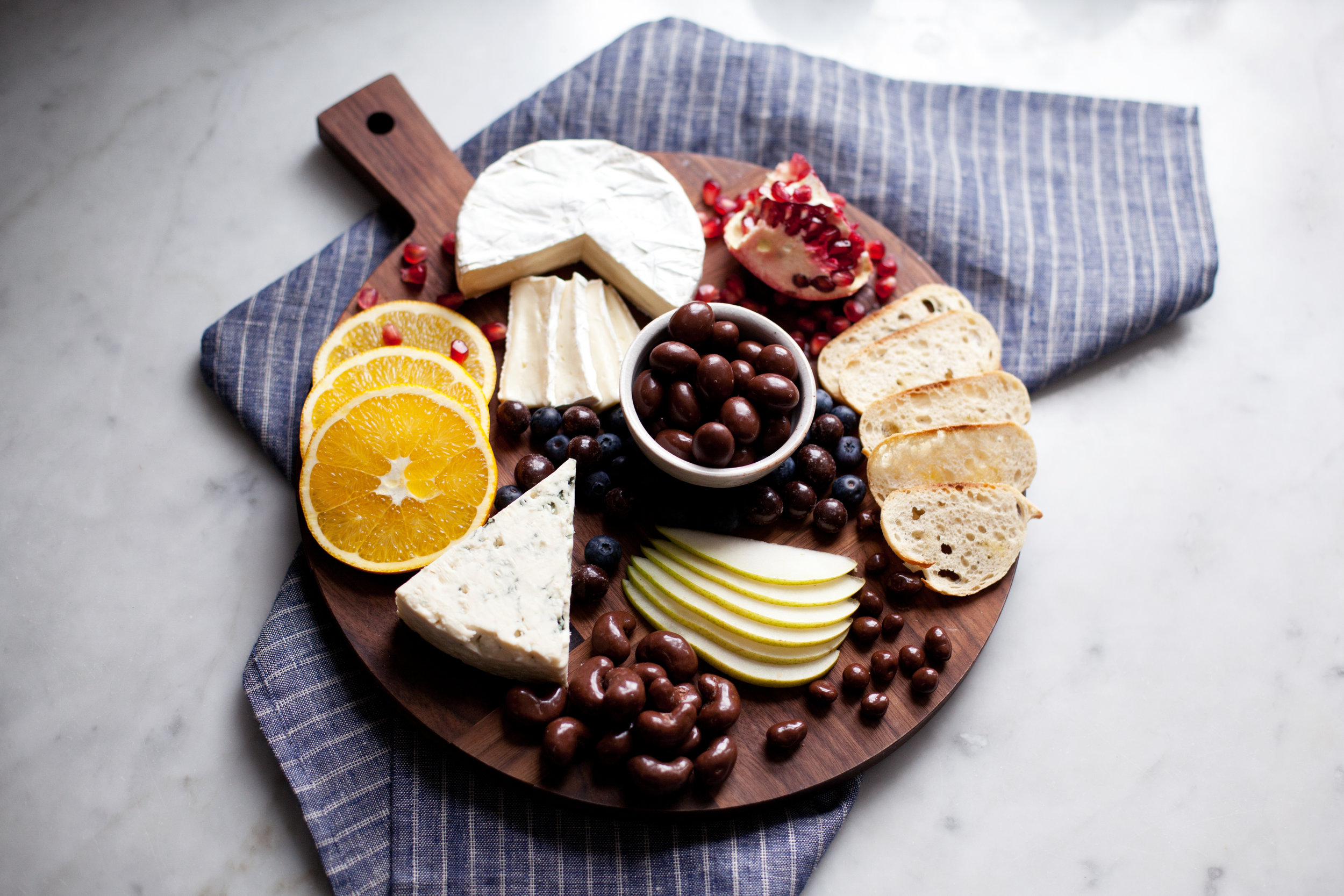
growing up my parents took us to quite a few fancy restaurants in niagara-on-the-lake & fine dining restaurants on cruise ships. they wanted us to be part of every celebration & every milestone they reached. whenever we went to these types of restaurants & it was time for the dessert menu to be served, it always had a local cheese board dish on it. i never understood how cheese was considered a dessert?! it was probably because my knowledge of cheese didn't stretch past the basic marble cheddar & kraft singles i was used to eating... two cheeses i wouldn't dare to eat now. as i got older, it all began to make sense. pairing creamy style cheeses with fruits, nuts, jam & of course chocolate was the best way to end a perfect meal.

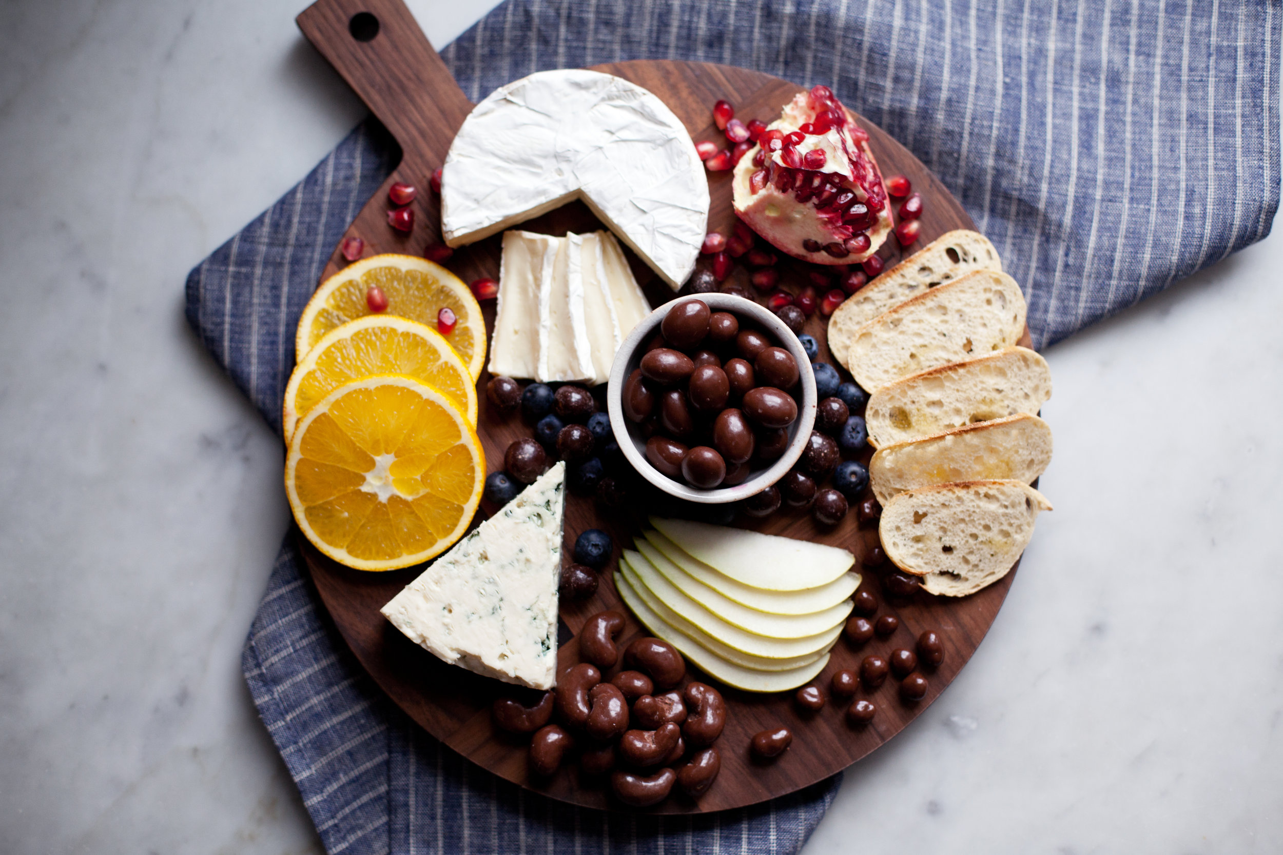
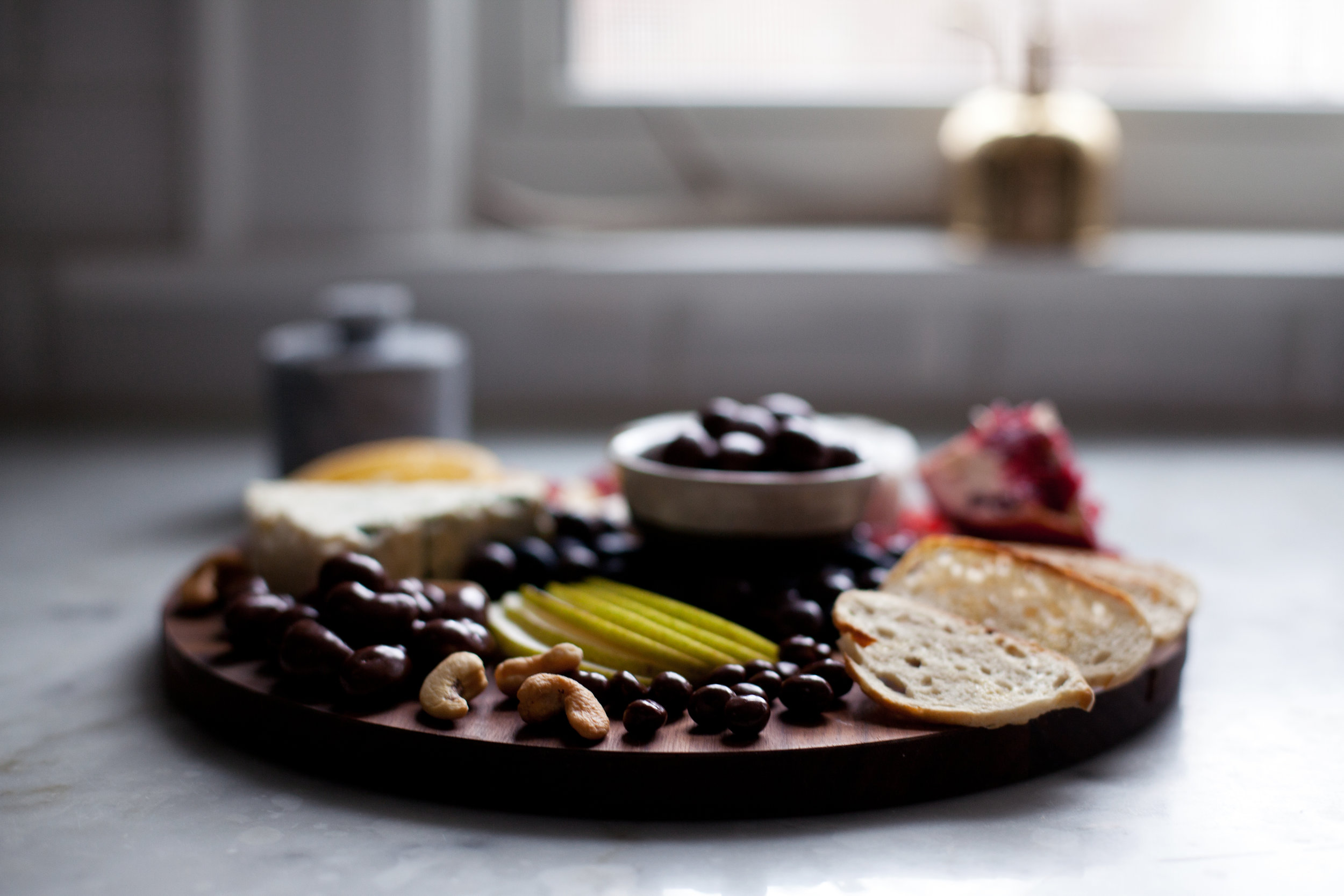
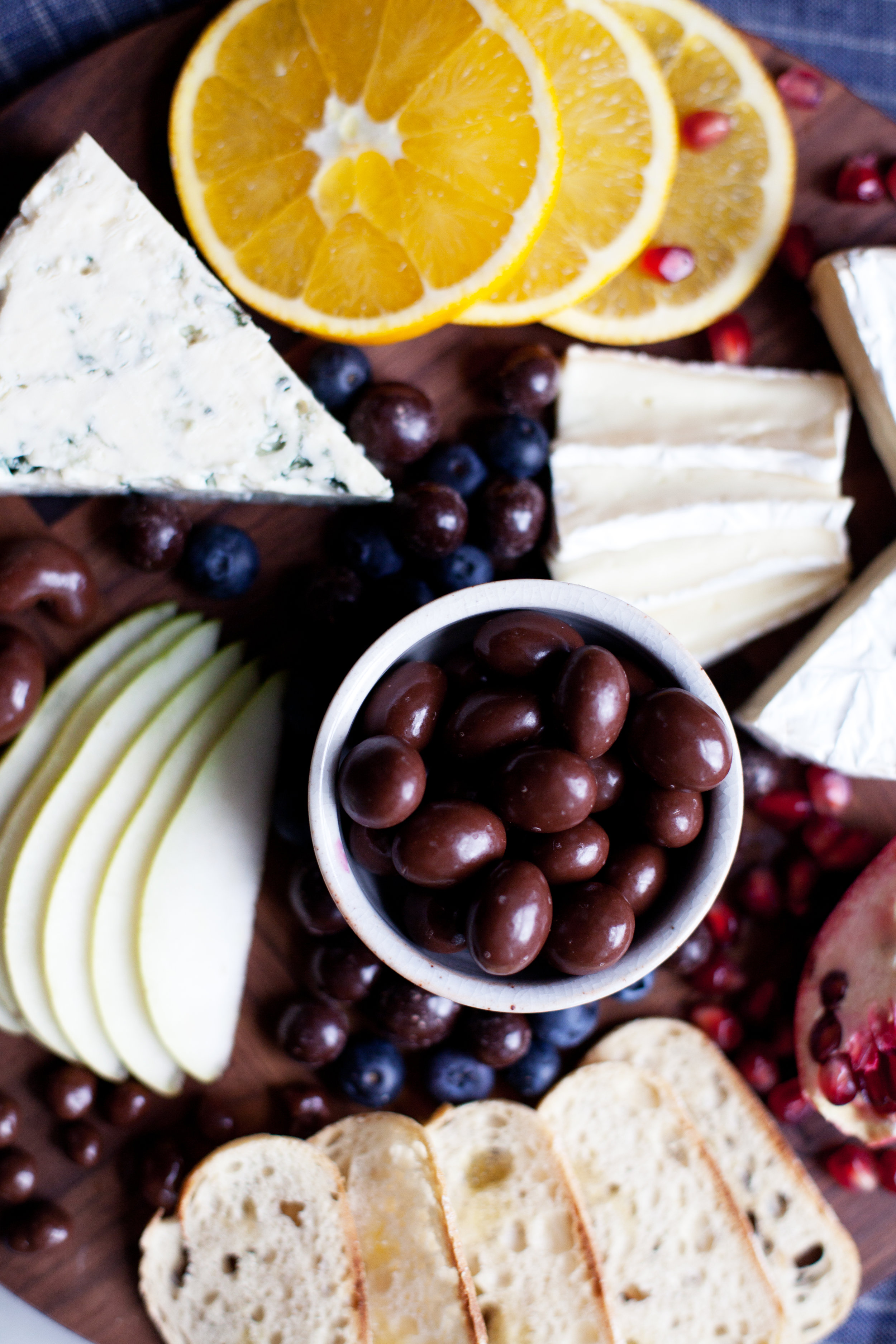
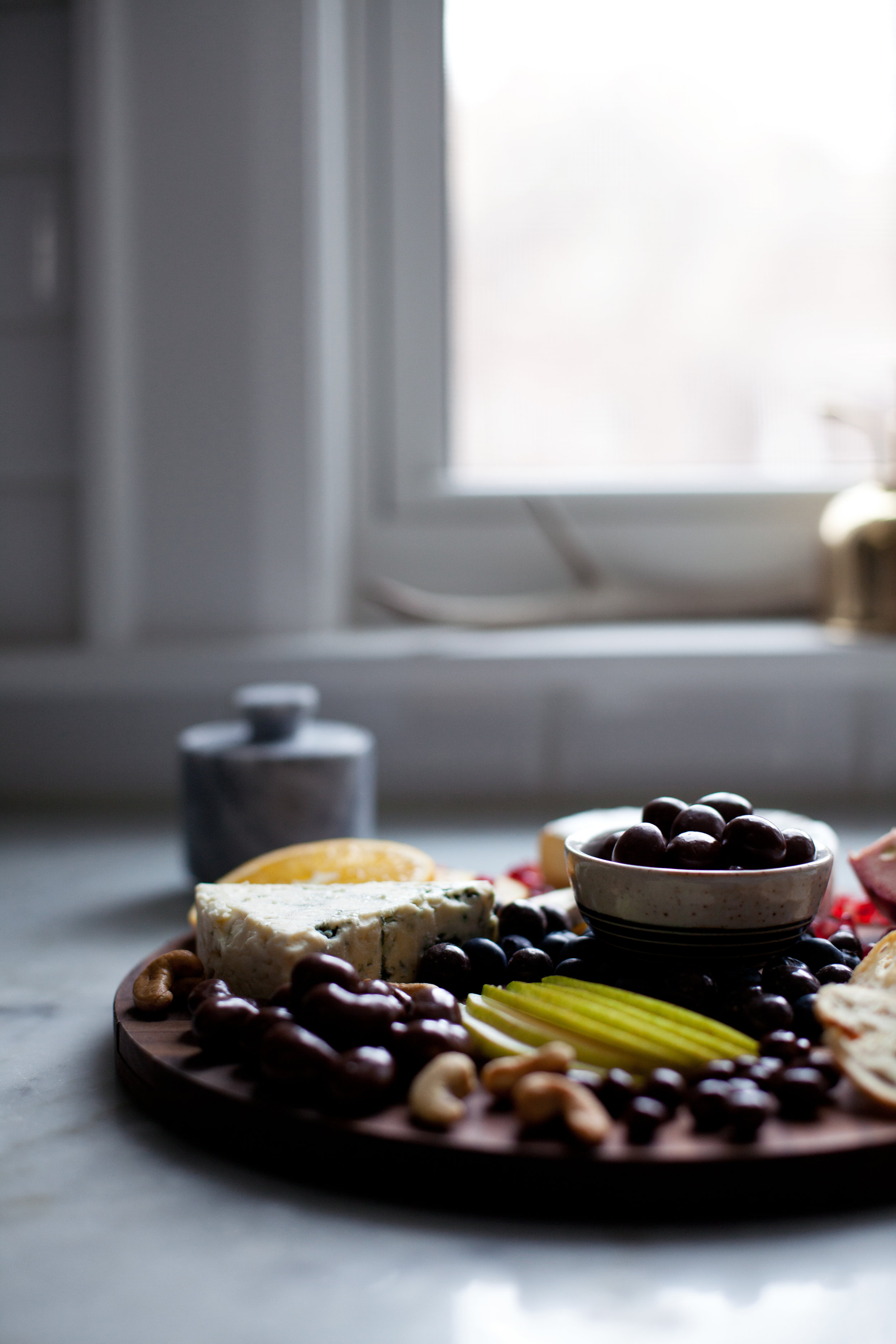
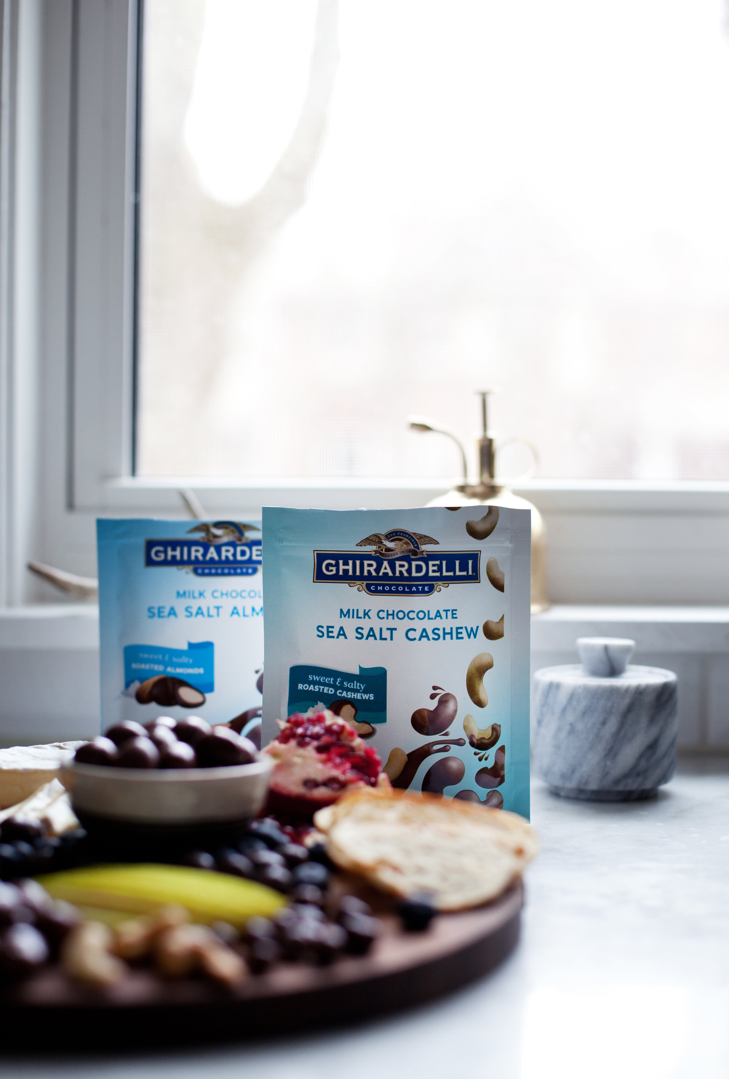
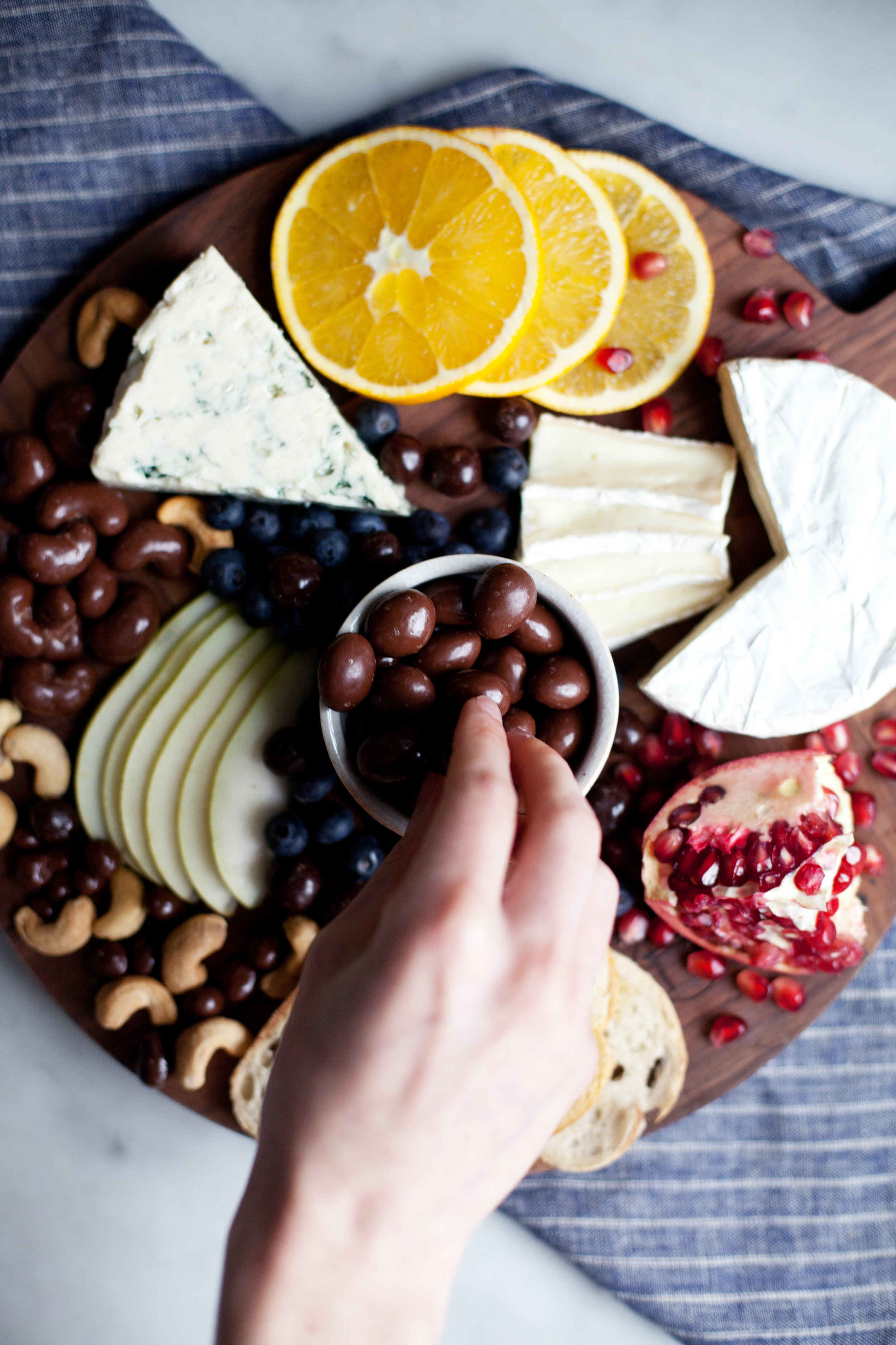
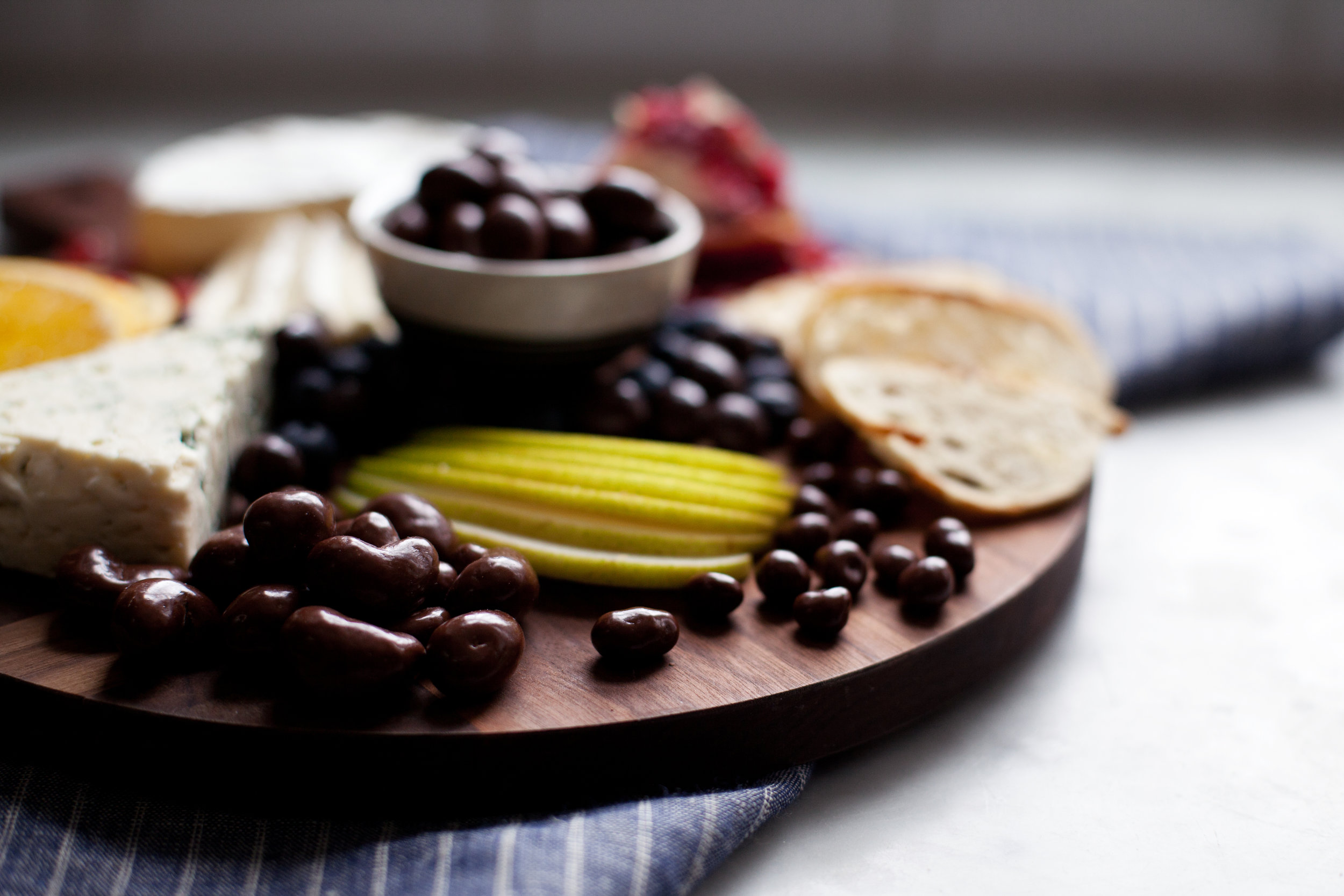
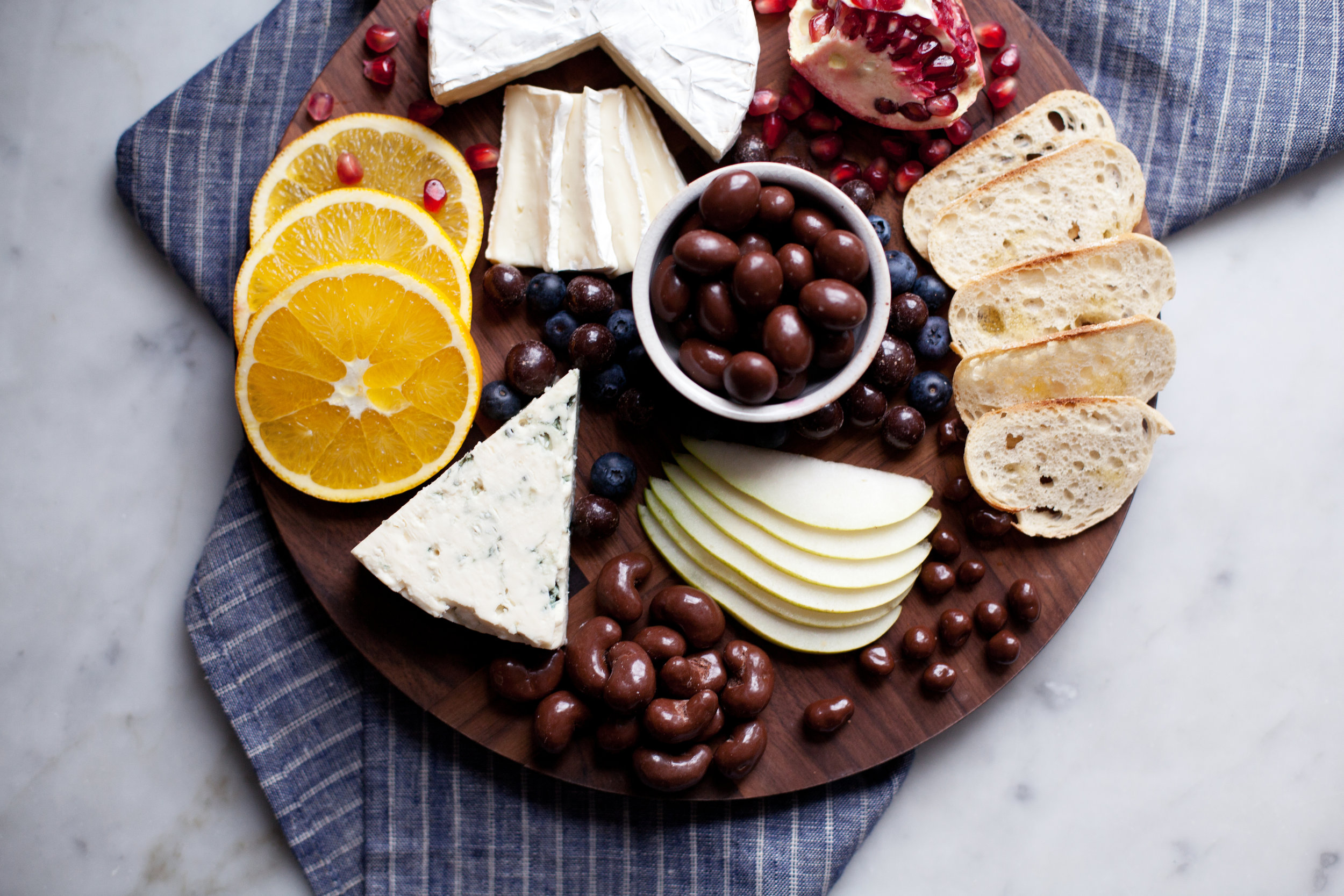
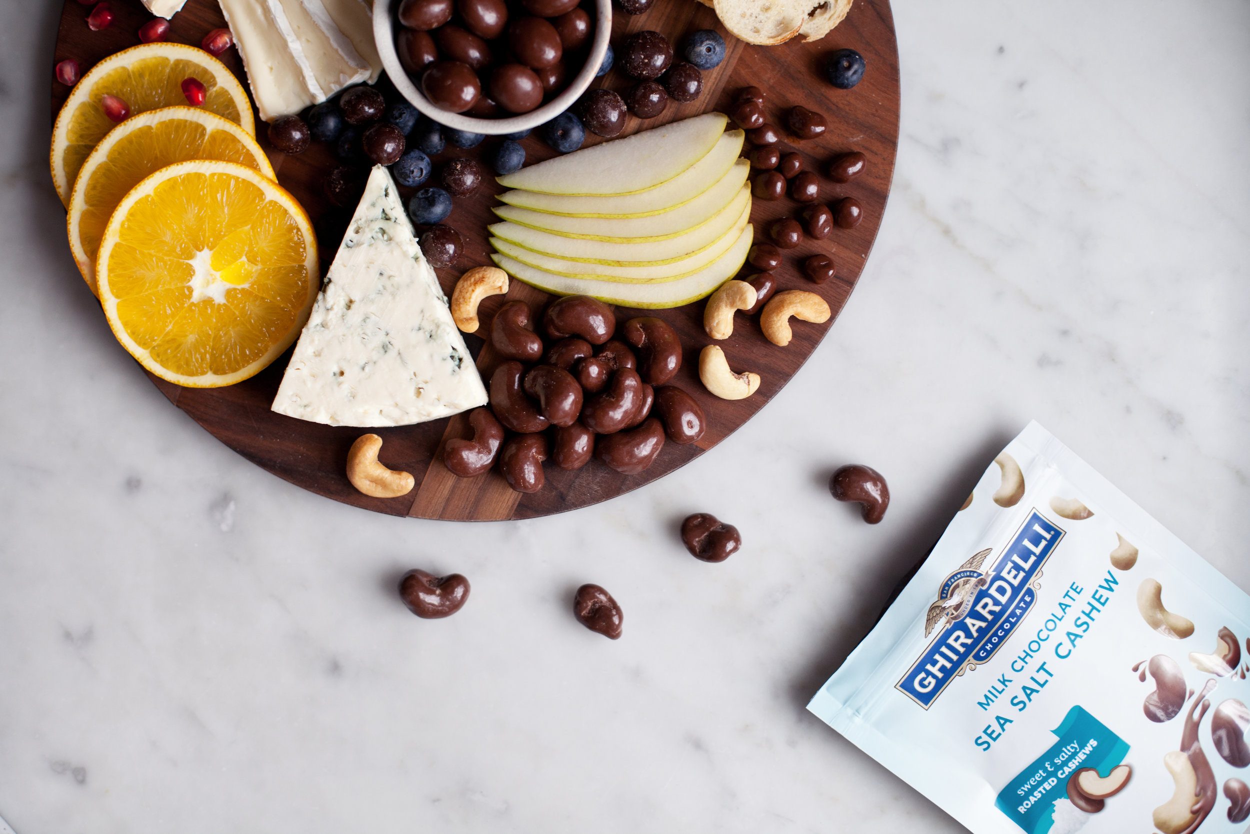
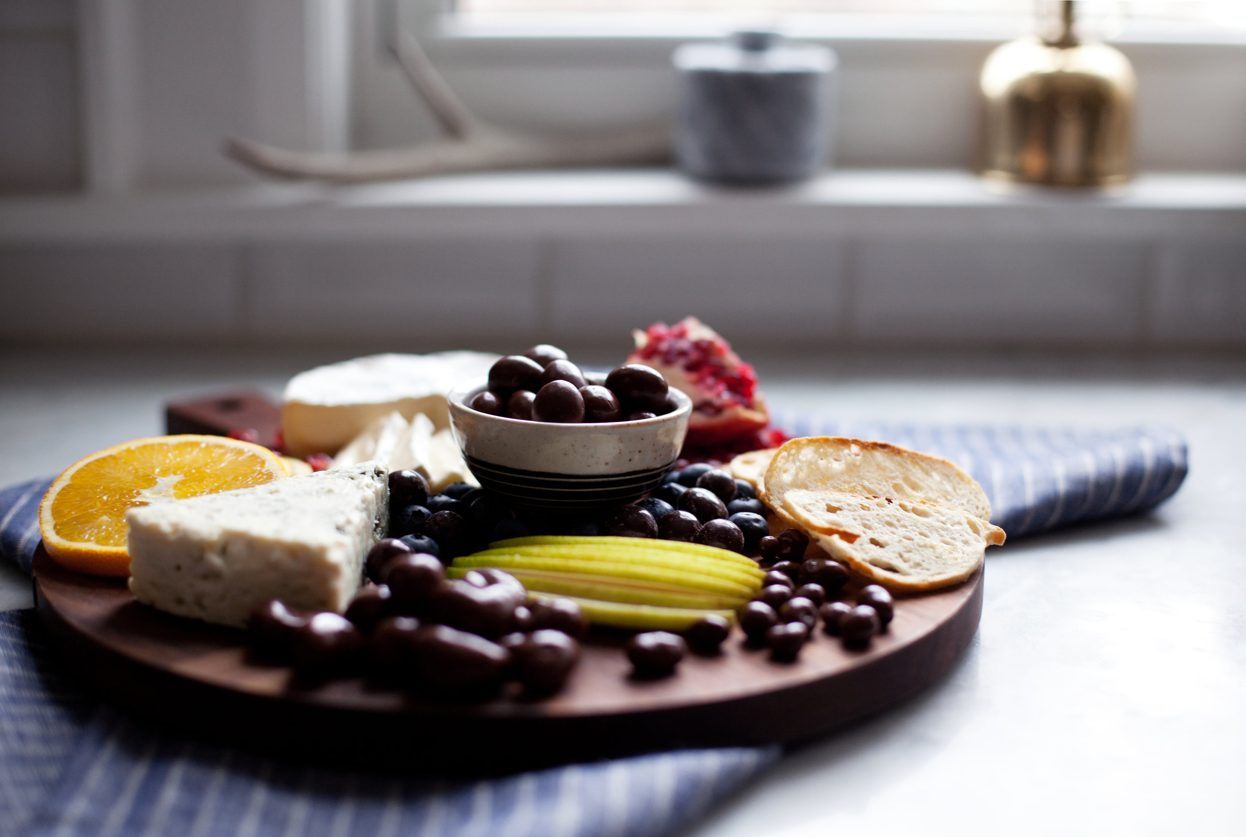
today i am teaming up with my friends at ghirardelli to present to you the ultimate dessert cheese board to serve at any party! be it awards, game day, or a casual gathering with friends, everyone is sure to find something they love on this board! now the star of this platter doesn't necessarily have to be the cheese, it can be all the fun chocolate you pair with it too! because you can't have dessert without a little chocolate i paired the cheese board with ghirardelli's snack line of chocolate covered treats! they make for the best finger foods as you saw in my previous salted cashew trail mix recipe (which you can find here). this board contains chocolate covered sea salt cashews, sea salt almonds, blueberries, and toasted coconut.. it has every flavour you can dream of.

ingredients

  • 1 4.8 oz package of ghirardelli milk chocolate sea salt cashew
  • 1 4.8 oz package of ghirardelli milk chocolate sea salt almond
  • 1 4.8 oz package of ghirardelli dark chocolate blueberry
  • 1 4.8 oz package of ghirardelli milk chocolate toasted coconut
  • 1 wheel extra creamy brie
  • 1/4 wheel extra creamy danish blue cheese
  • 1 orange, thinly sliced
  • 1 pomegranate, seeded
  • 1 cup fresh blueberries
  • 1 pear, thinly sliced
  • 1 baguette, thinly sliced & toasted

directions

  • on a large wood serving board place the brie & blue cheese.
  • arrange all other ingredients around it starting with the fruit, chocolate & baguette slices.

POWDER ROOM MAKEOVER


SO if any of you have noticed, i added a new "interiors" page to the site in the new year & this will be the first official design post to go into that category! it is also the first design of modest house that i will be sharing with you, but many more are coming throughout the year. on a side note, did you see my living & powder room makeover was featured on DESIGN SPONGE this week!!! incase you missed it, you can read all about it here. now back to the powder room.

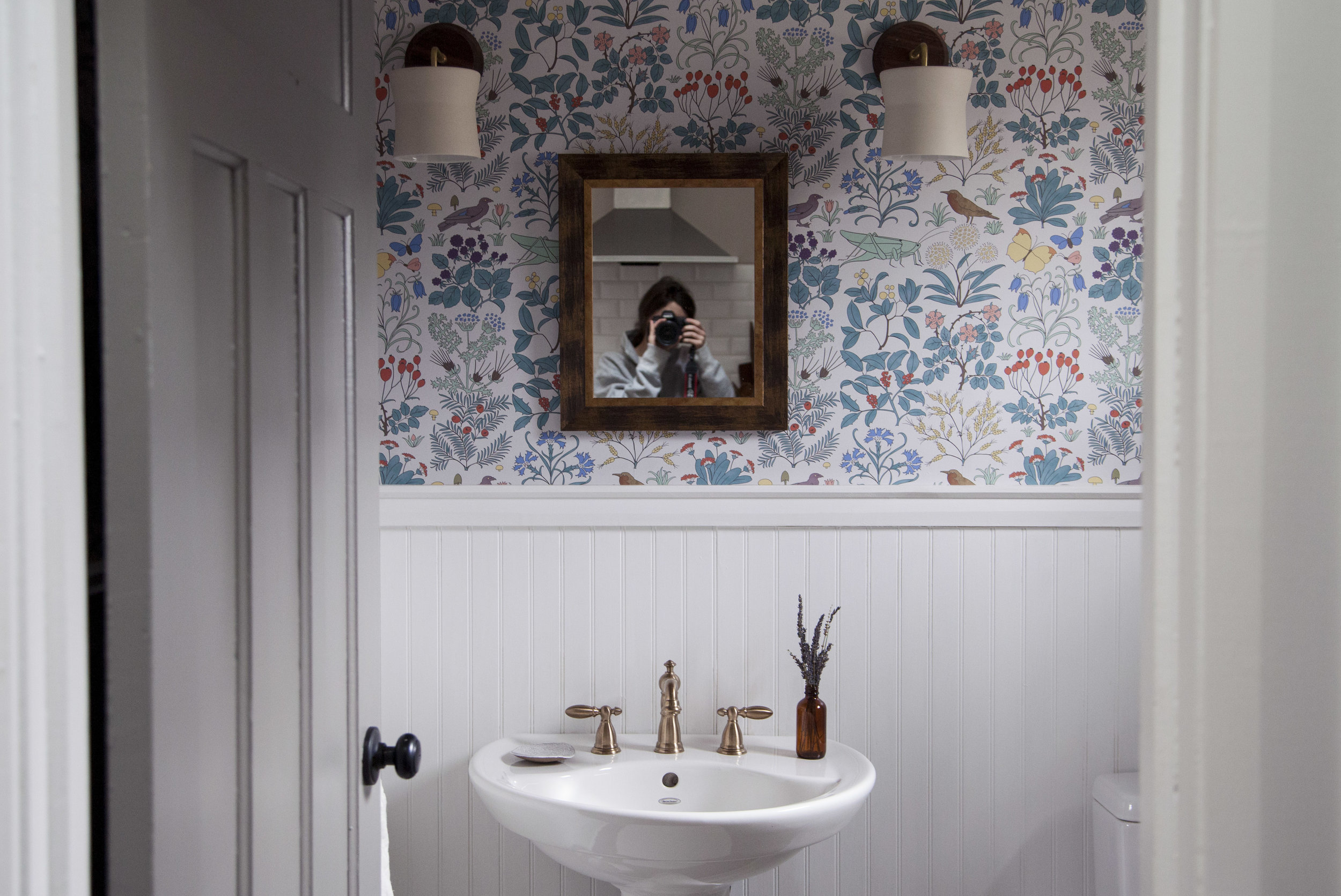
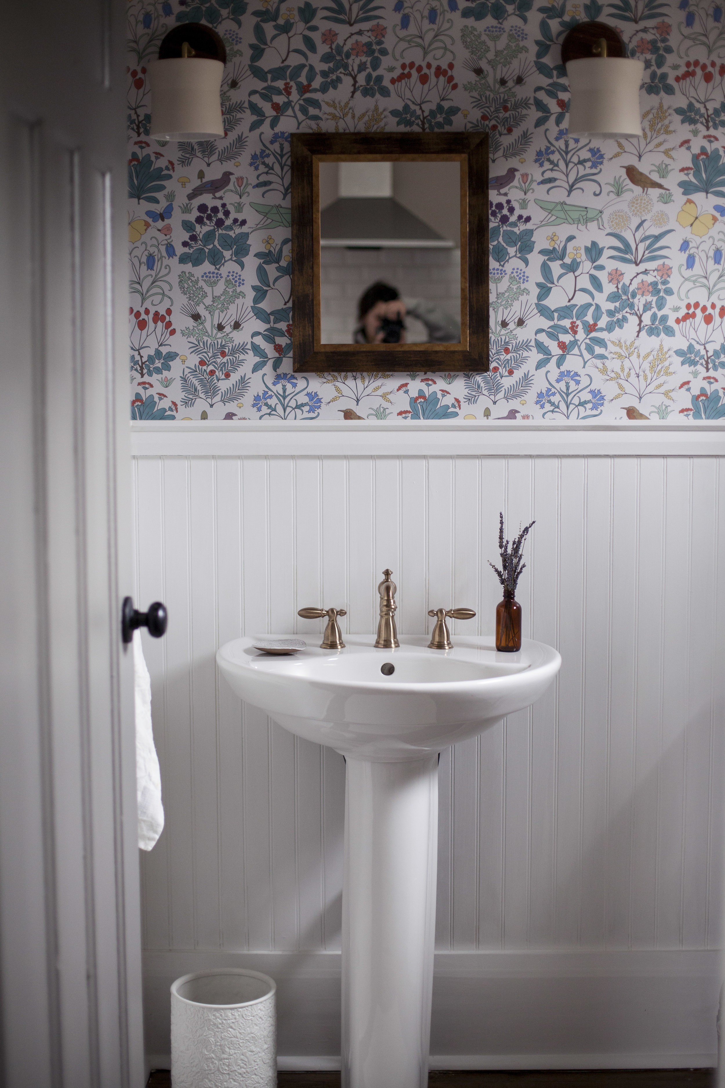
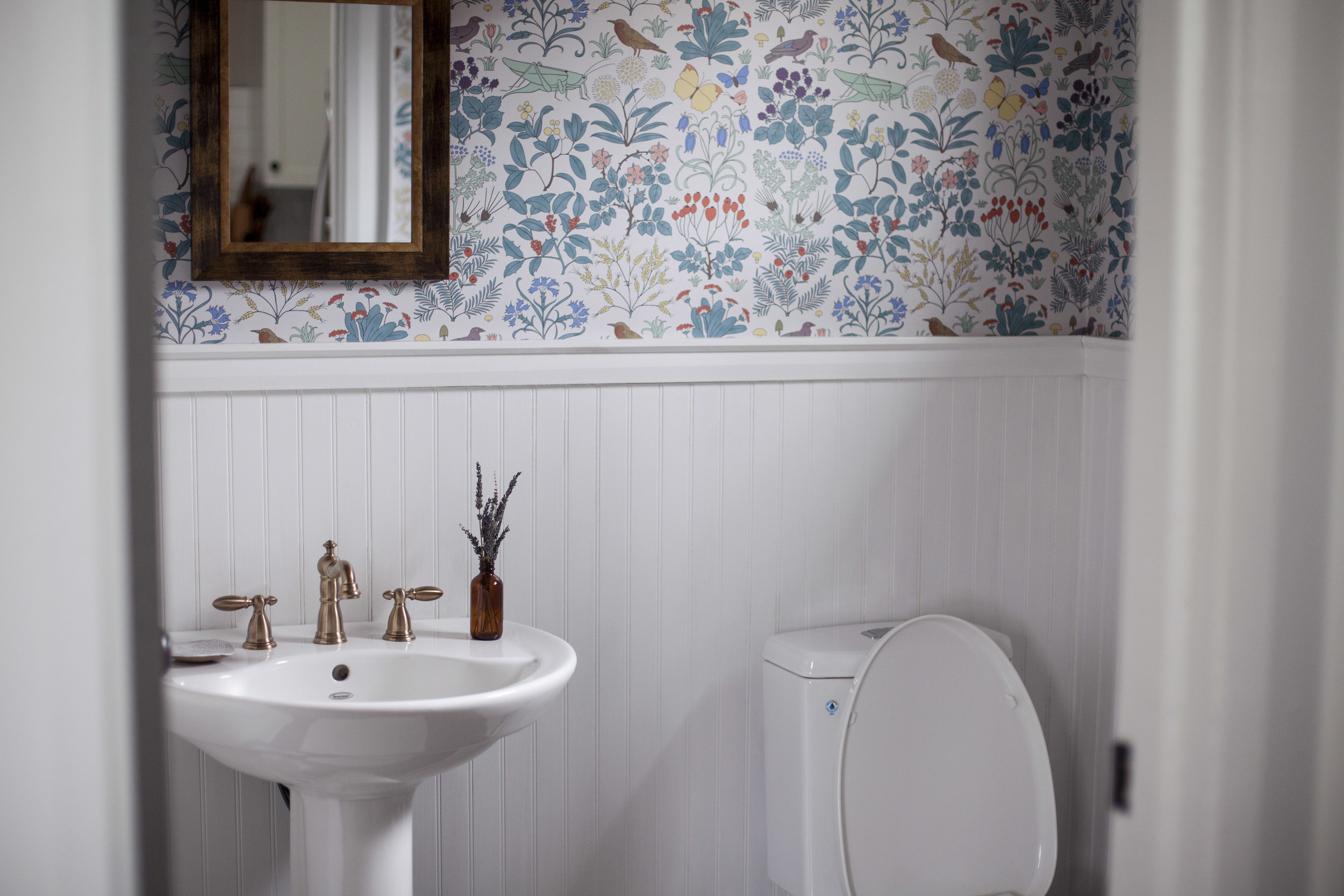
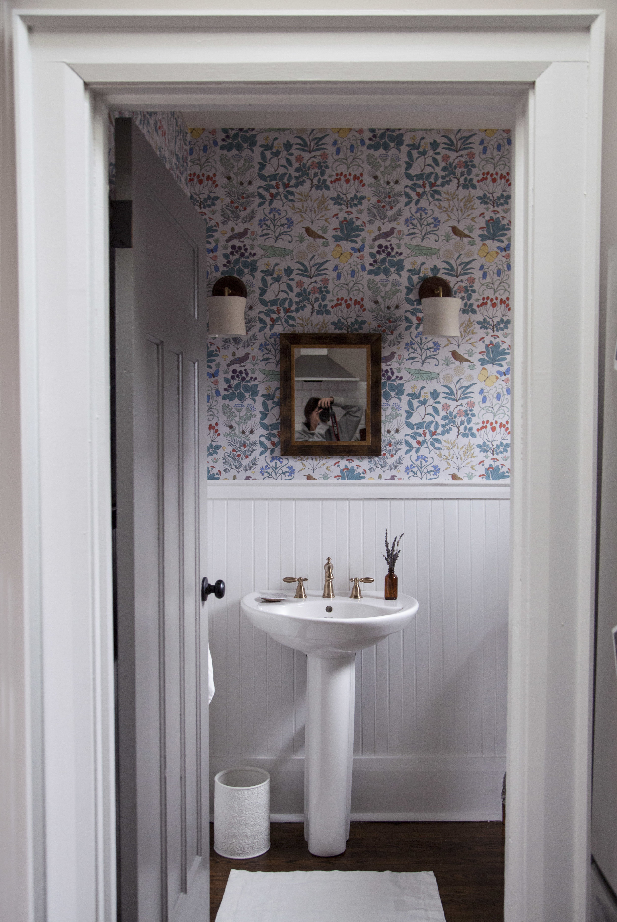
the first makeover i started planning in the house was the powder room. i started planning it the second we viewed the home to be honest, i knew i was going to make this house ours. while most of the house is quite monochromatic (i hear it over & over again from justin that it is too grey), i figured the powder room was the ONE room i could do something bold & colourful. to get started i had to decide on the two main design feature: the wallpaper & the faucet. everything else would fall into place once those were chosen.

step one: the wallpaper

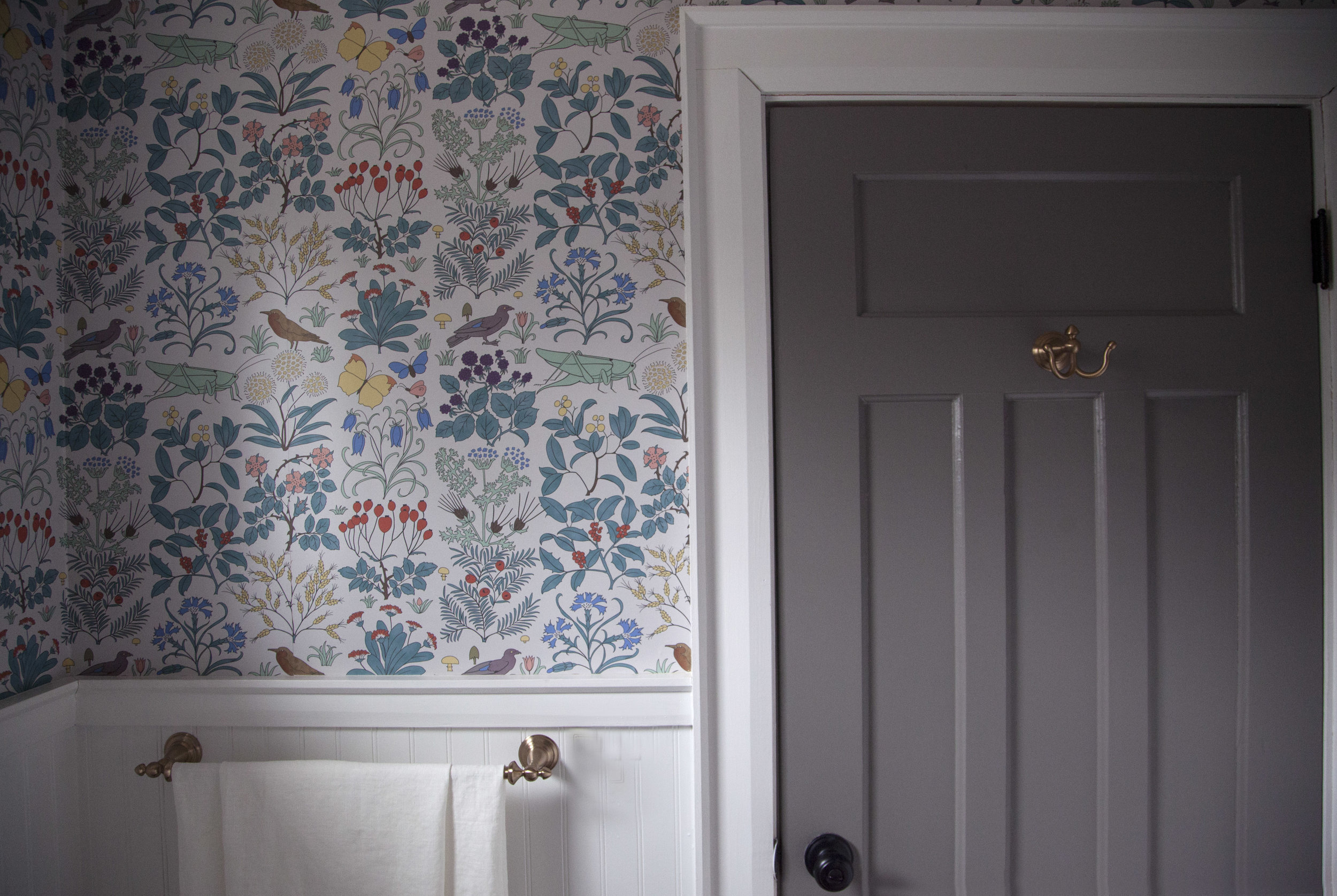
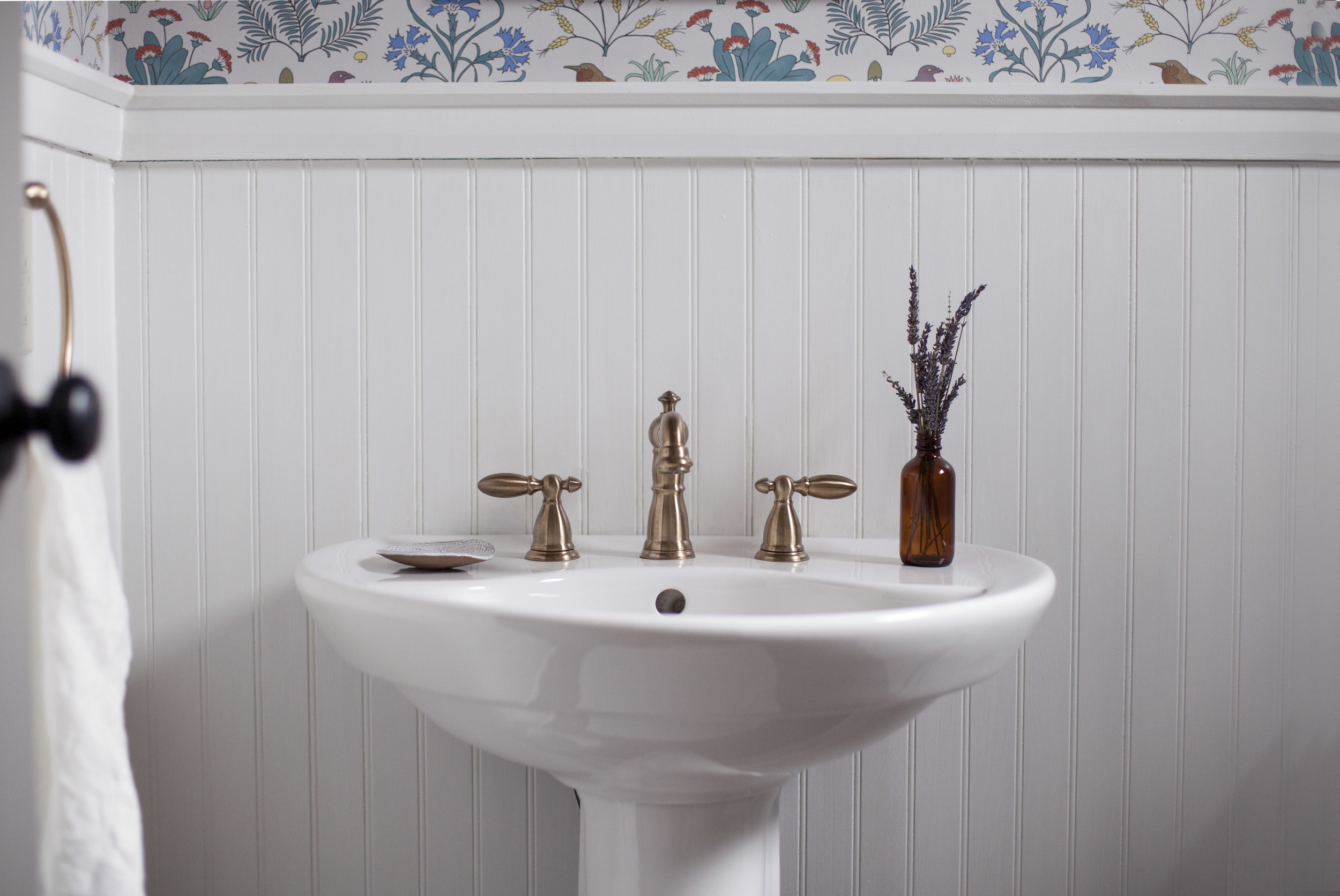
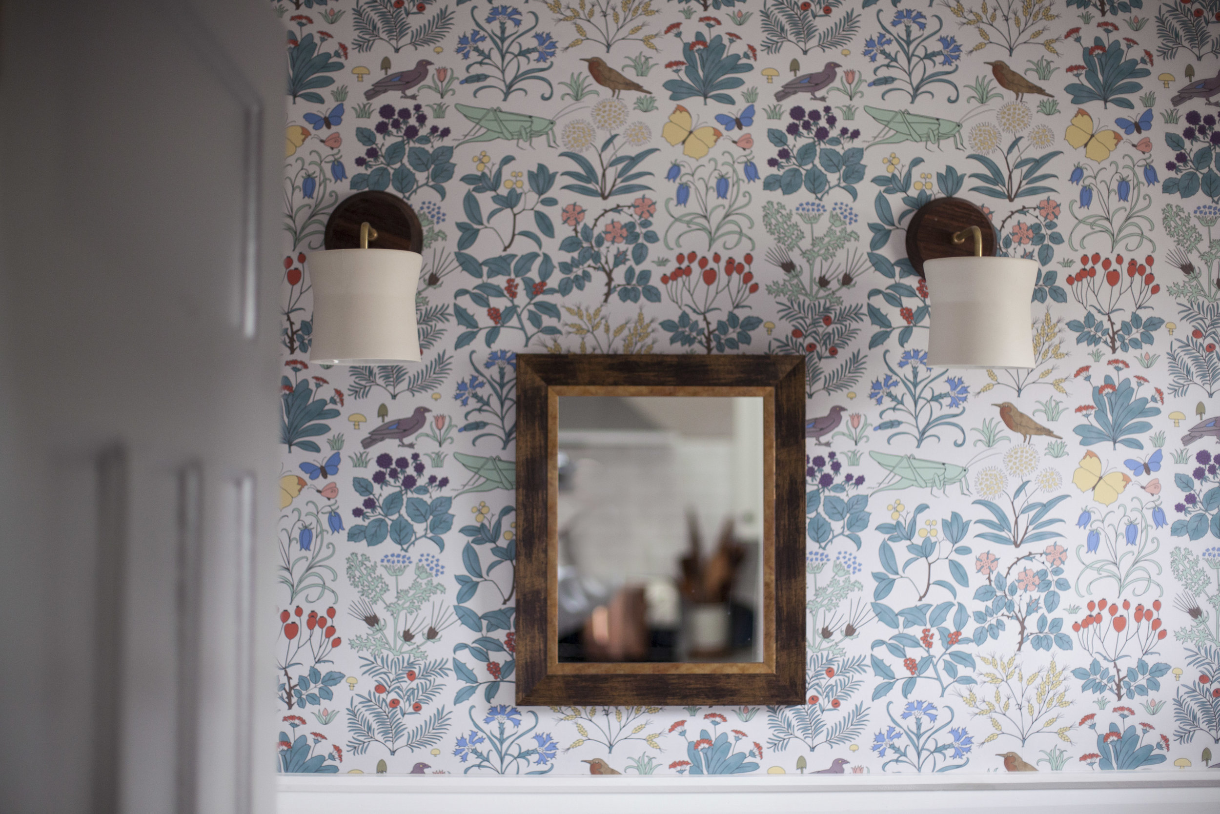
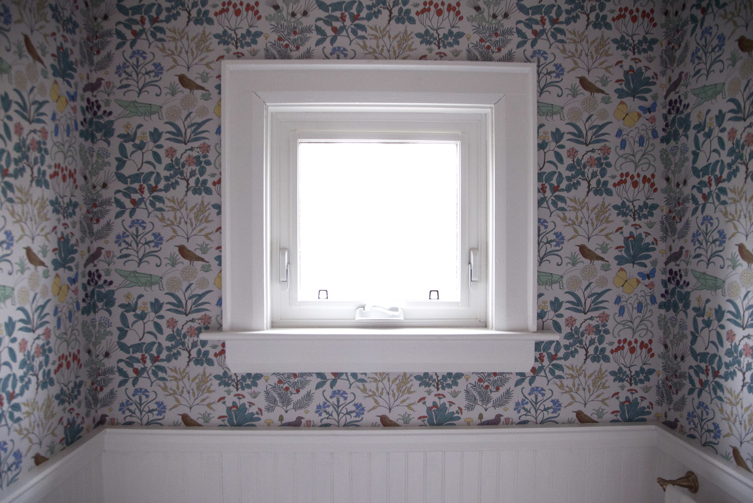
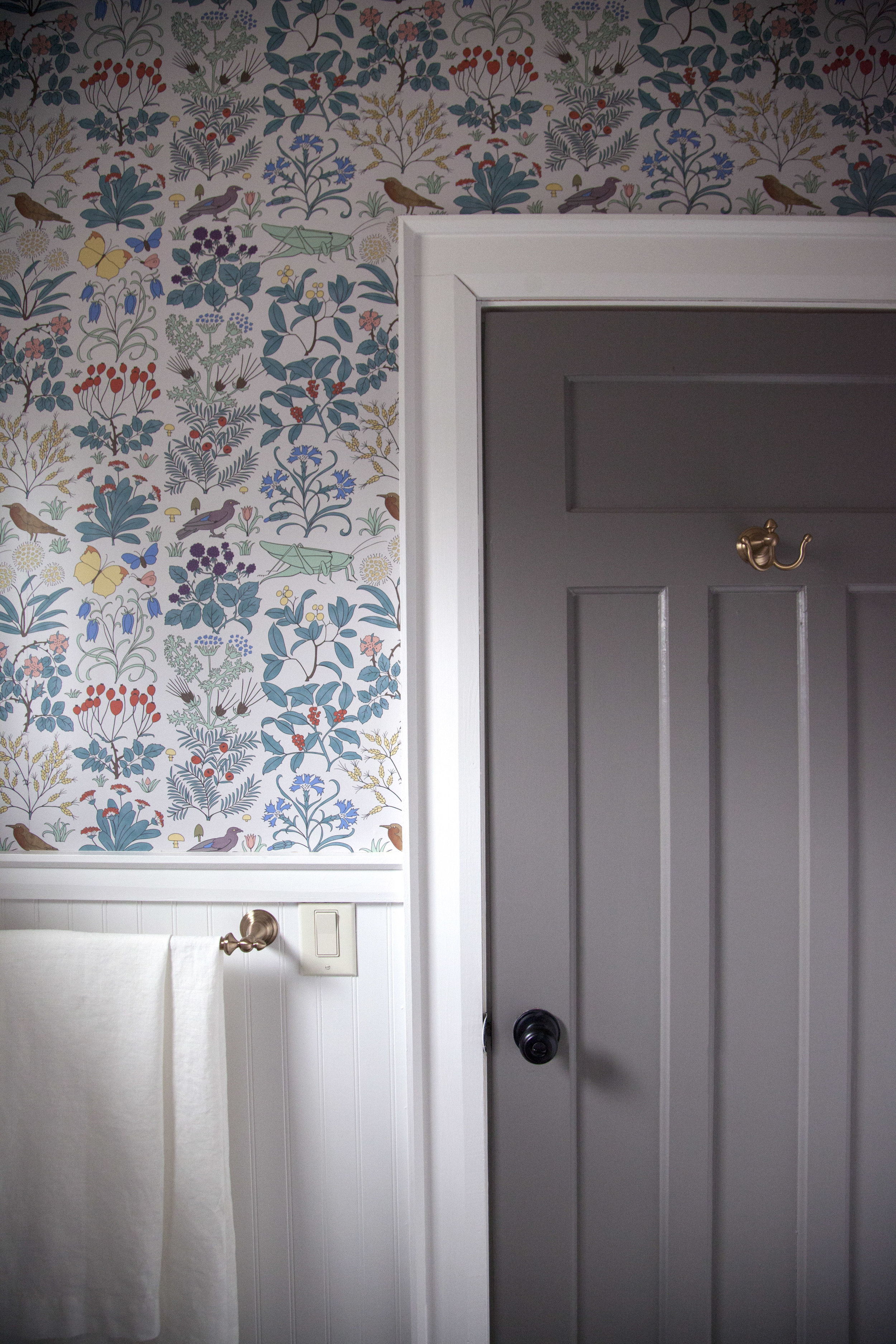
it was so hard to pick just ONE wallpaper print. i fell in love with the vintage designs by trustworth wallpaper who is run by one of the nicest artist, david berman. he sources vintage prints + fabrics & then turns them into the most beautiful wallpaper patterns you will ever see. i ended up going with "apothecary garden" in grey because it was an arts & crafts print that dates back to 1926, around the same time our house was built! it truly makes the space.

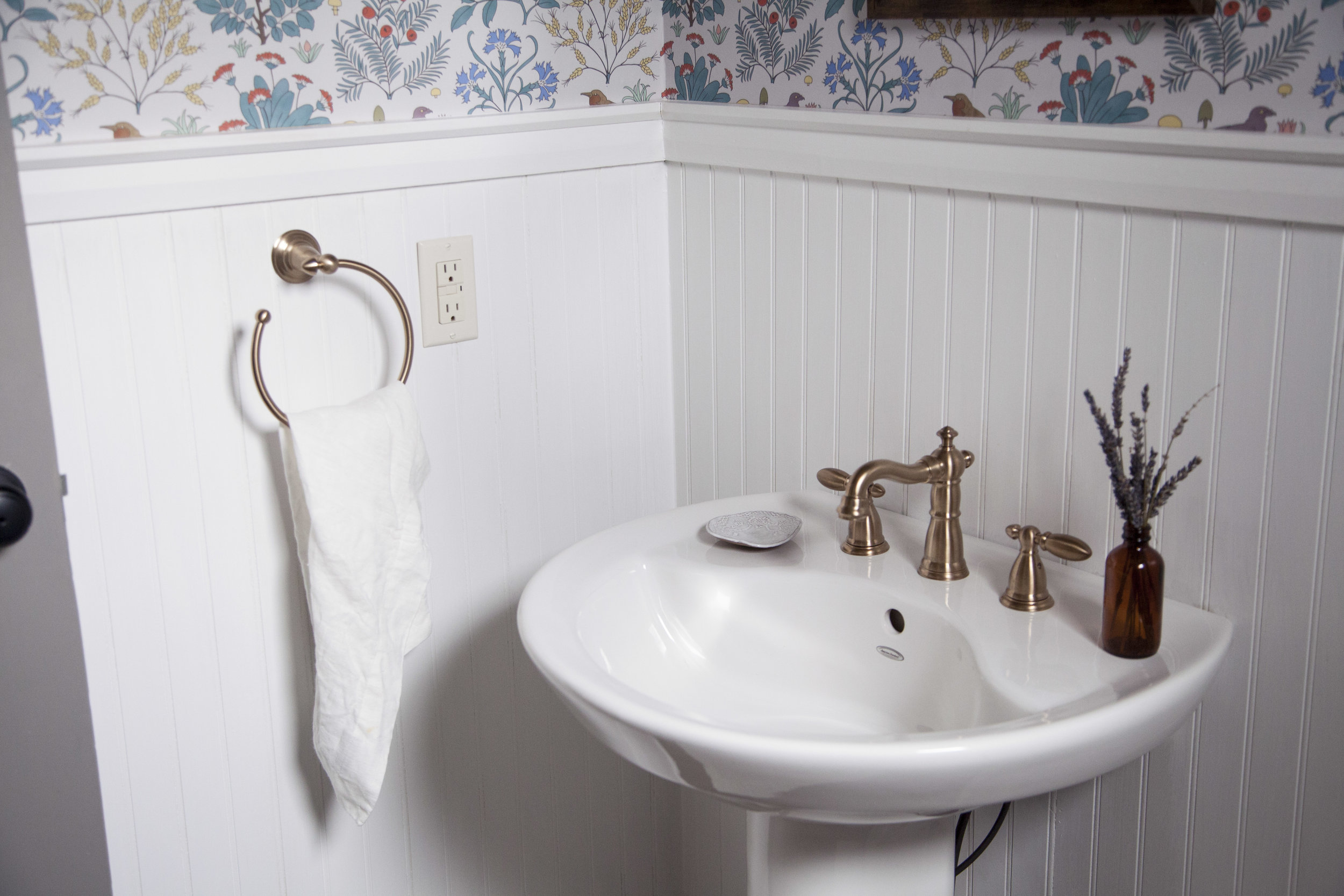
step two: the faucets & fixtures next up, i had to decide on the perfect faucet to go with the vintage wallpaper design! it seemed like a no brainer to go with brass, but delta faucet makes the most gorgeous "champagne bronze" colour too. the champagne bronze is more of a subtle brushed gold finish. not that i am against shiny brass, but it is harder to keep shiny & clean! plus this brushed bronze is perfectly gold without over powering the rest of the design elements. i went with the victorian line of faucet & accessories (towel rack, towel ring, tissue holder + door hook) to keep the whole 1920's theme i was aiming for.

step three: paint

after i decided on the two boldest designs in the room, i got to pick the rest of the design elements like light fixtures, paints & linens! i went with farrow & ball for all the paint throughout the house, so it was an obvious decision that i was using farrow & ball paint for the bathroom as well. i wanted the wood panneling to be bright & clean, so i went with "wevet" in estate emulsion for both the wood panelling & wood trim. it has the slightest of grey hue to it which went hand in hand with the grey apothecary garden wallpaper. this was actually a last minute decision i made the night before the wallpaper was installed! the original colour was a creamy white & i decided at the last possible second that it wouldn't look as nice with the wallpaper. the rest of the wood trim in the house is painted in wevet so i am happy i made the right choice in here as well. now those doors! believe it or not they were already painted grey when we purchased the house & i had the hardest time deciding to keep them grey or paint them white to match the bright white trim. in the end, grey won but we still repainted every interior door (yes EVERY single door i sanded & painted) in farrow & ball's mole's breath. mole's breath turned out a few shades lighter then the previous grey, plus we had to get rid of all those chips & cracks.

step 4: light fixtures

for the light fixtures i found the perfect sconce lights from cedar + moss, called the wyatt sconce. they have a touch of brushed brass in them, but what really caught my attention was the walnut wood base. i love that the base is a dark wood because it brings in a touch of warmth to offset the white & grey tones. plus, the shade is made of CLAY! yes CLAY! it is handmade by pigeon toe ceramics & every time someone comes over i feel the need to point out that the light fixture is actually a piece of pottery.

step 5: linens

last but not least, the linens! i am a little bit italian (okay, some would say super crazy italian) when it comes to my linens. these linens are so nice that i don't like people actually using them. the linens are from rough linen & came in a set called the "bath makeover". i went with a neutral white but struggled to pick between the dusk & charcoal. every colour was just so pretty, i can't wait to keep a set for the main bathroom was well! the quality on them is absolutely amazing, so i am slowly getting over my craziness & allowing them to be used as i know these linens will wash well for years & years. also, using 100% natural linen was the last little touch of vintage inspiration the space needed to tie it all together.

i hope you love how it turned out as much as i do! xo