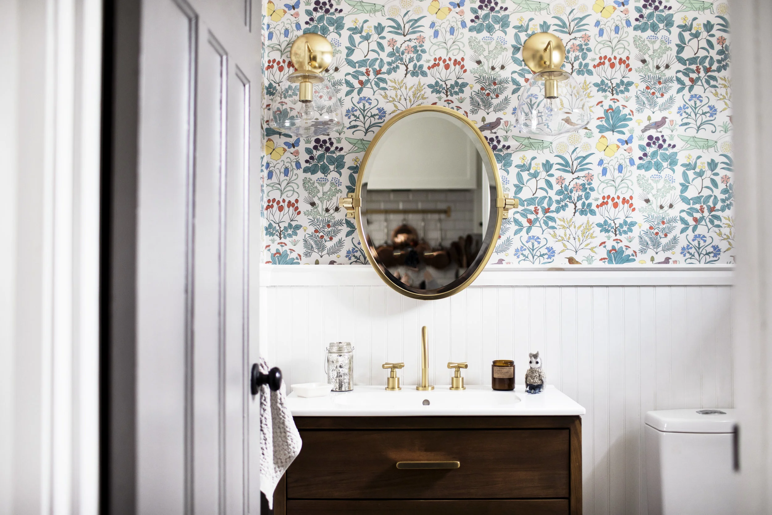
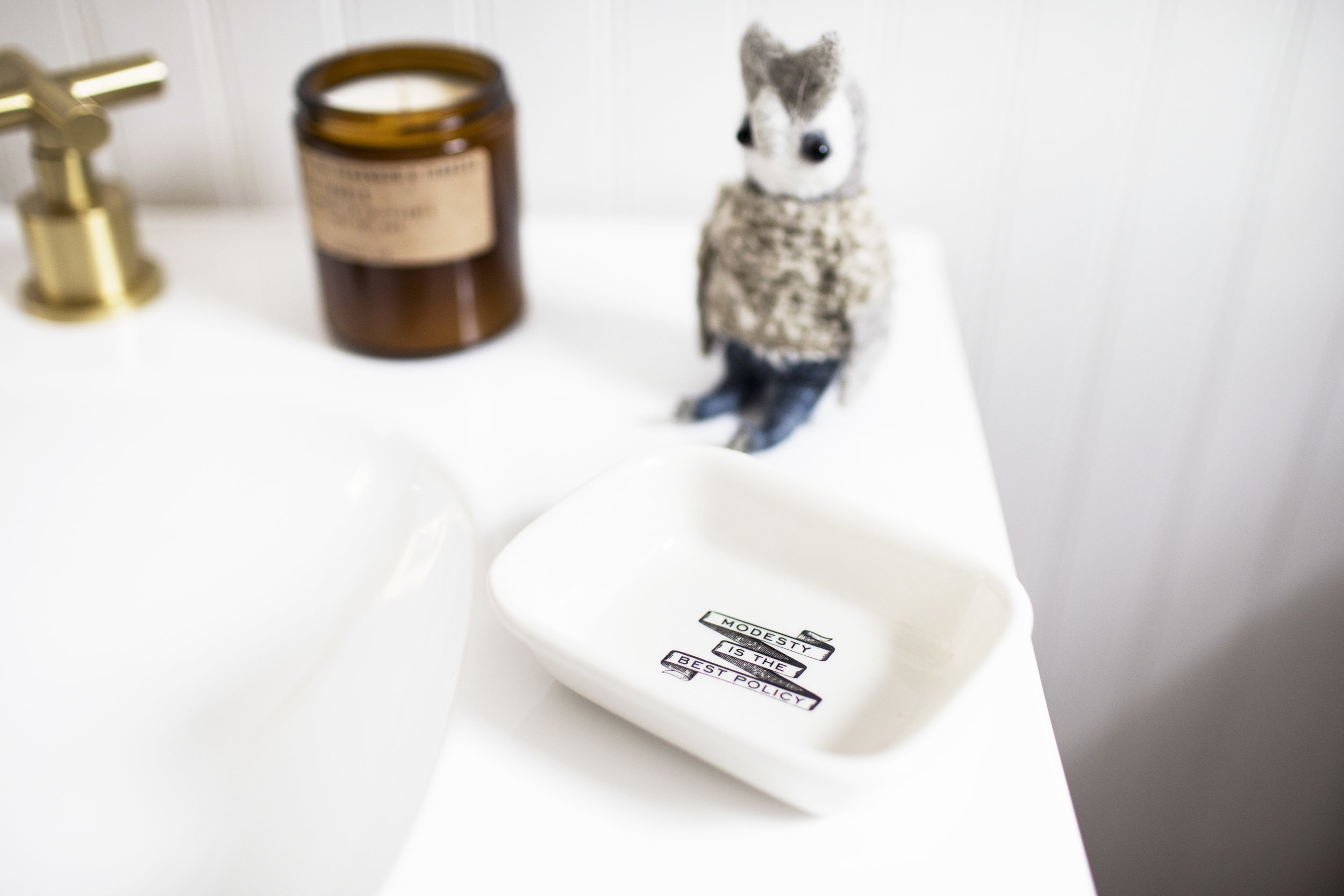
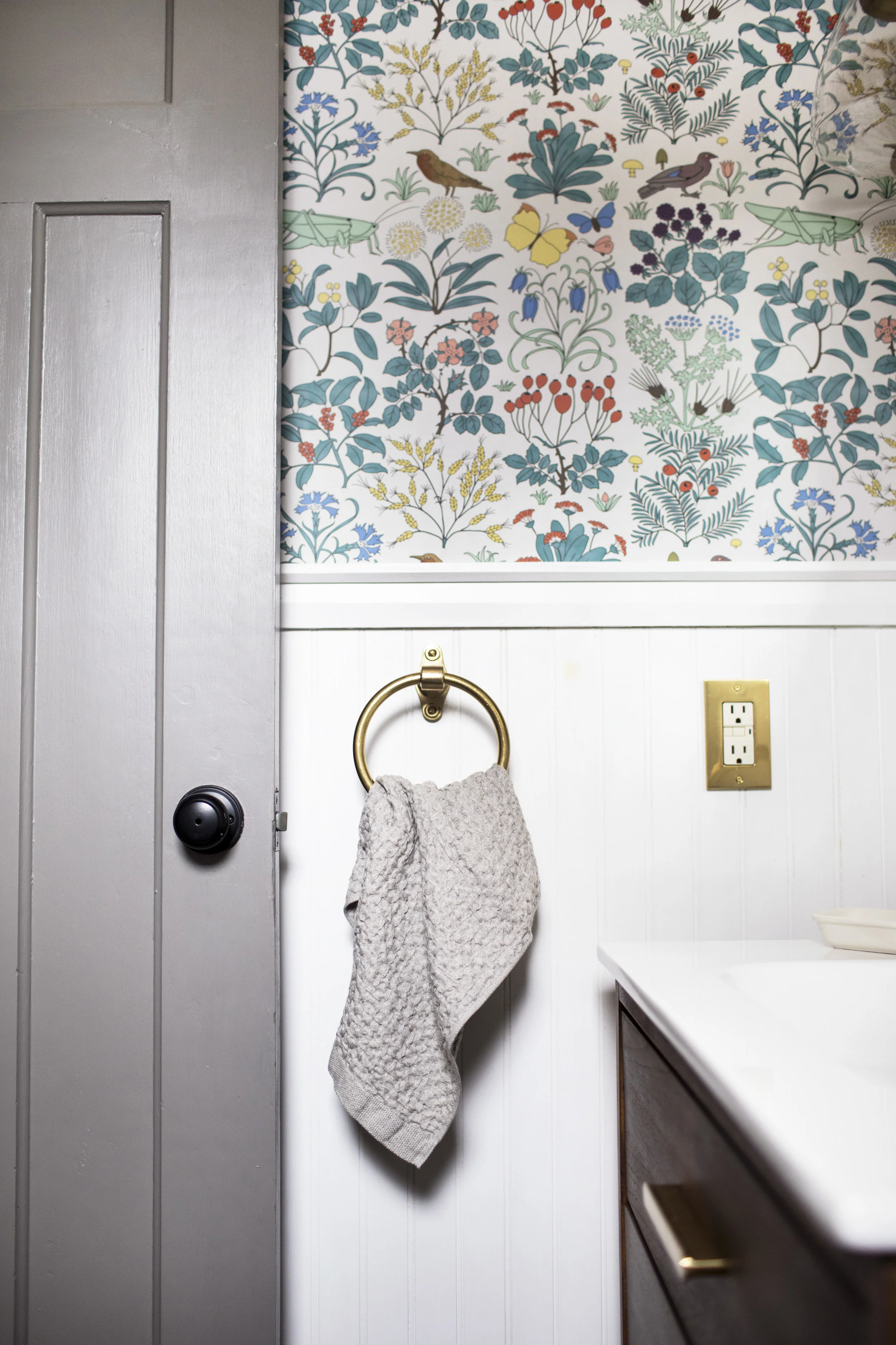
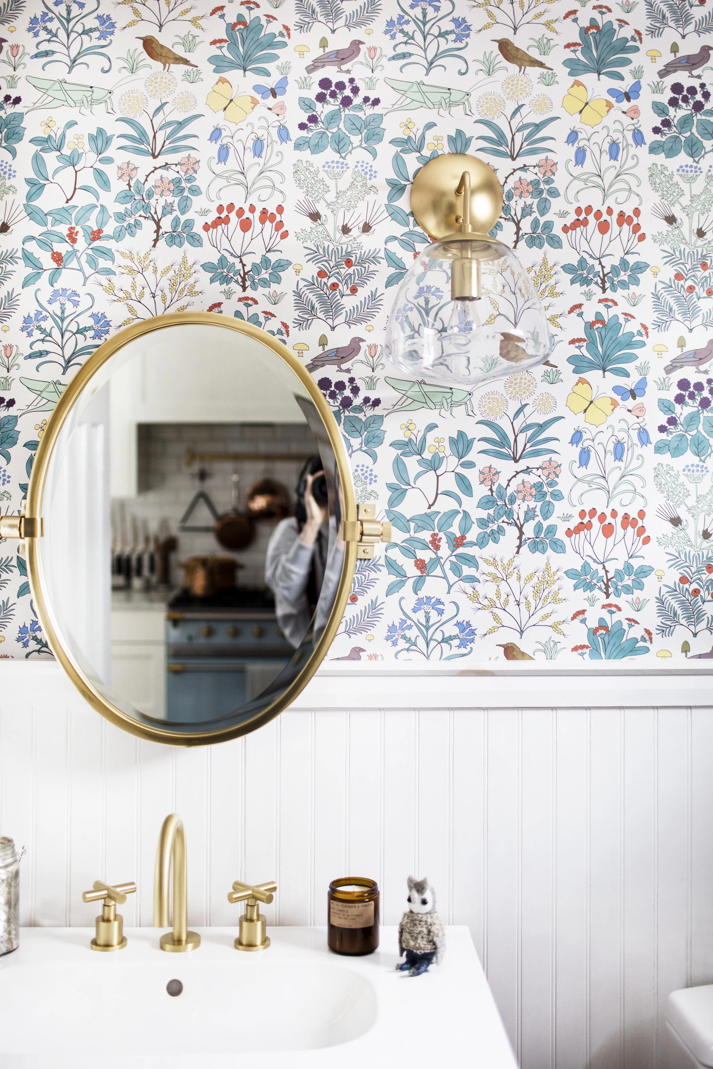
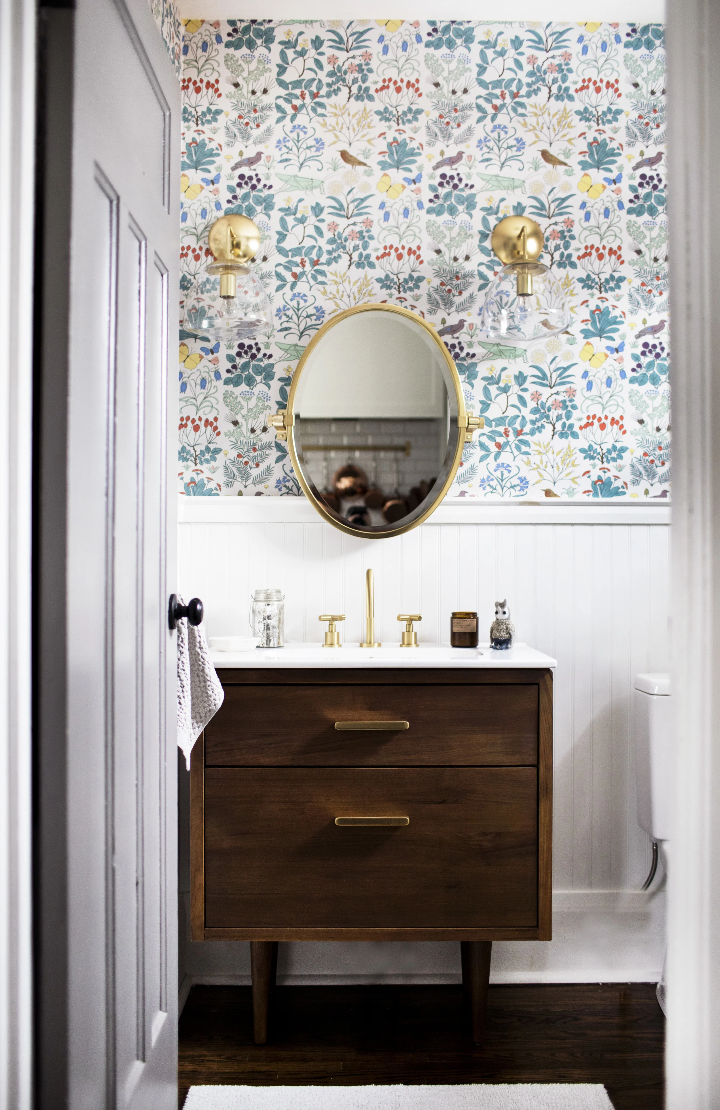
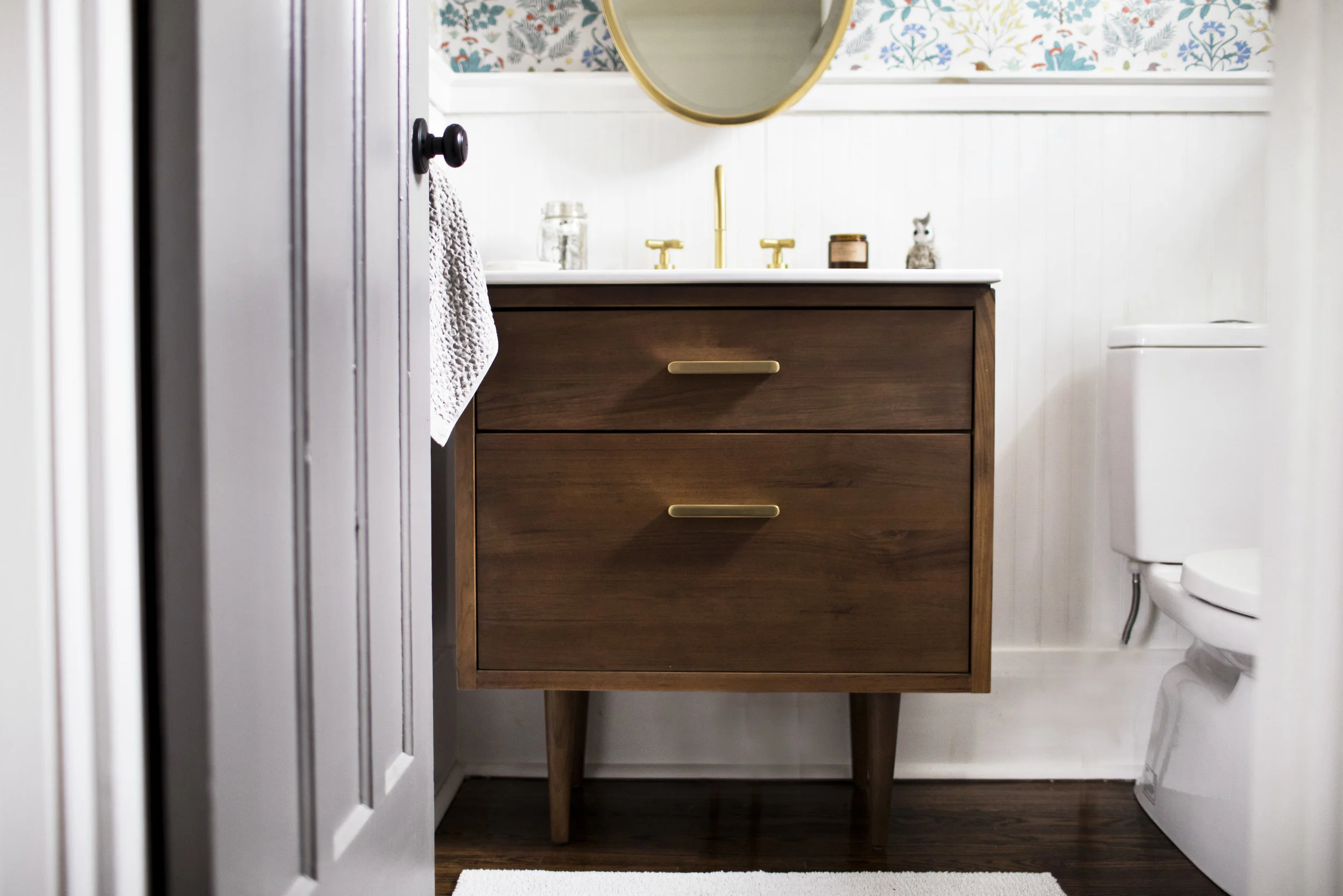
first up on the 2019 list of projects for modest house is a powder room refresh! what inspired this refresh was the need (ok, want) for a vanity. it is a rather large space & the previous pedestal sink offered zero storage. years ago when we viewed the home, the powder room was a very plain & bare addition. i was actually happy that it was so basic though, because it meant i could put my own style & design flare to the rather empty space.
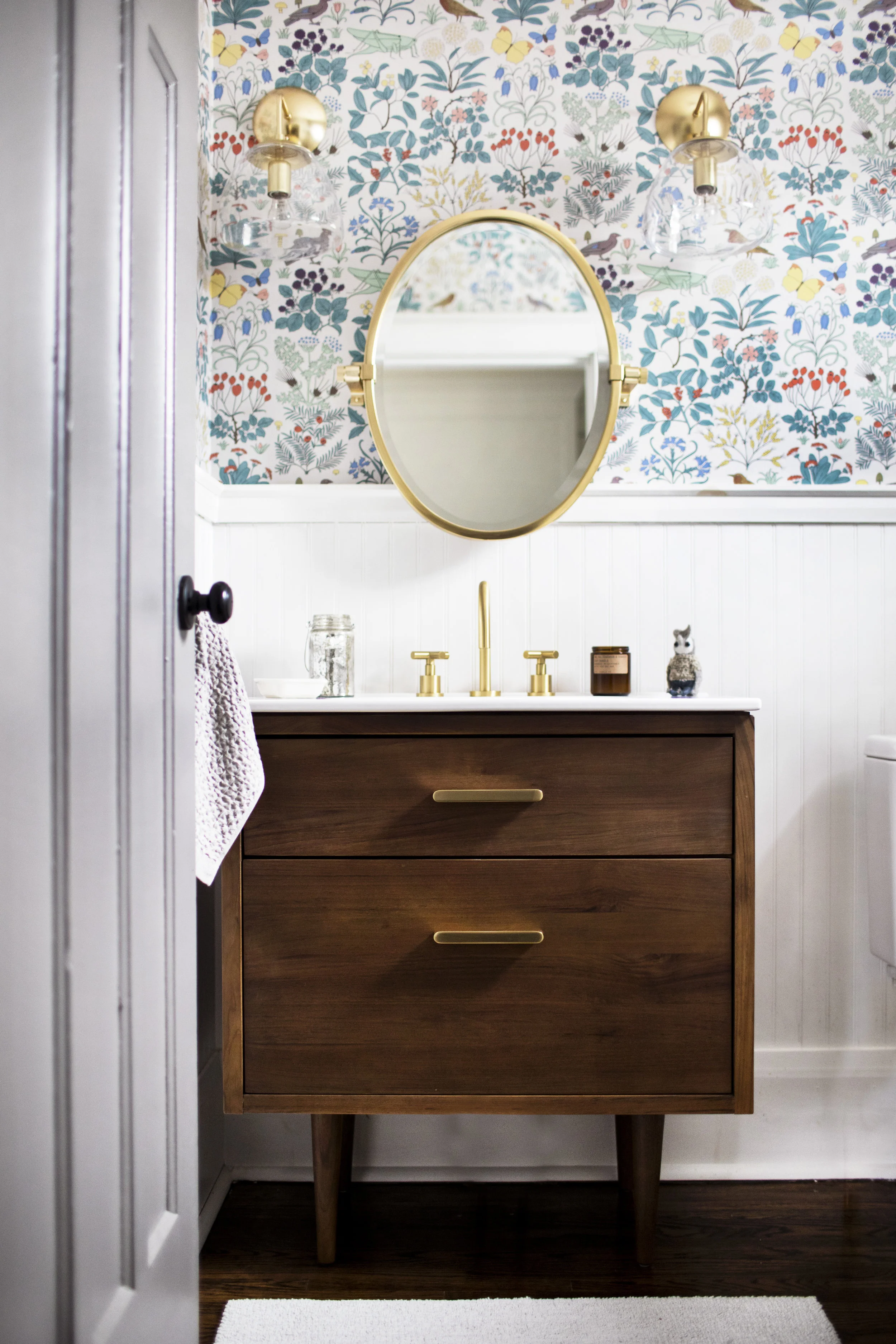
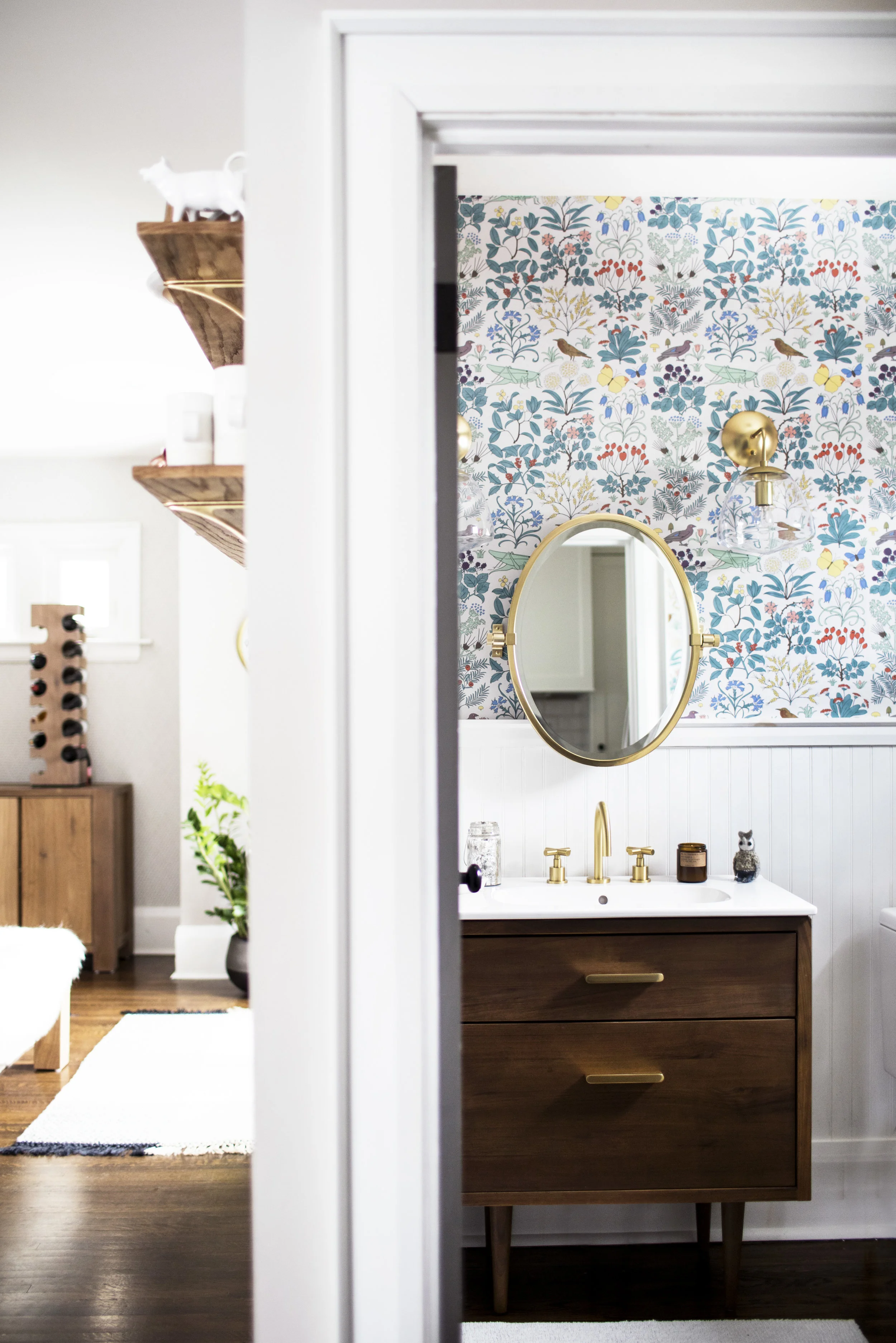
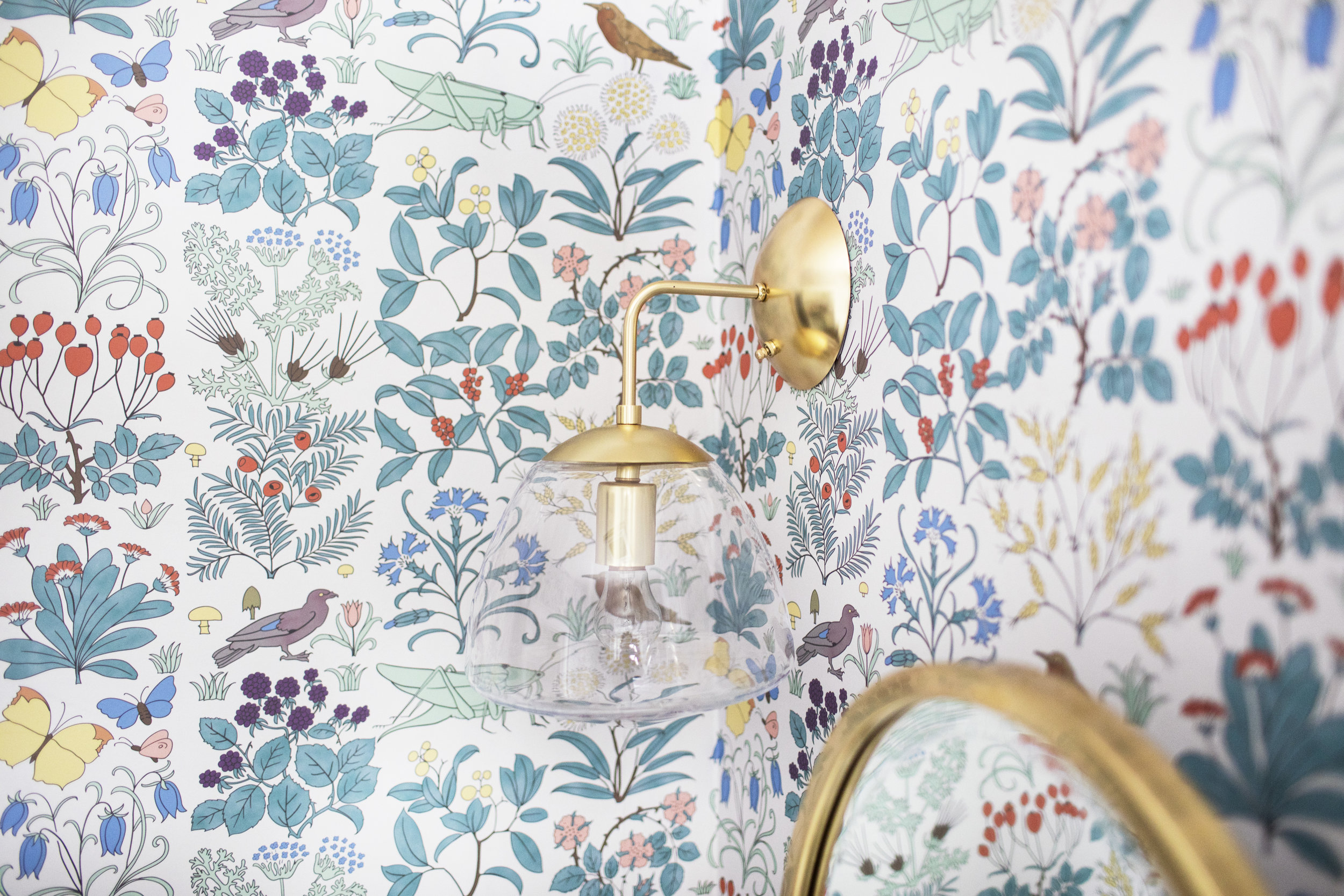
the first thing we did was add a bold & colourful wallpaper to the room. i know colour is not something you often see from me, but i wanted the powder room to be a unique space. the wallpaper in the space is by trustworth designs & the print is called "apothecary garden". i love it as much as i did when i picked it three years ago & as long as i am in this home, the wallpaper will remain (i promise justin). trustworth designs is run by artist, david berman. he sources vintage prints + fabrics & then turns them into the most beautiful wallpaper patterns you will ever see. you can find all of his other wallpaper designs here! hey diddle diddle is one of my favourites.
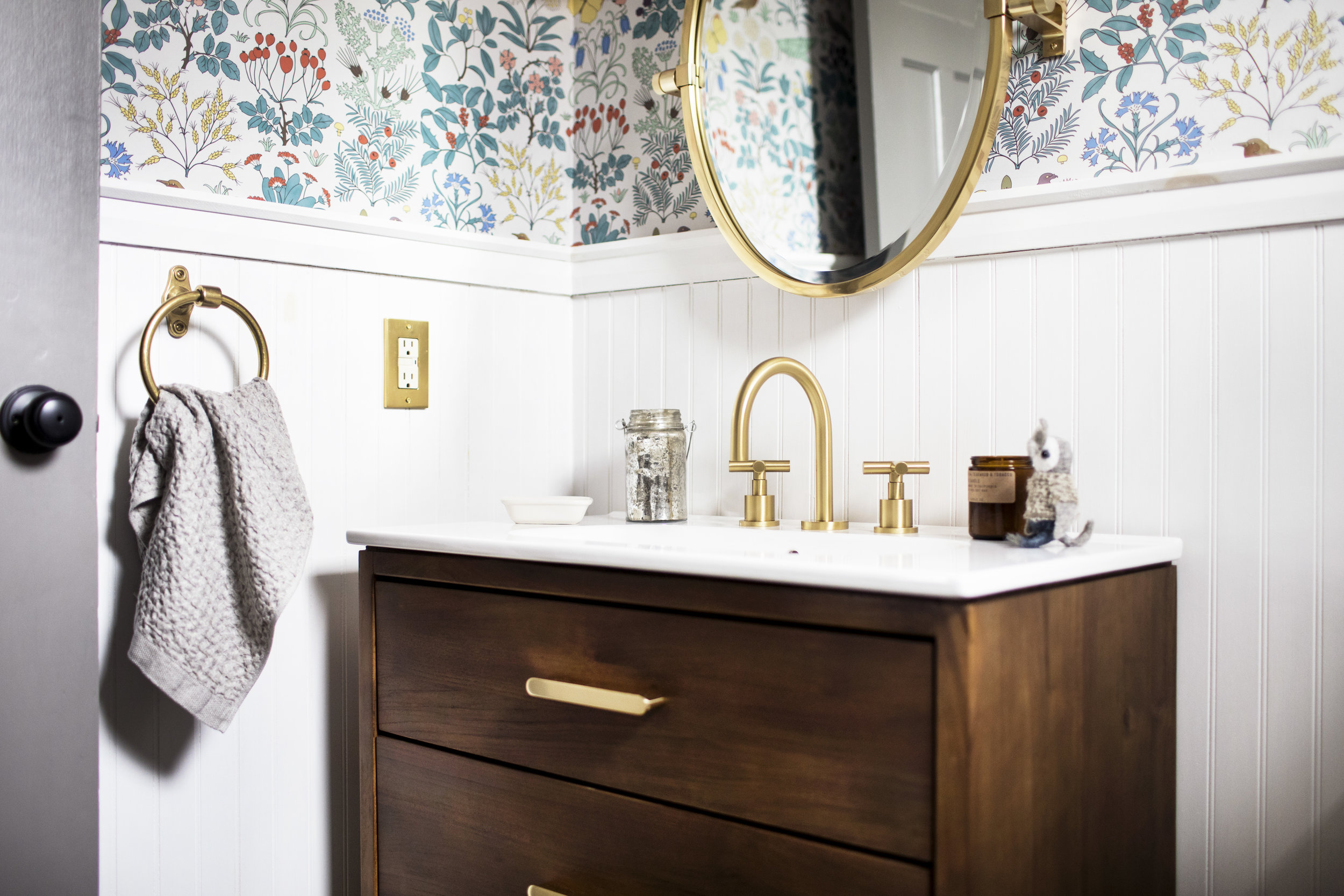
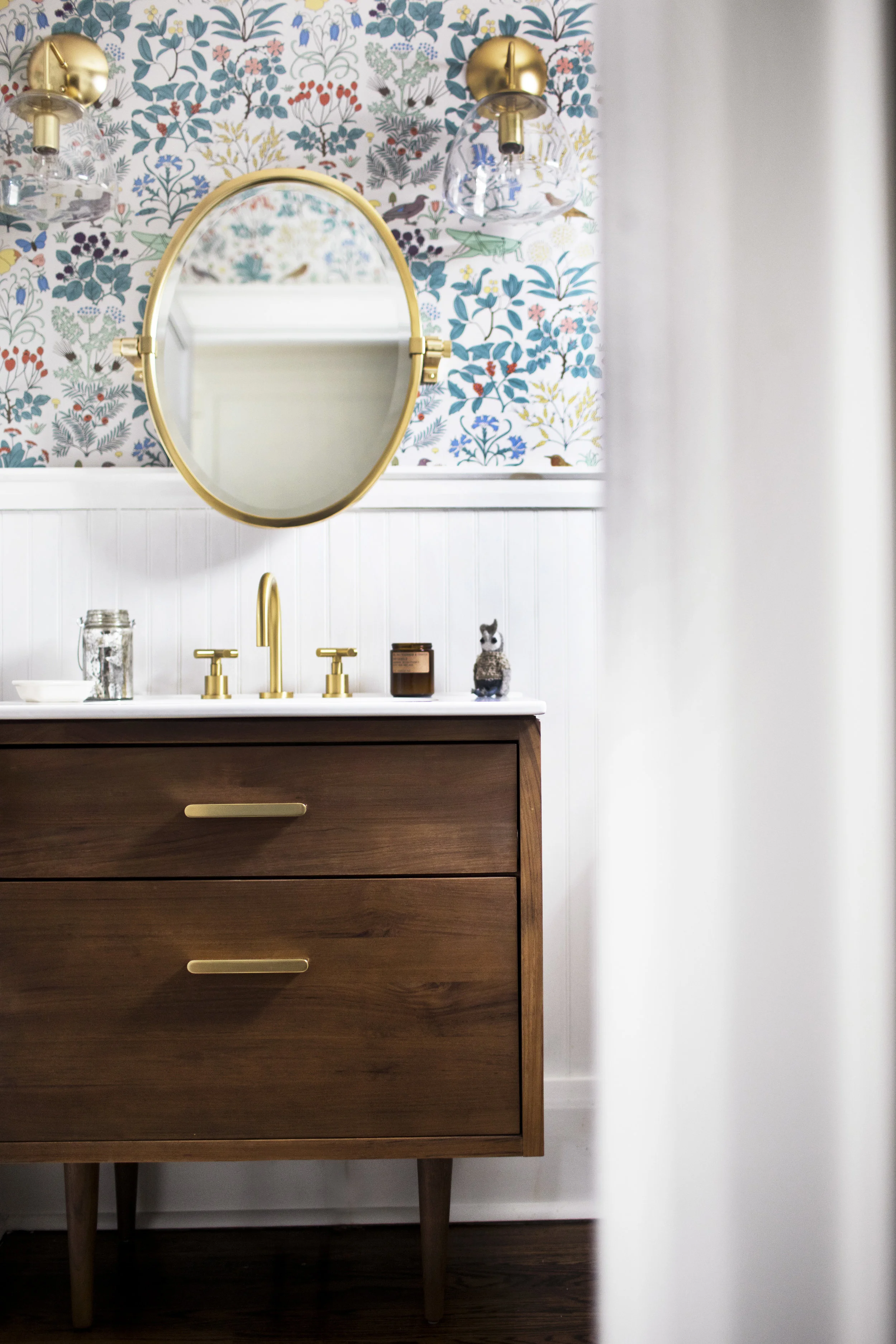
now.. lets talk about that vanity! the vanity that inspired the rest of the design is the mid century "marquam teak single vanity" beauty from rejuvenation! adding an element of wood to this space was a must for me. i can't believe how switching from a white pedestal sink to a wood vanity makes as big of an impact as it did. it looks like a completely different space & feels so much more inviting. i am pretty obsessed with it to be honest, justin is too. the vanity comes with a solid white porcelain counter top with an integrated sink. for the handles, you get to pick between different brass, black & silver hardware. brass was a must in this space, especially with that wallpaper! it is like the vanity & wallpaper were made to go with each other.
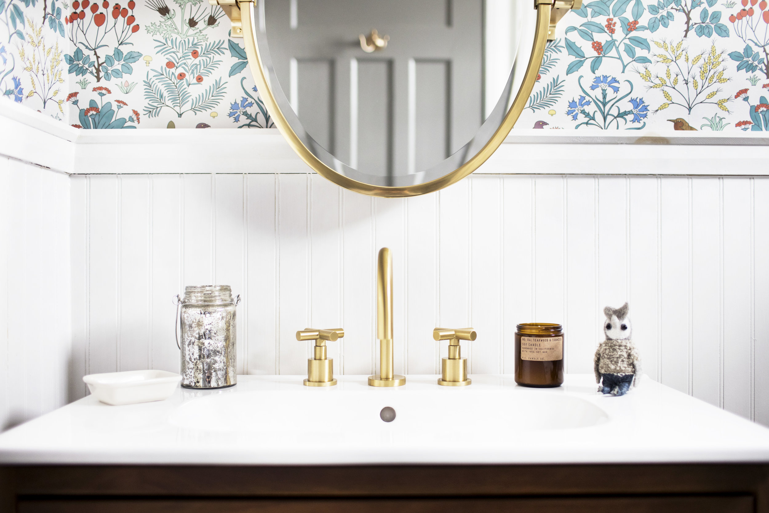
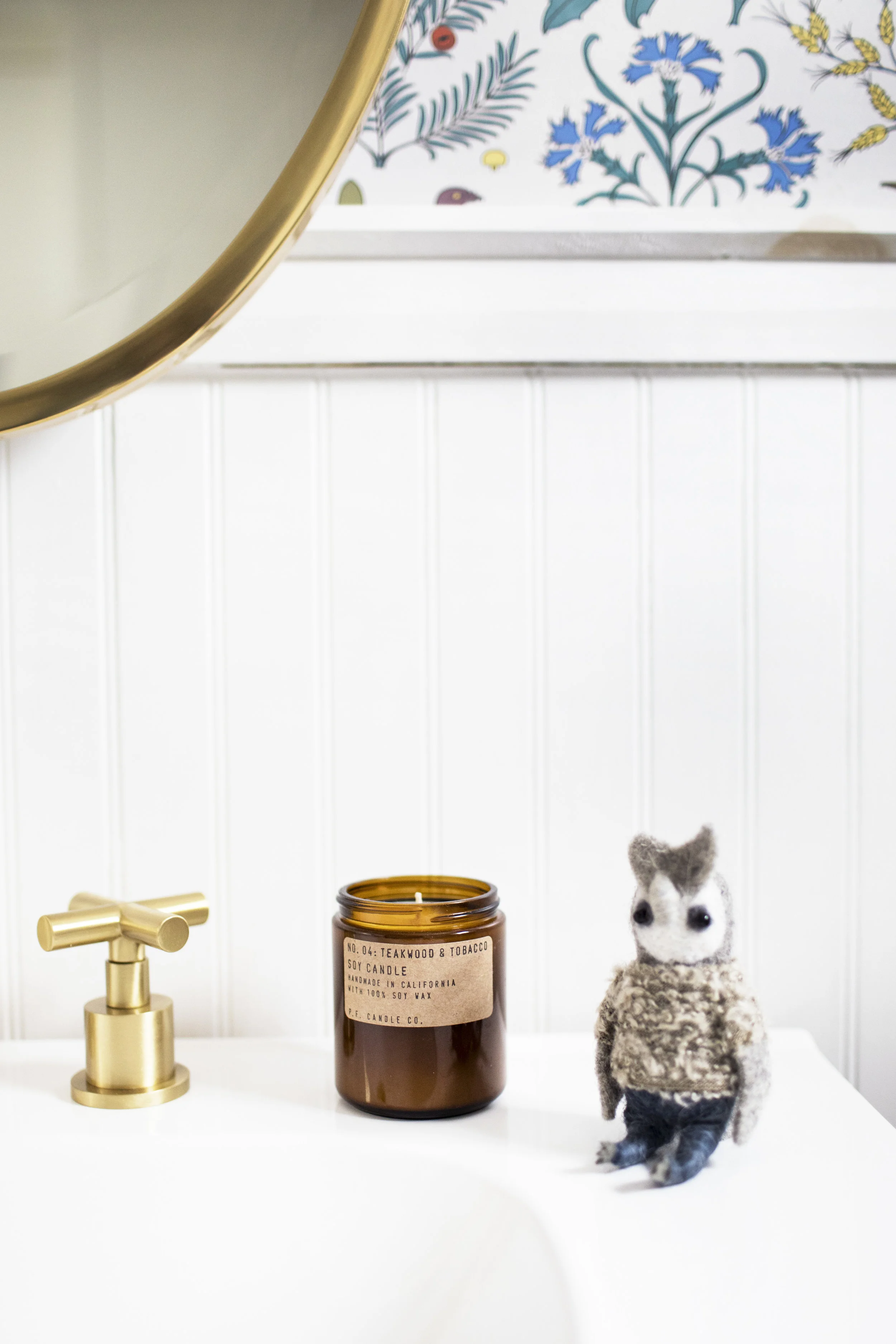
moving onto those faucets that give me ALL the heart eyes! with the mid century vibes from the vanity, i wanted to pull in a simple, clean & modern facuet. we went with the "west slope faucet" from rejuvenation, which is made in USA by a luxury faucet company called watermarks. the quality of these faucets is like nothing i have ever seen before & because it is an aged brass finish it won't pantina over time.
lastly, the lights & mirror! again, i stuck with brass because.. brass. i know everyone is loving the mixed metal trend, but sometimes i think sticking to one finish looks more cohesive. truthfully, i am not big on mixing silver & chrome finishes with brass. it just isn't my style! for the lights, i went with an oversized sconce light, which is the "oswego 9 inch opal dome wall sconce" from rejuvenation. i love the traditional 1920's style of the lights, but the oversized looks gives it a modern vibe. just like the rest of the powder room! we went with an oval mirror, which is the "west slope oval pivot mirror" from rejuvenation. because of the beadboard going so high, the pivot mirror was a must as it does not sit flush with the wall. we originally planned to go with a round mirror, but the oval fit much better in the space.
there you have it! the first project of 2019 is complete & the powder room is forever complete. i can't think of a single thing that would improve this space. right down to that japanense waffle linen hand towel, i am in love! now lets not get me going over my obsession for waffle linen! i could do a post on that alone.
all sources are linked below. xo
like what you see? get it here. vanity | faucets | wallpaper | oval pivot mirror | sconce lights | waffle linen towel | toilet paper holder | towel ring | bath rug
