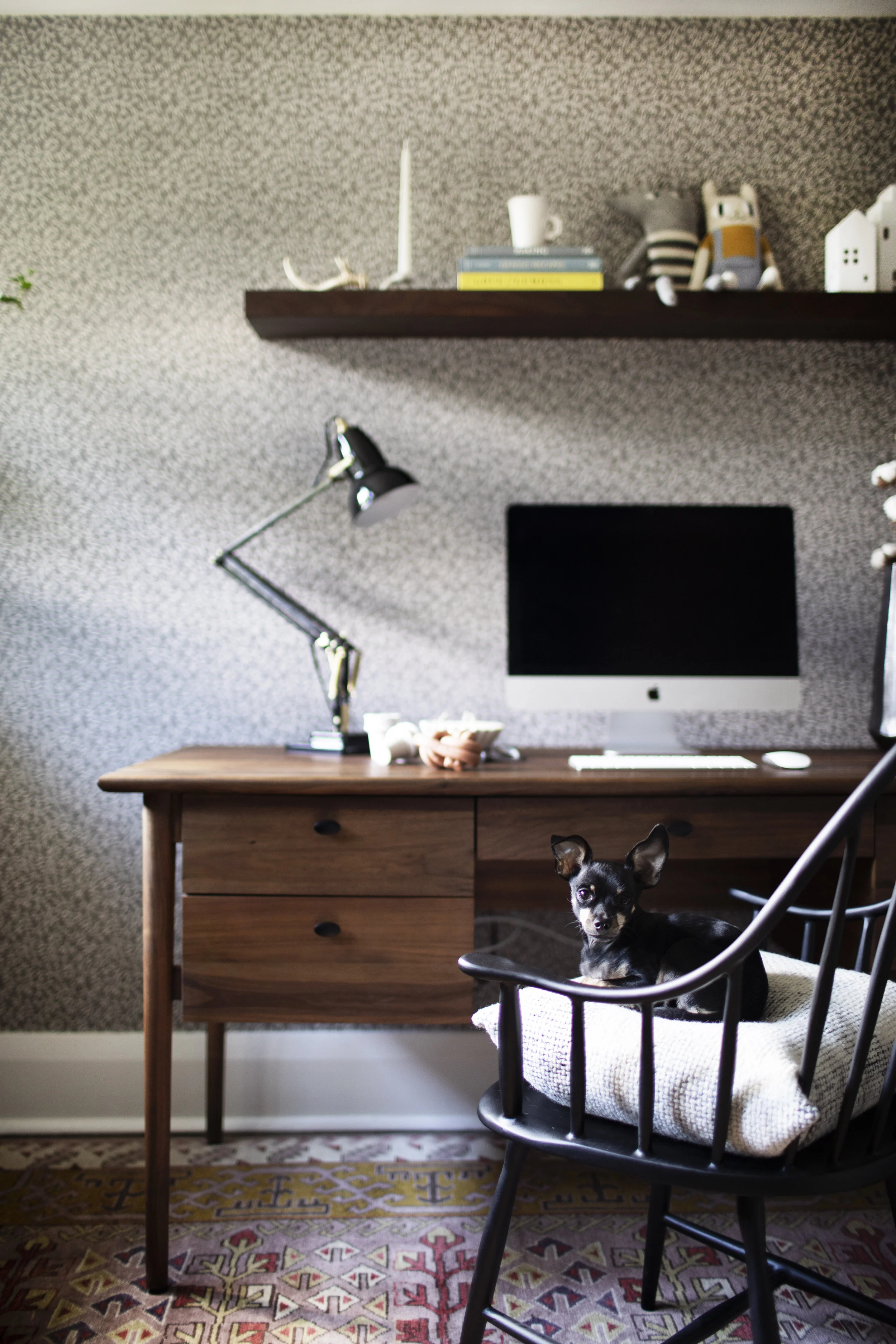
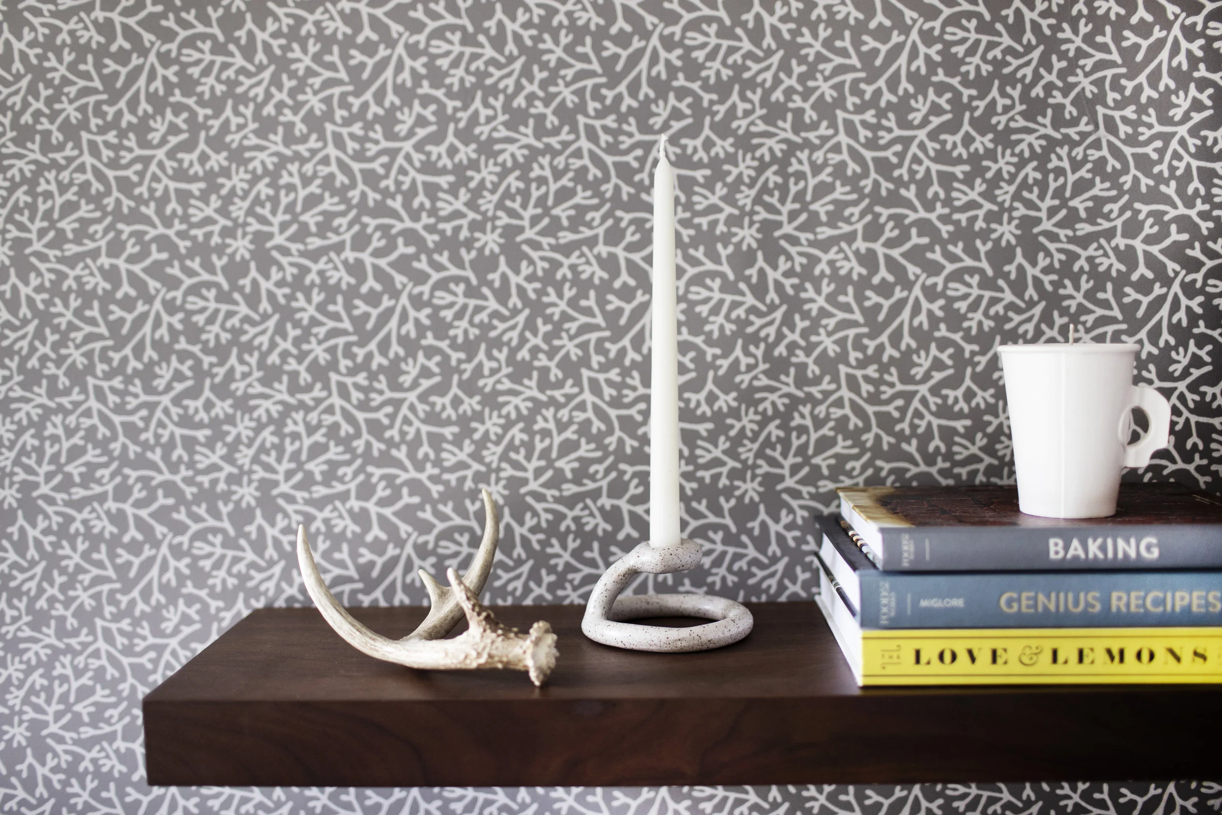
happy september friends! i am kicking off the start of fall with a little home office refresh. most days i work from home, which means i spend a lot of time between these four walls (some days too much time). it was beginning to feel very uninspiring, so i decided a refresh was in order. new season, new work space! the end results turned out so timeless with a hint of whimsical. i can't wait to walk you through this space! note: the wallpaper was done a few years ago when we first moved in & i love it as much as i did then. i went with samphire by farrow & ball, which looks woodsy to me. anyone who tried to stop me from hanging all the wallpaper in my house because i would quickly get sick of it was wrong. it makes for the perfect backdrop to any design. ok, lets get into the details of this office!
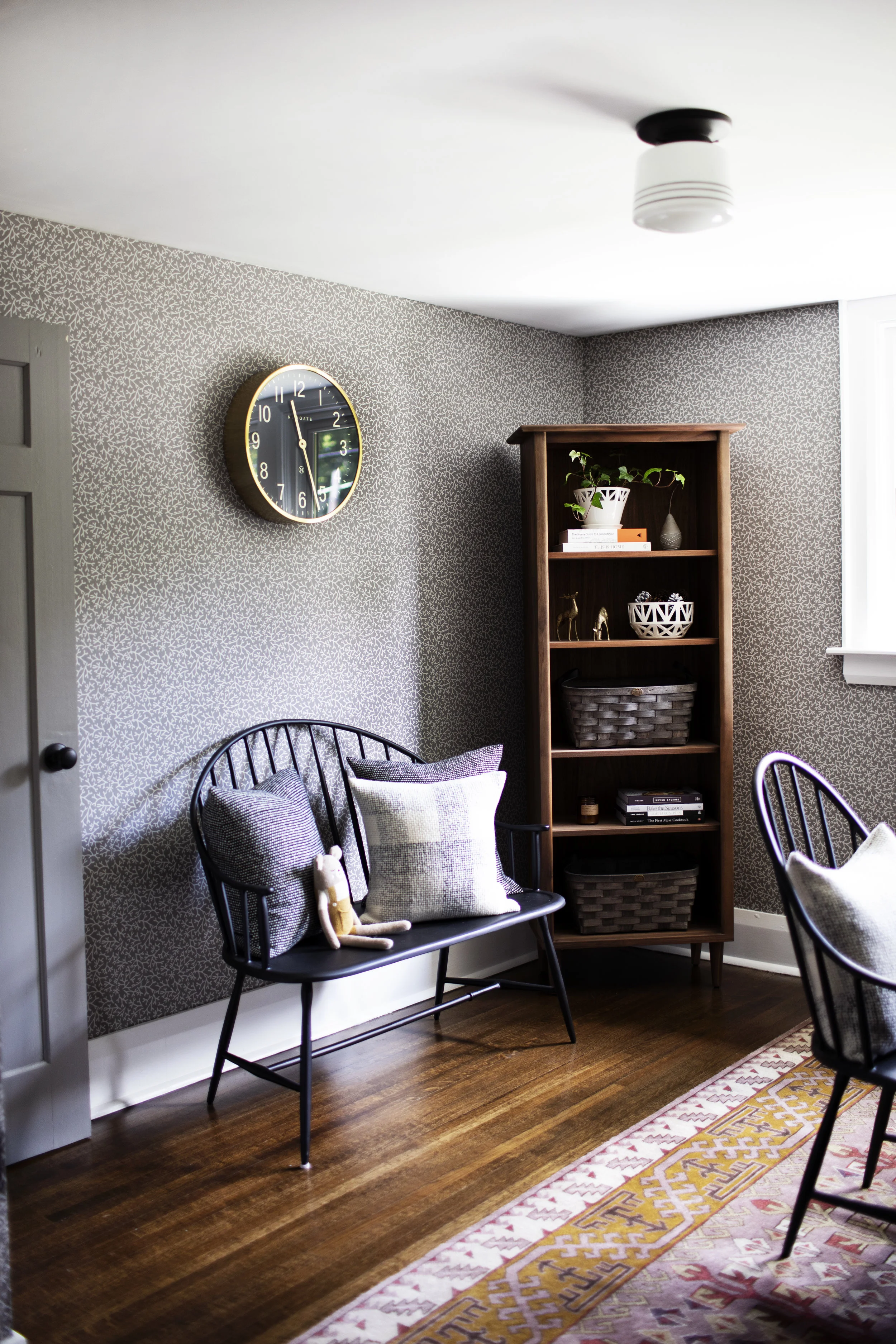
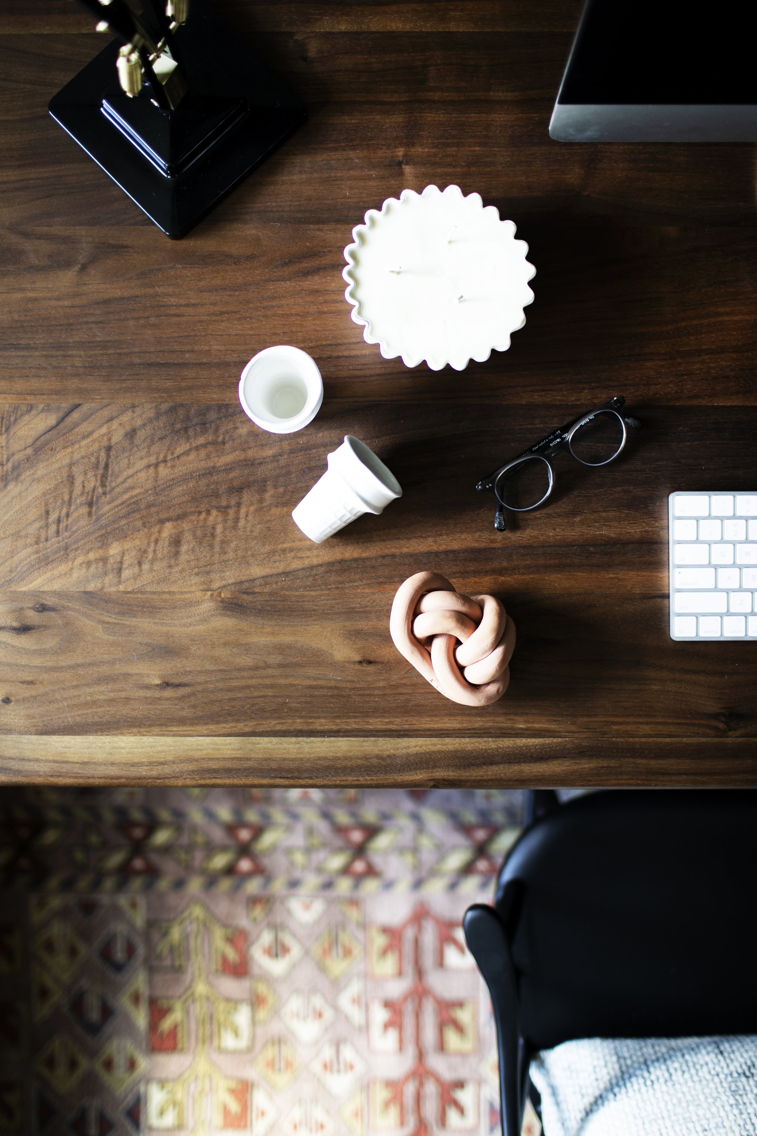
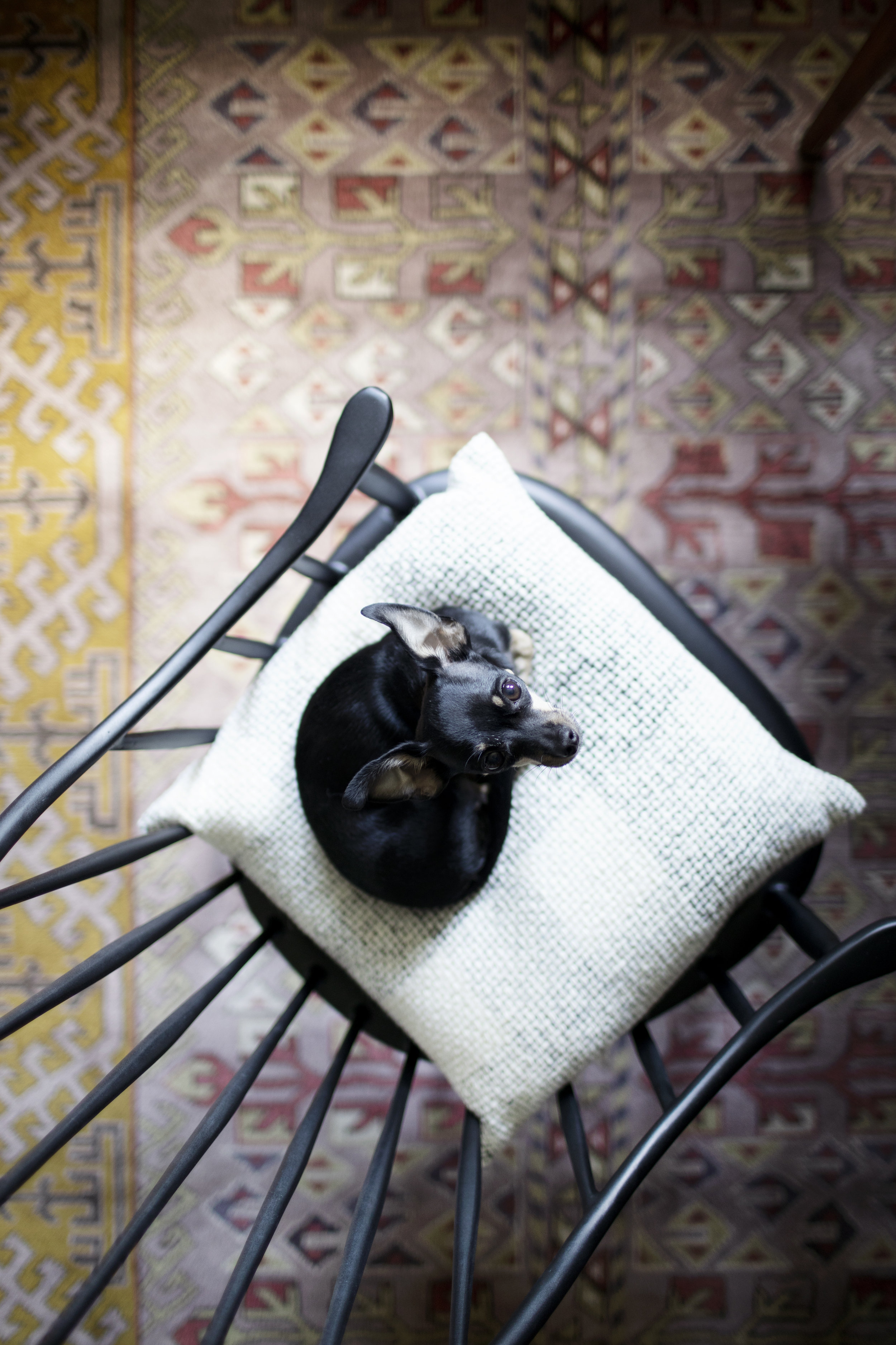
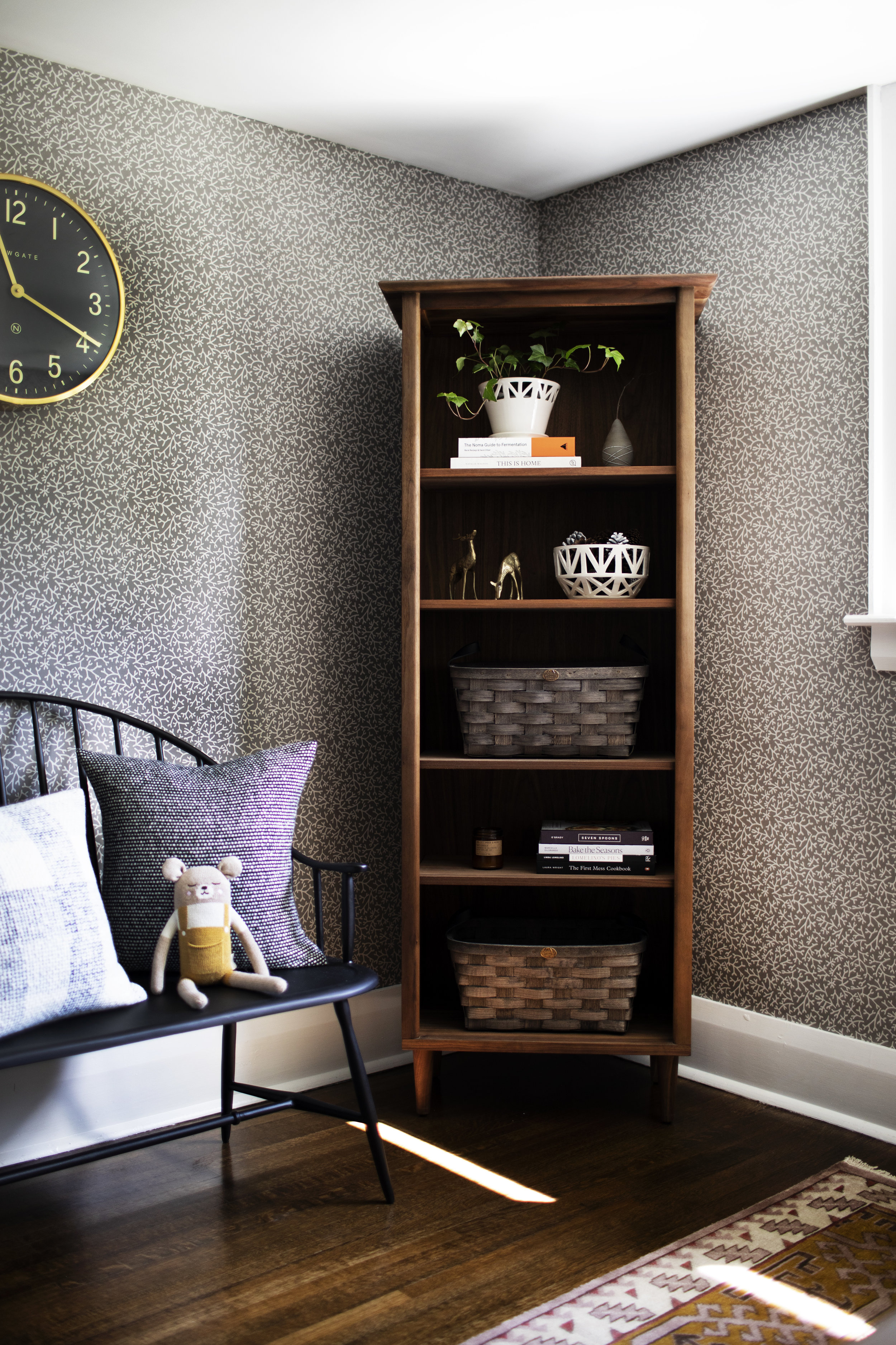
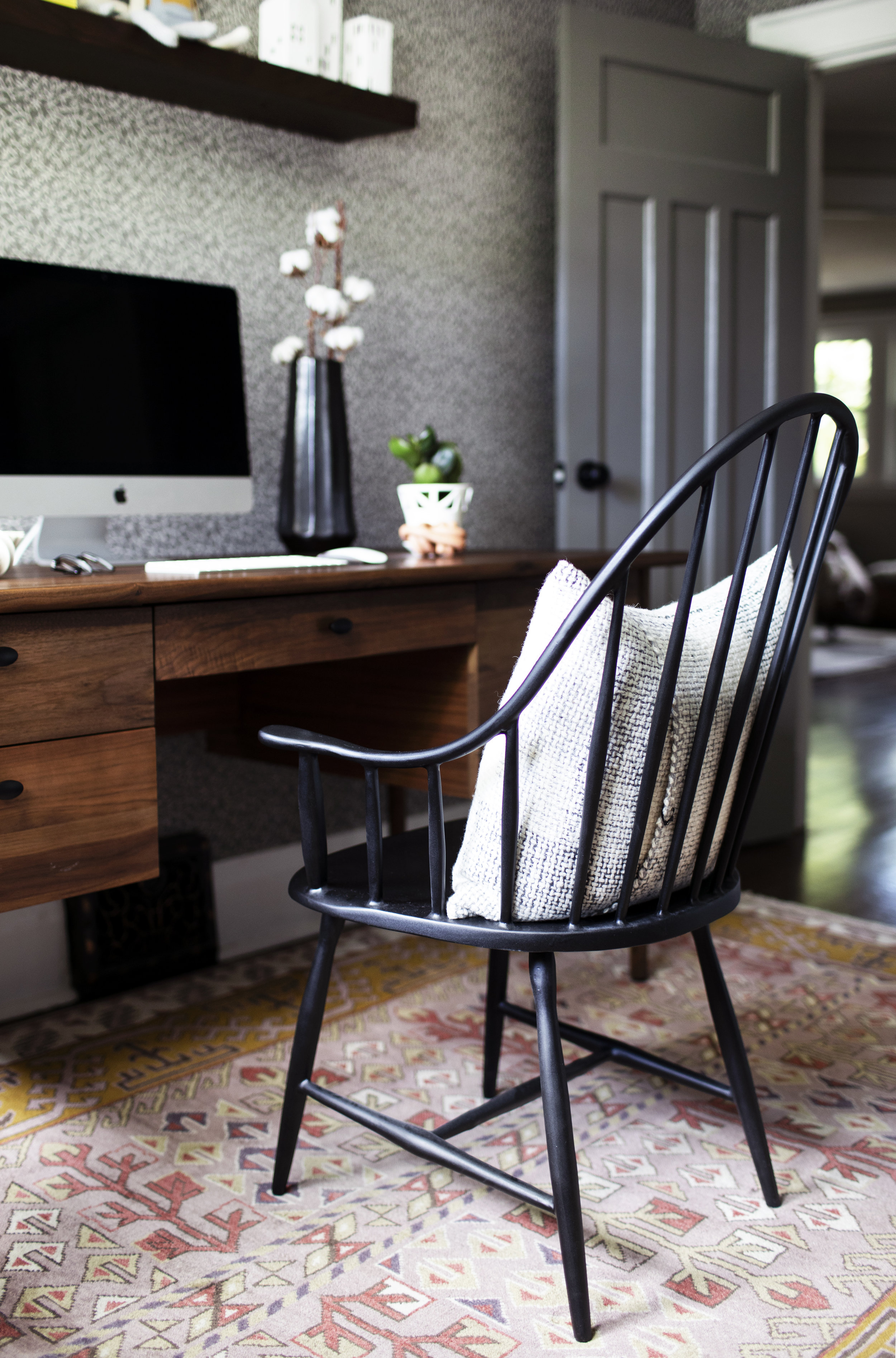
this space didn't require any updated furniture pieces. the mid-century inspired desk & bookcase remained the same, which shows it is amazing how a few interesting decor pieces can change a whole space (FYI the desk is the kendall walnut desk from crate & barrel). what brought the most colour & change to the space is a new area rug! i have wanted to add more colour throughout our home, without getting crazy. the rug has so many gorgeous soft pink & plum colours throughout the design pattern with a subtle pop of mustard yellow. i knew i wanted to bring a bold rug into the design, but it had to compliment the wallpaper. the muir hand-knotted rug from rejuvenation was the winner by a landslide. it looks so good with the wallpaper, without taking away from the simplicity of the pattern. it also compliments the guest room beside it as the room is wallpapered in soft pink hues.
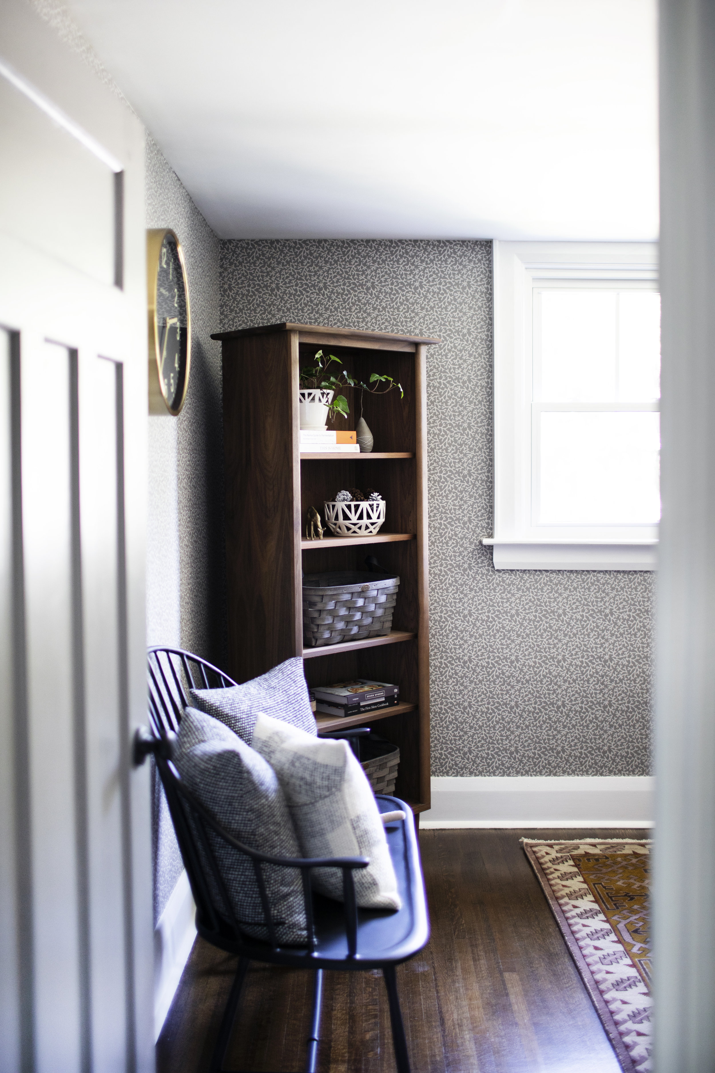
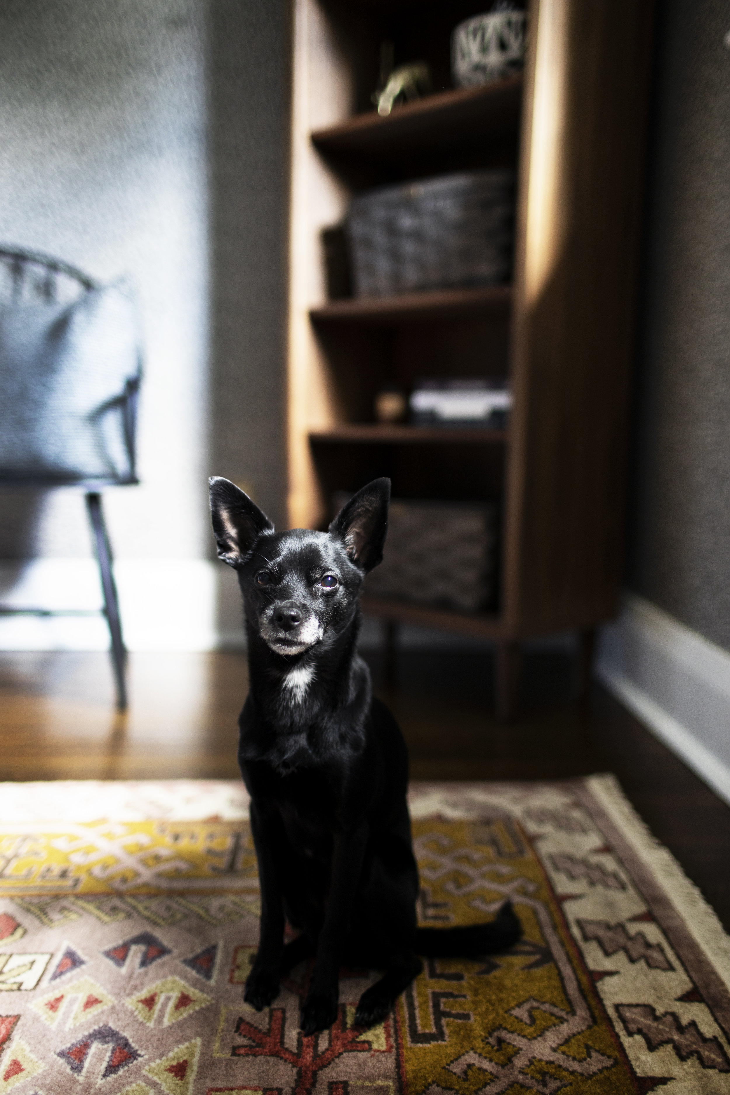
next up, the bench! this wall has been empty for years as i never really knew what to put in the space. since i am always forcing justin to come hang out with me while i edit photos & write blog posts, i realized he needed a place to hang out too. this bench fits the wall space perfectly & allows for extra seating in the office (for both justin, pete + buddy). it is the henry settee from rejuvenation & the matching desk chair is the henry chair. i love how it fits with the era of the house, as it is a modern take on the traditional windsor chair.
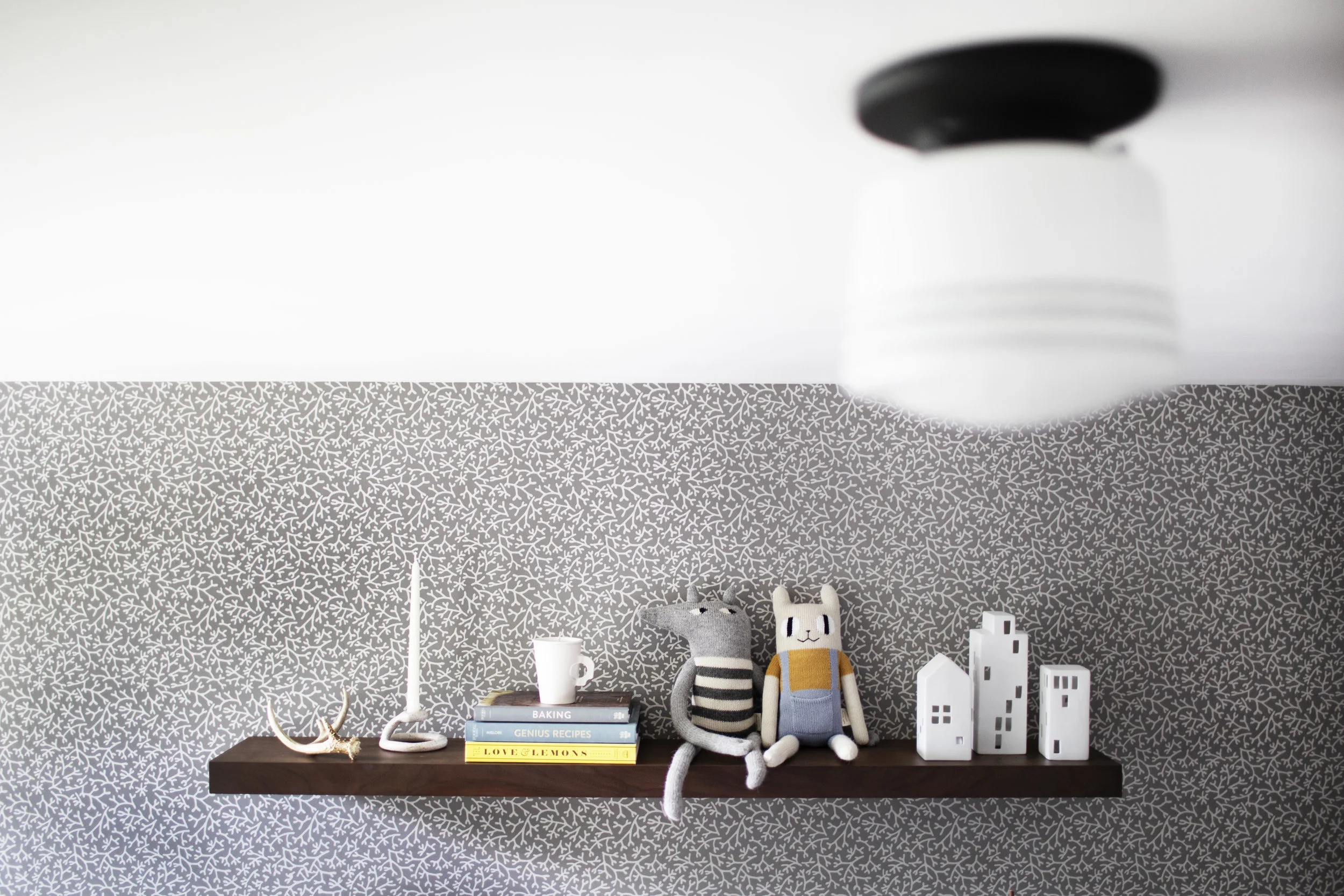
now let's talk wall decor & wallpaper. it took me way too long to allow anyone to nail or drill into my precious wallpaper (wallpaper people, you get me right?), until i realized this room looked so bland without anything on the walls. because it is an office & i have a thing for school house clocks, i decided hanging an oversized clock was worthy of putting a nail into the wallpaper. the mr. edwards clock matches the other the brass & black elements in the space, such as the brass switchplates + anglepoise original 1227 brass desk lamp. the second (most stressful) element we drilled into the wallpaper for was the floating shelf. above the desk was beyond bare & i knew it needed some sort of shelving. wall art just didn't cut it as nothing was large enough or interesting enough to fill the empty space. justin & i are not the best at hanging things straight in this crooked old house, but we did it! i can't believe what a difference something as simple as a shelf can make. now i get to display all my favourite clay pieces & whimsical creatures. i went with the floating american walnut shelf from rejuvenation as i wanted it to be minimal, clean & match the walnut desk. it ended up being super easy to hang, especially if we managed to do it on our own (haha).
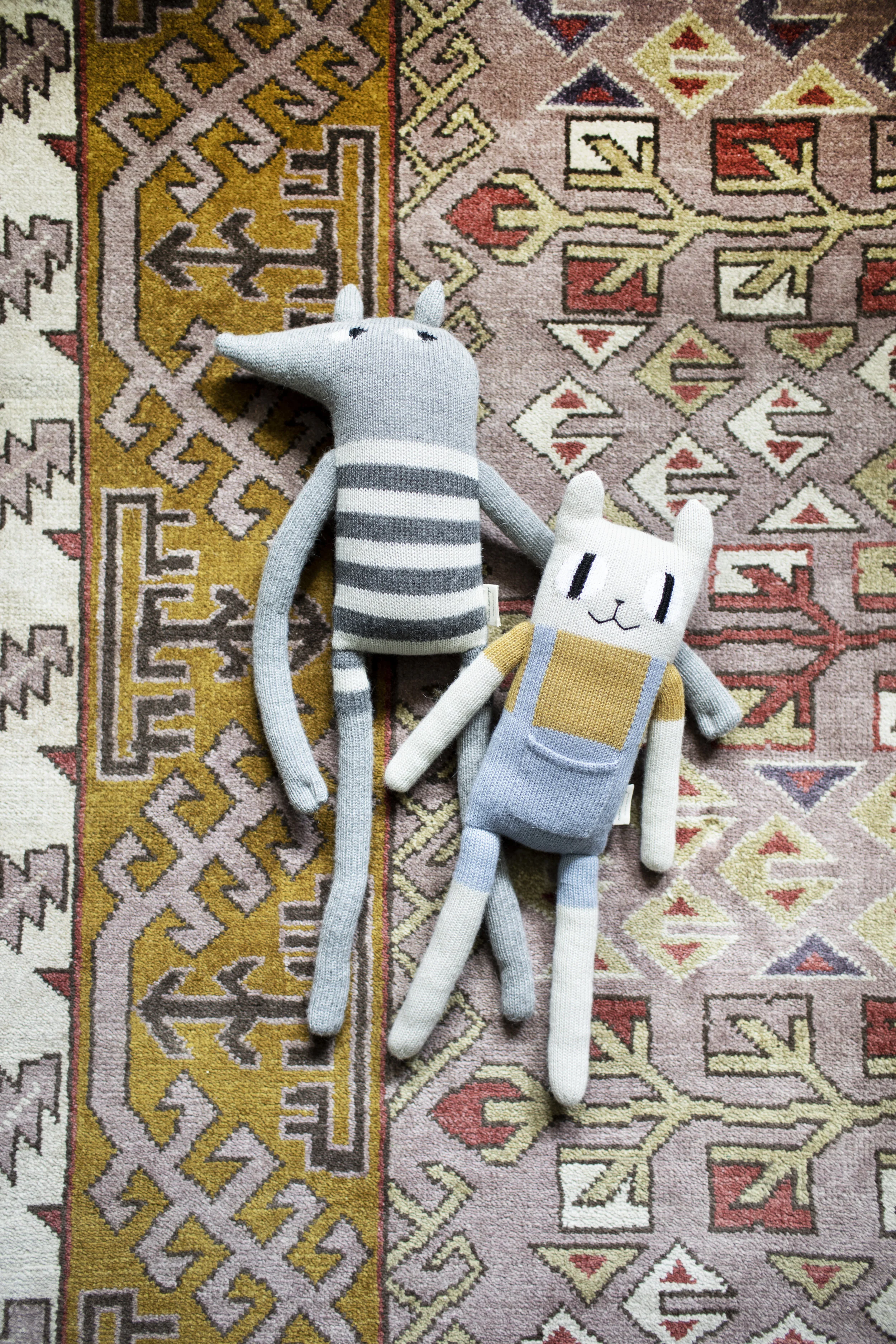
last but not least, the final touches that really make the space feel cozy. as i mentioned above, i wanted to add a little whimsical vibe to the design because i will forever be a kid at heart. these hand knit baby alpaca soft toys might be the cutest things i've ever seen. they are from main sauvage in france & bring a sense of joy to the space. for the textiles i brought in a variety of wool pillows to really cozy up the space. the pillows are from rejuvenation & are woven in ireland from merino wool. i love the soft tones & texture they add to the space. now i just need to keep little pete off of them! for the decor, i have on display a few of my favourite cookbooks & handmade items from SIN ceramics & home goods. my favourite addition is the paper weight fist knot! virginia sin's creativity always amazes me.
i will link to everything item below & if i missed anything, just leave a comment. at last, another room in modest house is now complete! this year we finished the powder room, front entry & home office. to view ALL the designs, click the interiors tab at the top of the page. i think a kitchen reveal might be next..
xo
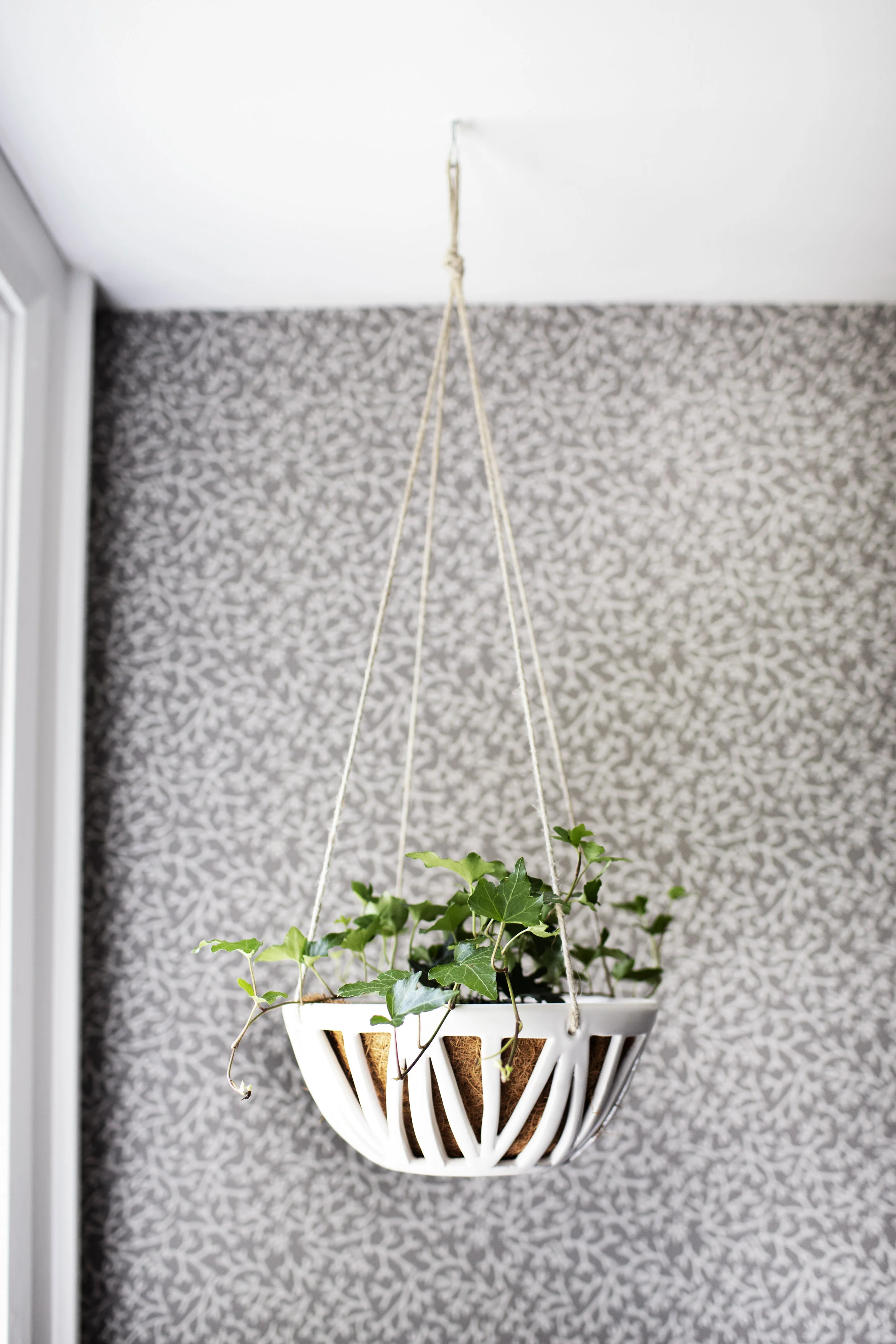
like what you see? get it here: wallpaper | walnut desk | bookcase | bench | chair | area rug | schoolhouse clock | walnut floating shelf | ceramics | pillows | soft knit toys | baskets | flush mount fixture | striped schoolhouse shade | task lamp | planters | switchplates
