master bath refresh


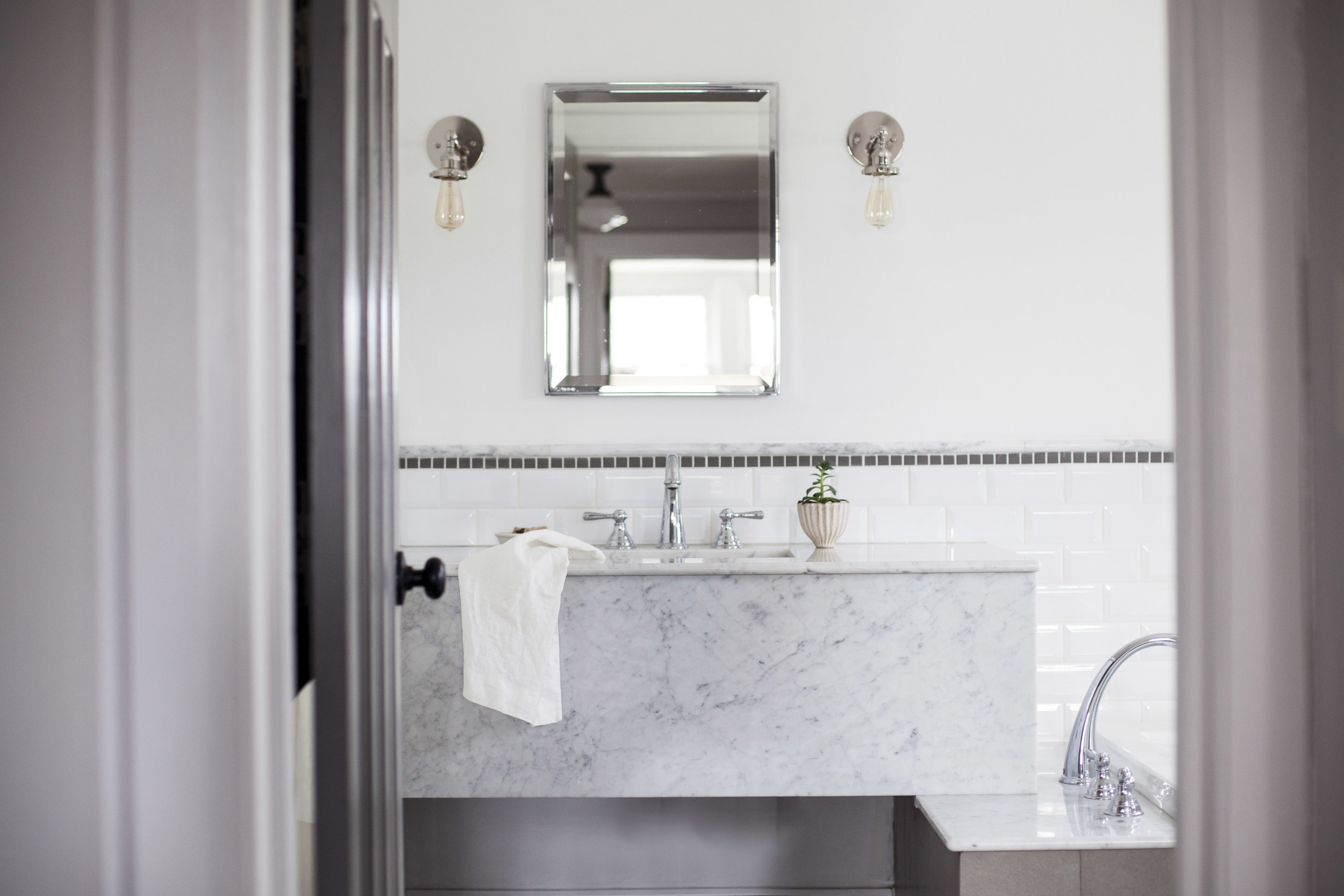
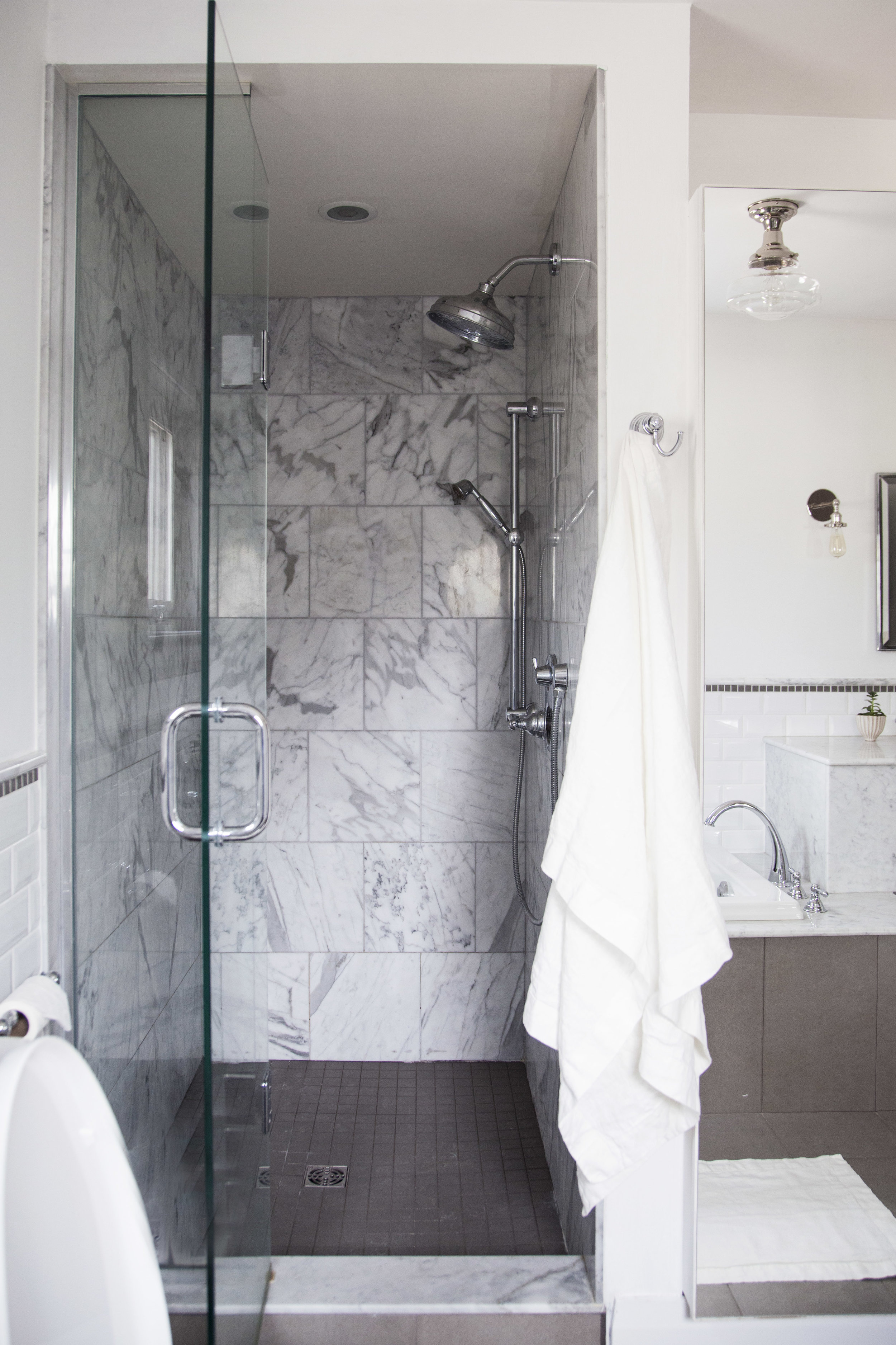
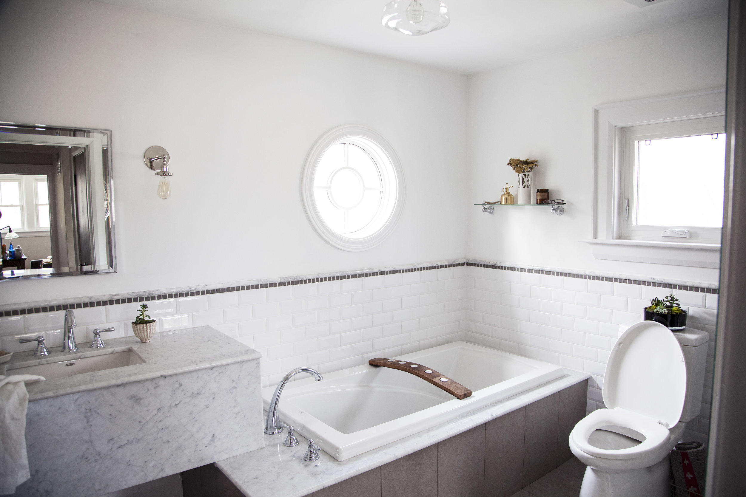
in my opinion, spring is the perfect time for a little bathroom refresh! now i can't take full credit for this gorgeous bathroom. the previous owner had already done the most beautiful renovation featuring a marble shower & a custom marble vanity. it was one of the features in the house that won my heart over. it is the only full bathroom in the house, but unlike every couple on hgtv i really didn't care about an ensuite. one full bathroom featuring both a bathtub & shower was plently! who wants to clean multiple bathrooms anyways? not me. there was just some minor things i wanted to change to the space & personalize it with my own touch.

step one: the paint

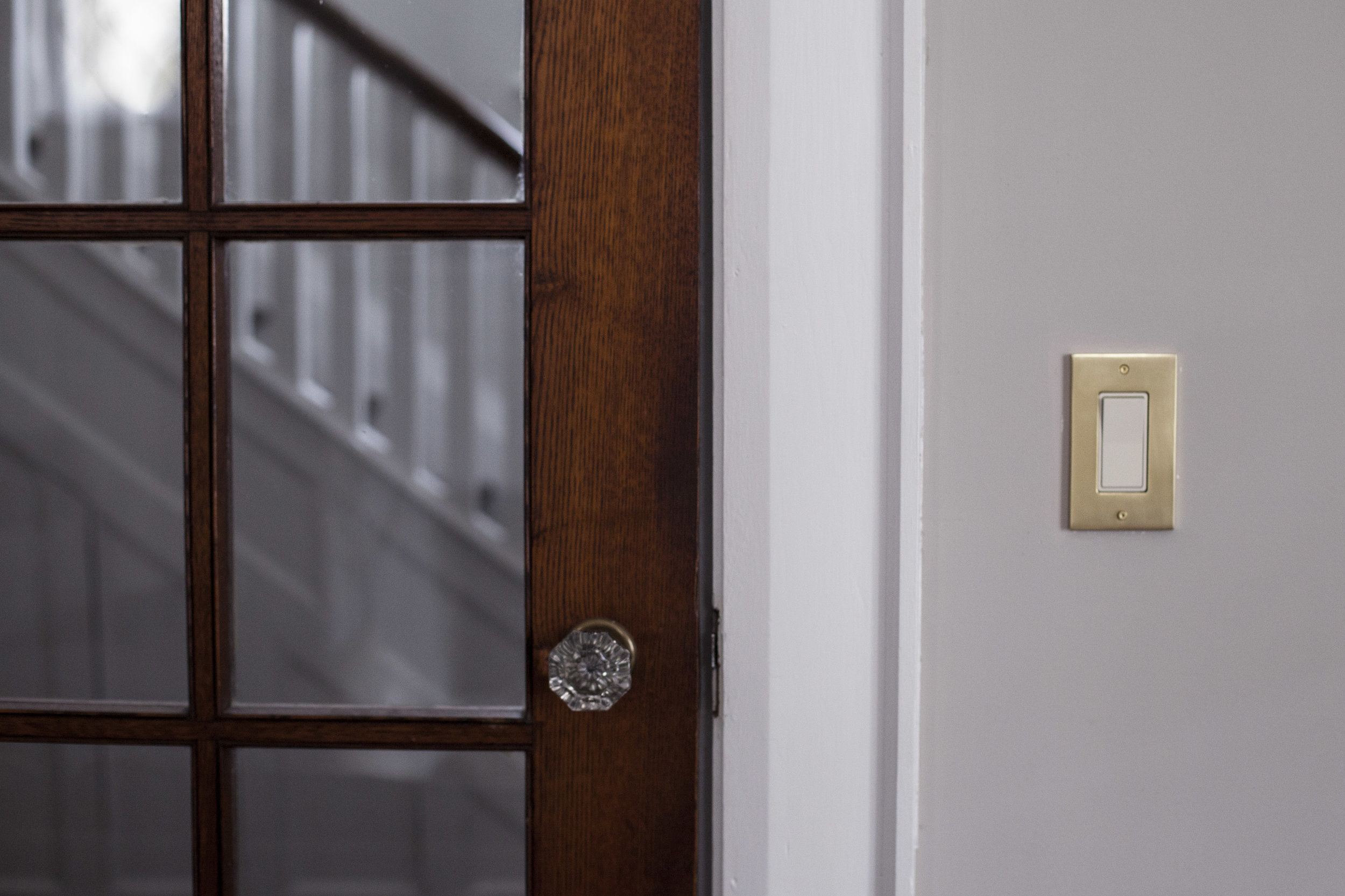
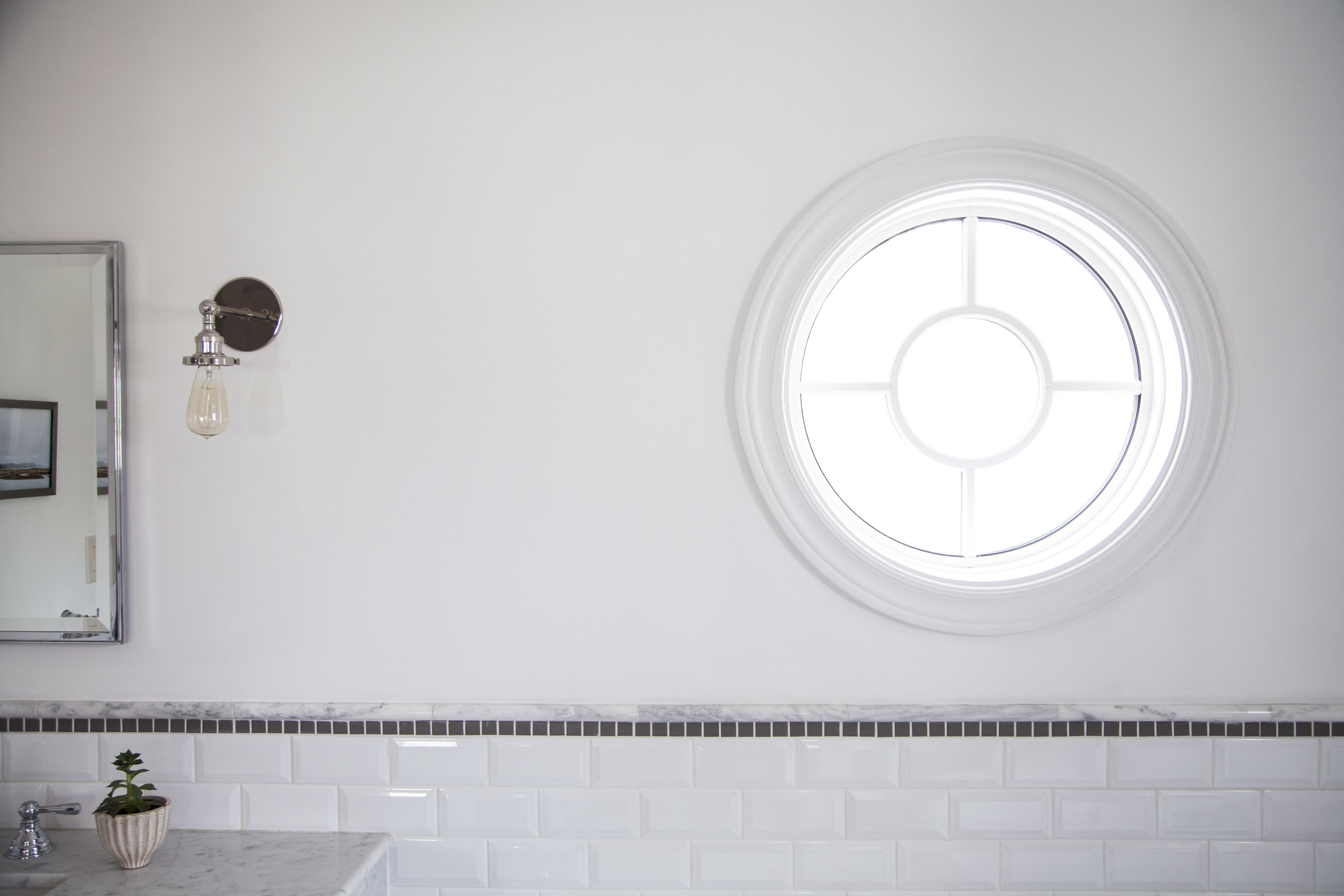
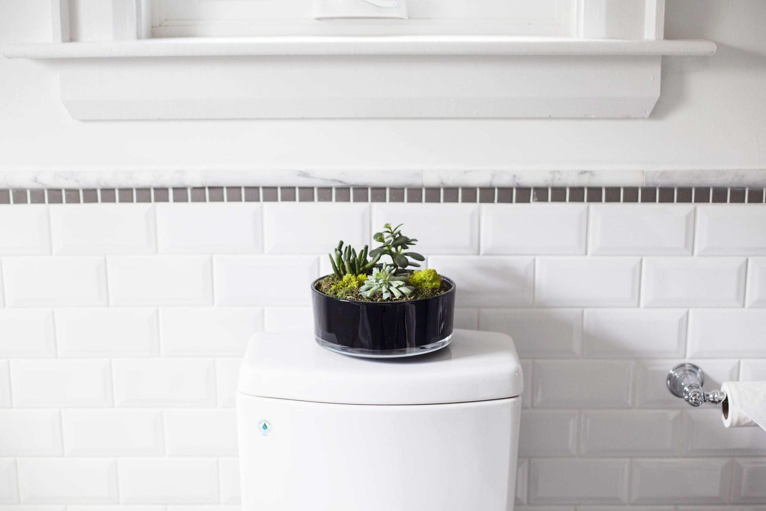
the original colour of the space was a powder blue. i am not big on colour when it comes to wall paint (or anywhere) so i knew i wanted to change it to white. we actually ended up having to paint it TWICE! the first colour i chose turned out just awful, it had a beige tone to it & simply looked like a dirty off white. FARROW AND BALL TO THE RESCUE! i talked with my friend over at dreamy white lifestyles who seems to have done her research when it came to finding the perfect shade of white. i wanted something with no undertones so she recommended her favourite colour all white! farrow and ball's all white in estate emulsion is perfect. it is clean, bright & has that perfect chalky finish. i stuck to farrow and ball's wevet for the trim to match the rest of the house, which is actually a touch darker then the walls & has a slight grey hue to it. it is something you don't notice in the other rooms, but when you put it up to a clean white you finally see the hint of grey! lastly, i painted the door farrow and ball's mole's breath to bring in a touch of grey & pull from those marble veins.

step two: the lighting

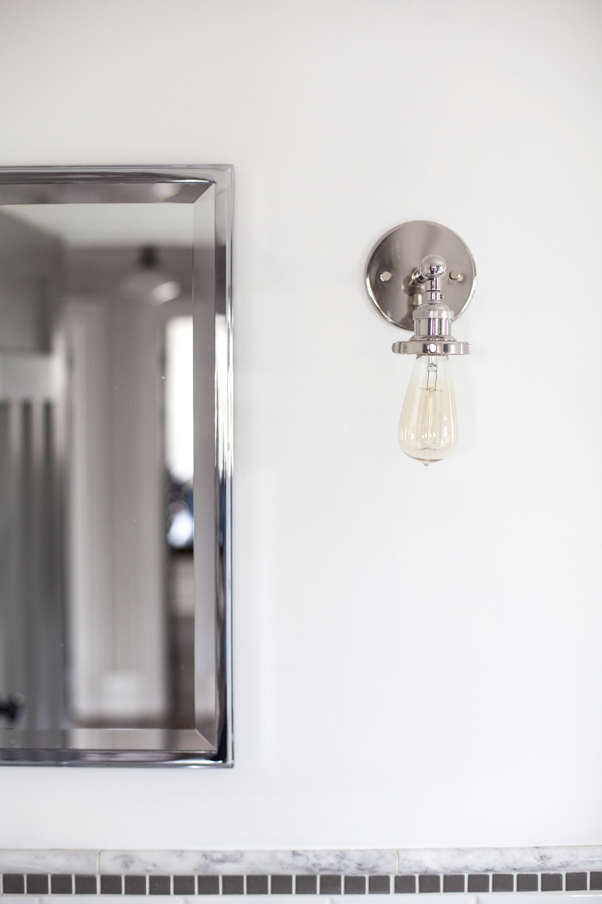
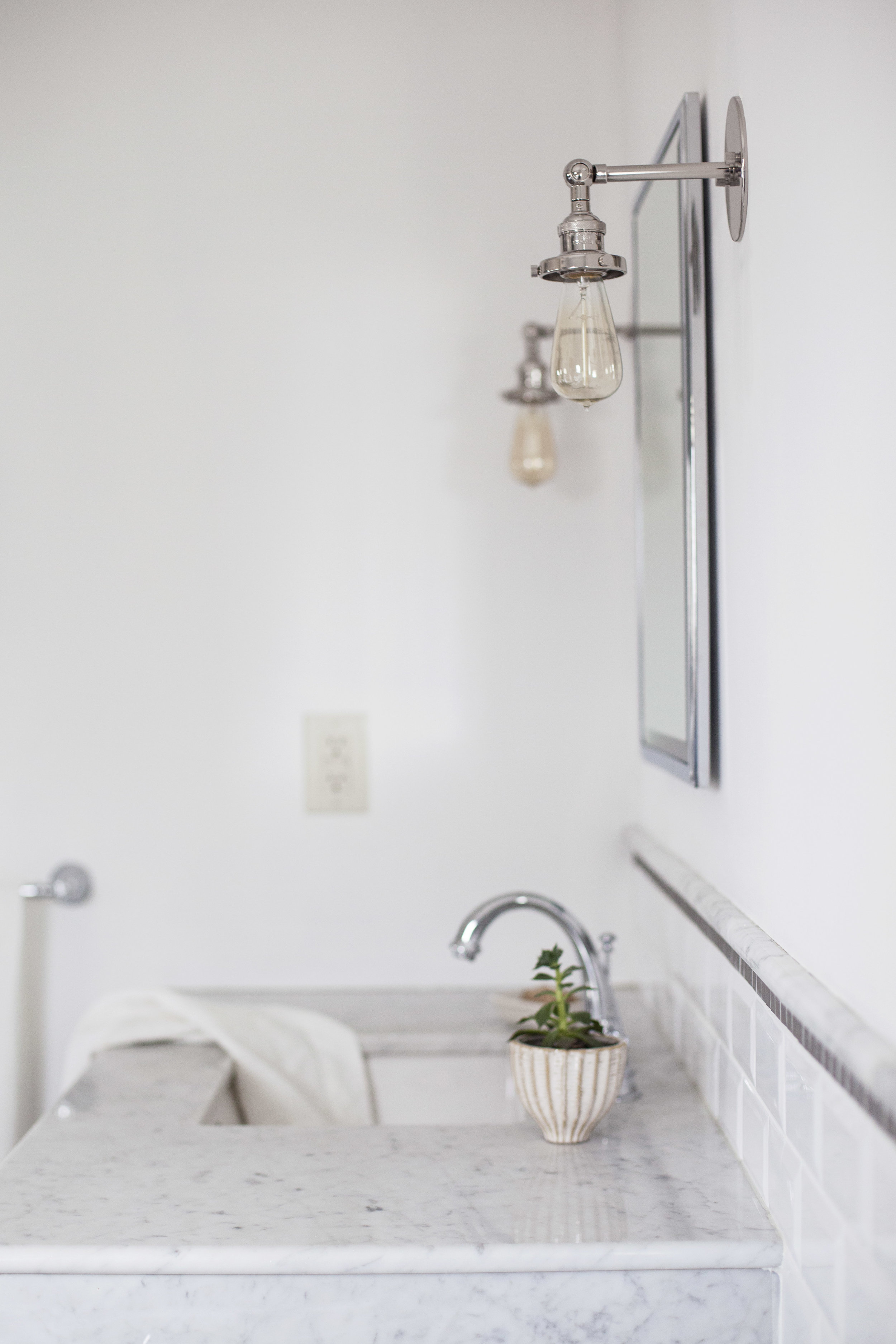
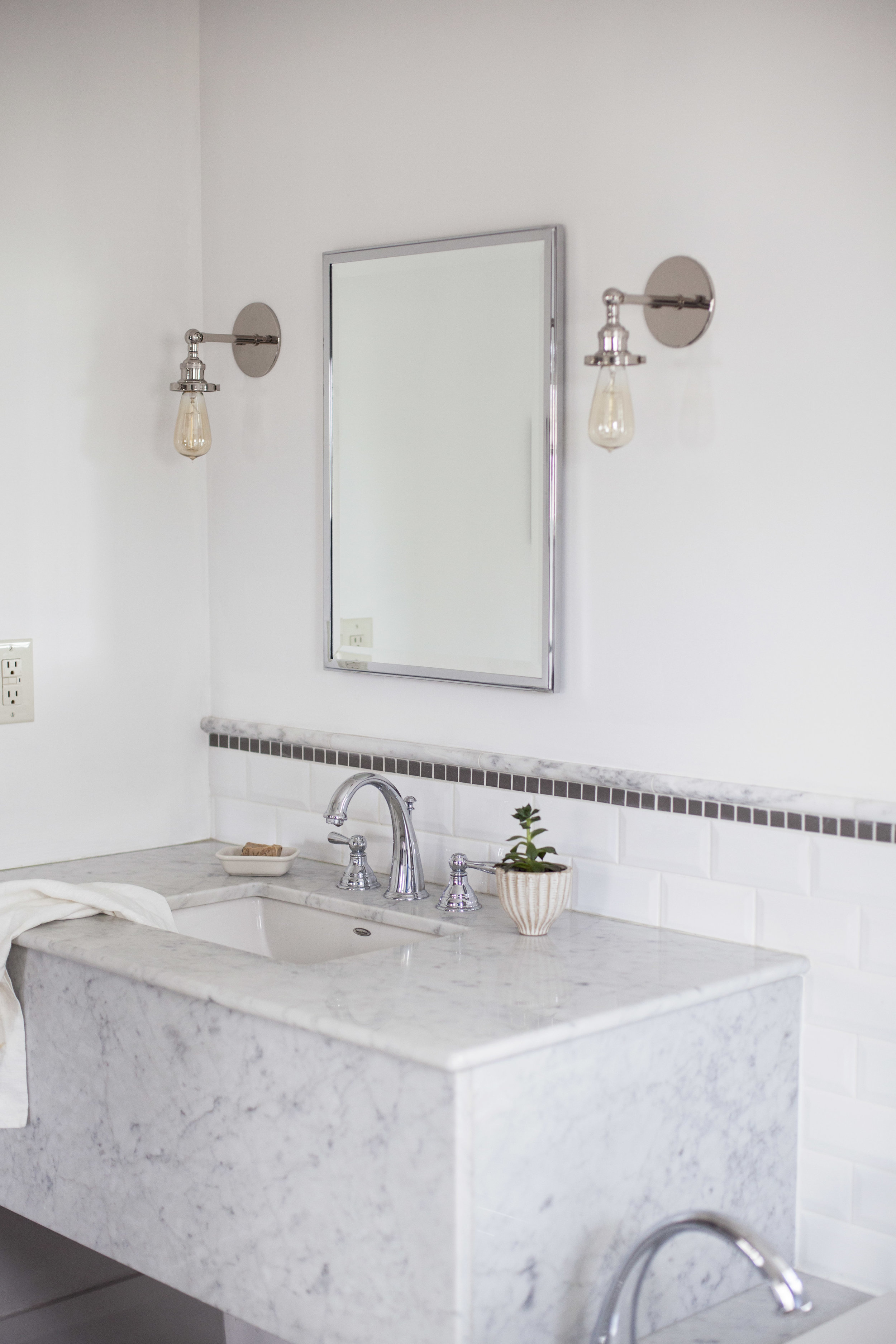
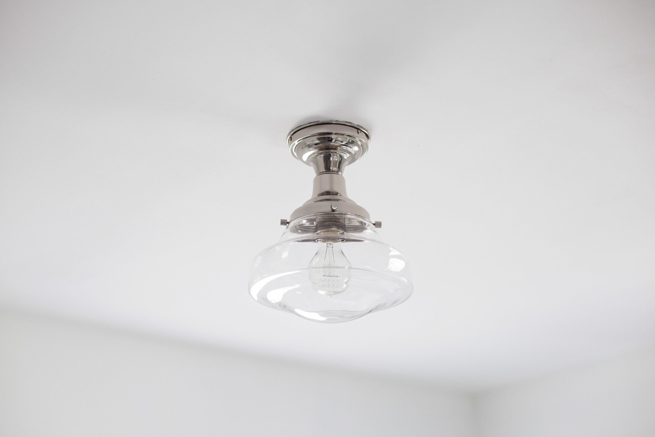
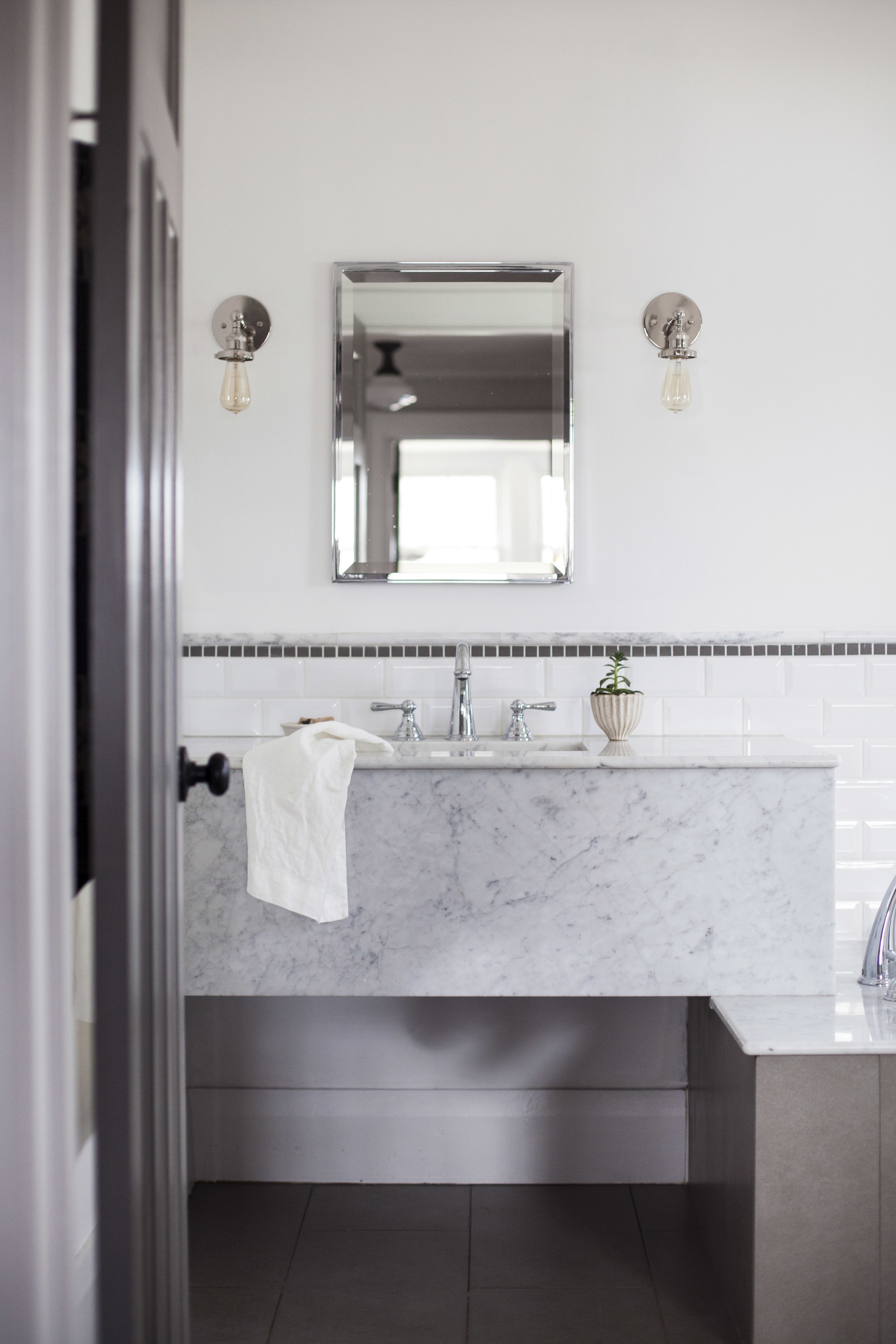
the previous lighting in the space was very classy & square, but i tend to lean towards more school house & industrial vibes. the mirror was a huge frameless mirror that i had no intentions of changing, but we accidentally broke it when we painted! so i chose to get both the mirror & light fixtures from restoration hardware. i am obsessed with this store, but we all are.. right?! i am so happy how the shadeless sconce lights look along side the chrome framed mirror. i chose the same school house style light fixture for the spare room & office, but in the bathroom i went for the clear shade instead of the milk glass. the clear shade looks a little more elegant & i love how the vintage edison bulb is visible to match the scones lights.

step three: the hardware

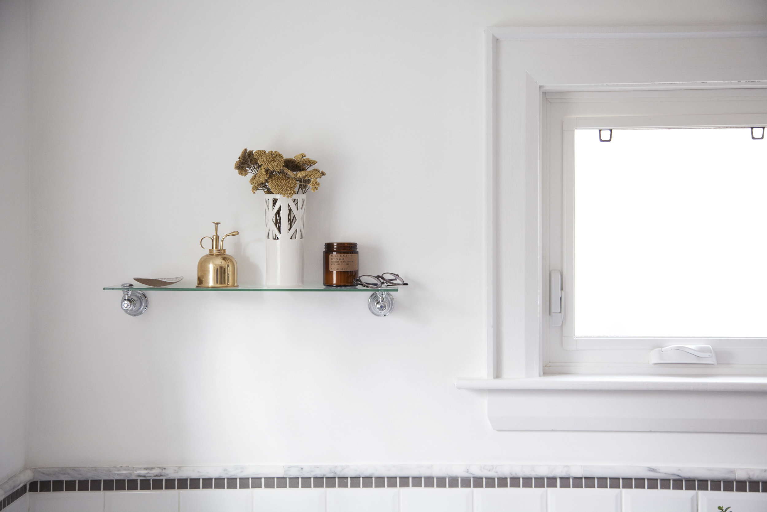
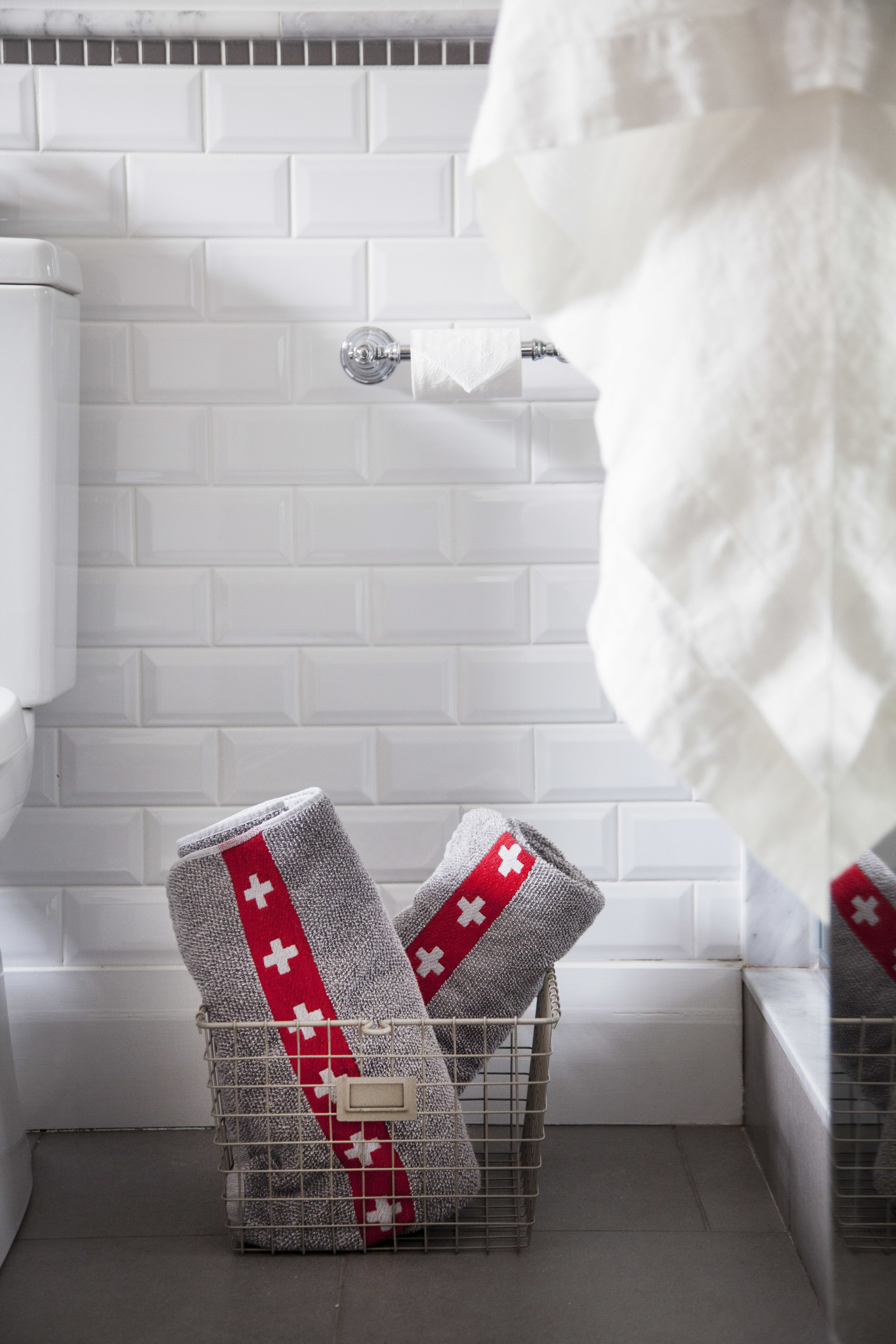
the faucets in the sink, tub & shower are all moen's kingsley line. the hardware, however was not. i managed to find all the matching pieces to moen's kingsley line on wayfair (p.s. yay to free shipping in canada)! they sell the faucets featured in this space too. i installed a toilet paper holder, towel bar, glass shelf & towel hook in the matching chrome finish. the beautiful shelf above the bath is the perfect spot to hold candles as well as a place to rest your glasses/jewlery before you get into the bath tub. the towel hook i installed next to the shower makes it so much easier to just grab your towel before getting out of the shower. it is WAY to cold to get out & search for a towel! lastly, that cute modern farmhouse basket where i store the extra towels is from wayfair as well. it is perfect to hold just about anything in & even comes in a copper finish!!!

step four: the linens

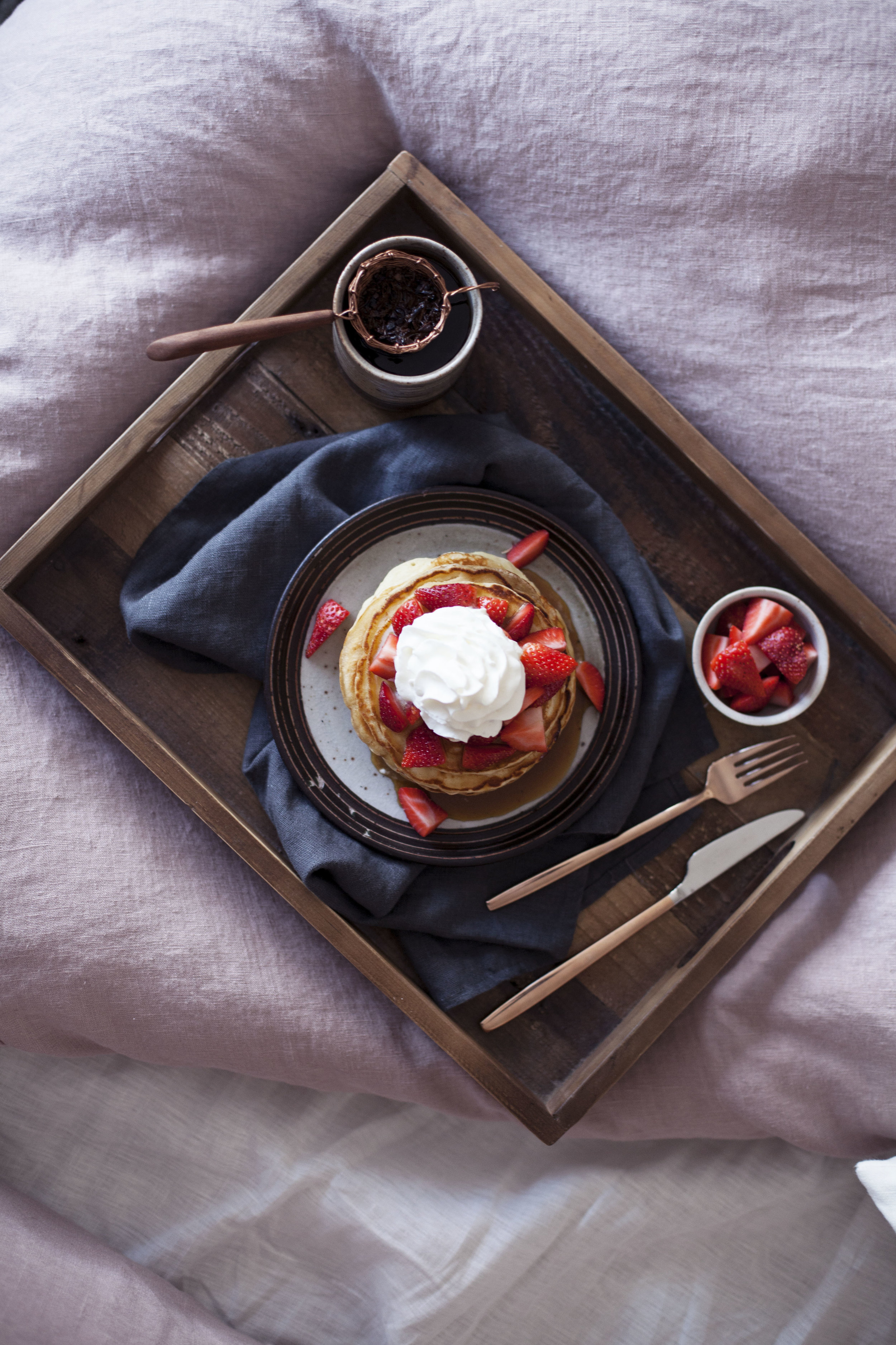
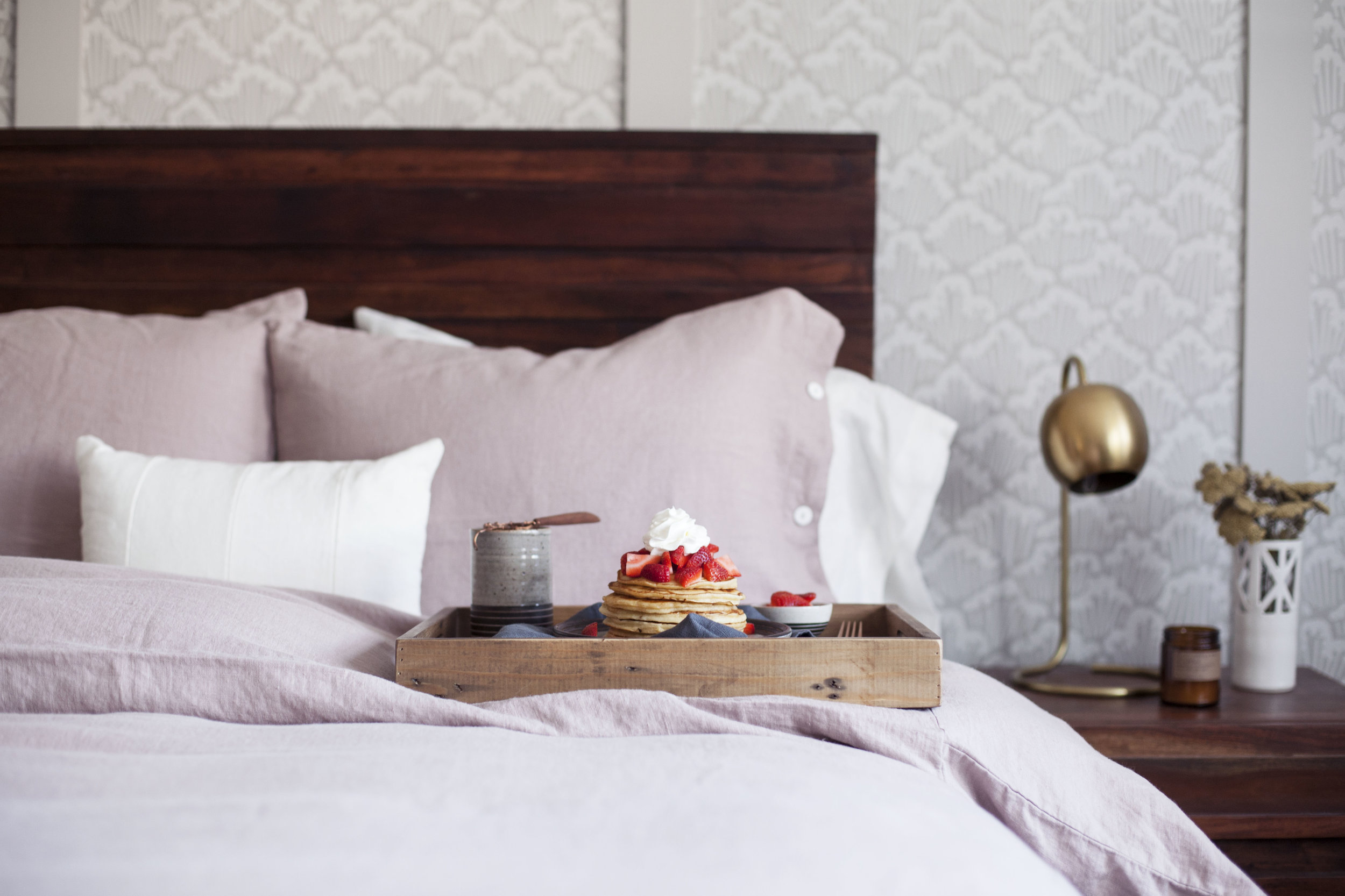
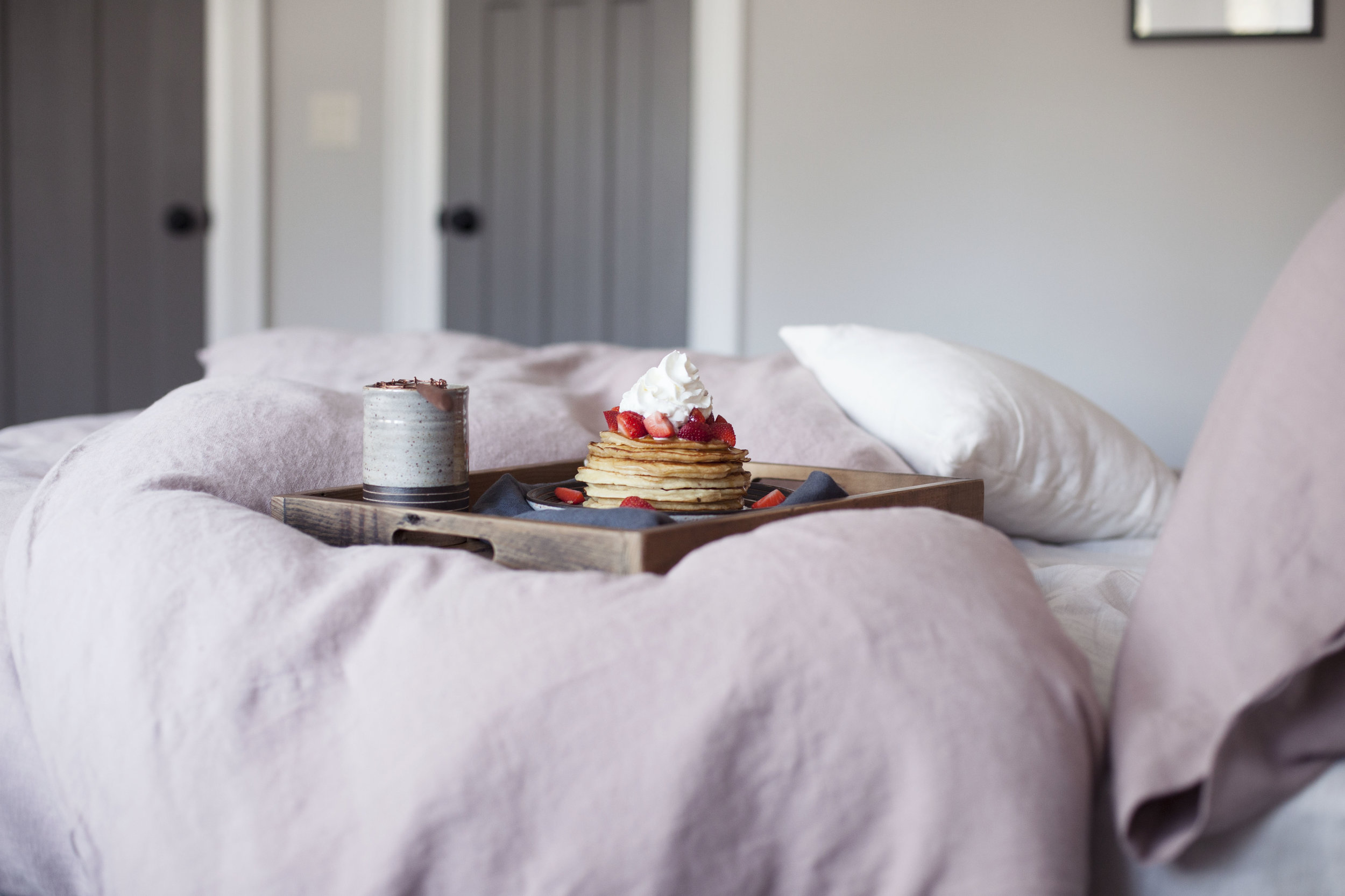
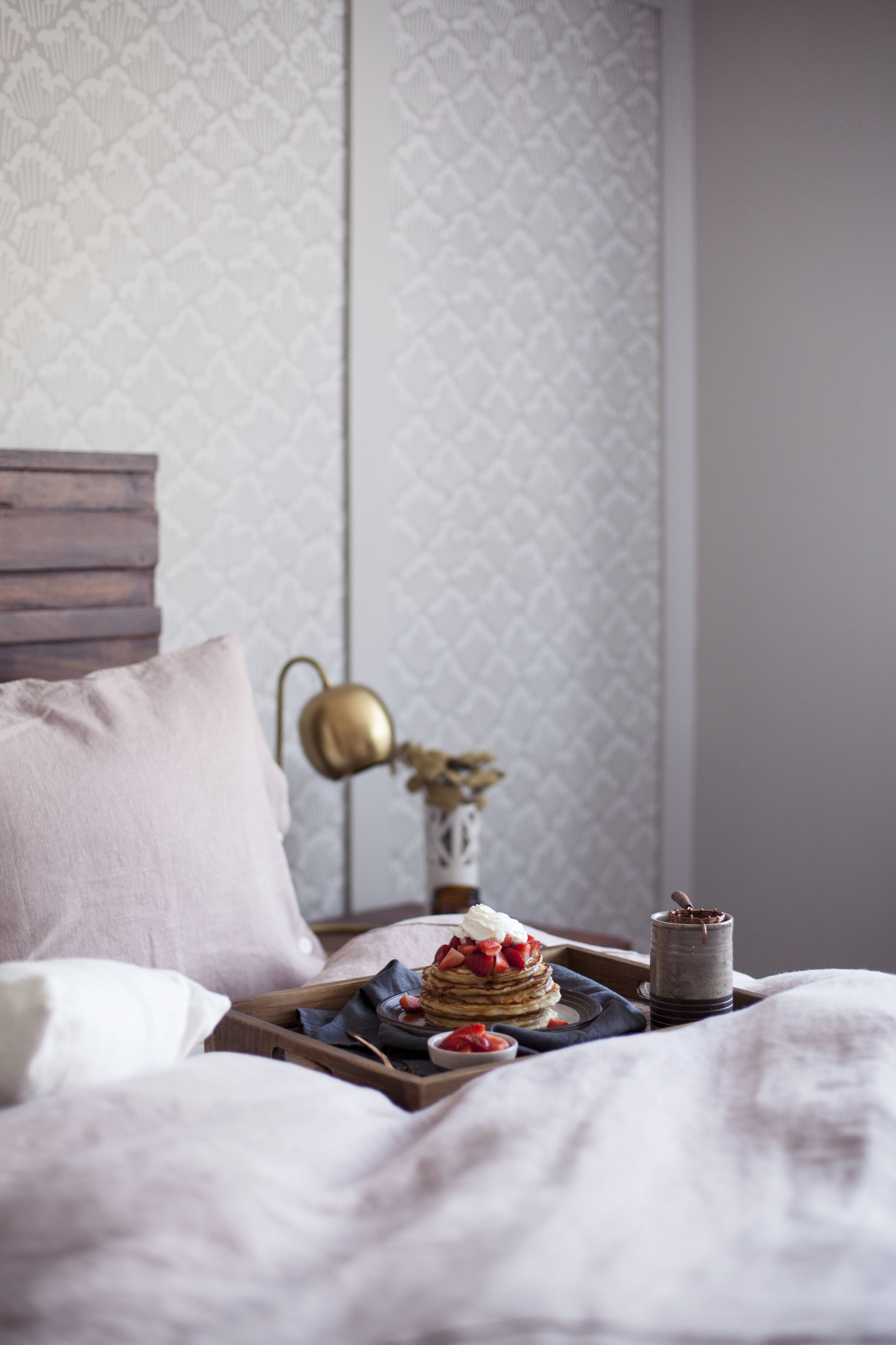
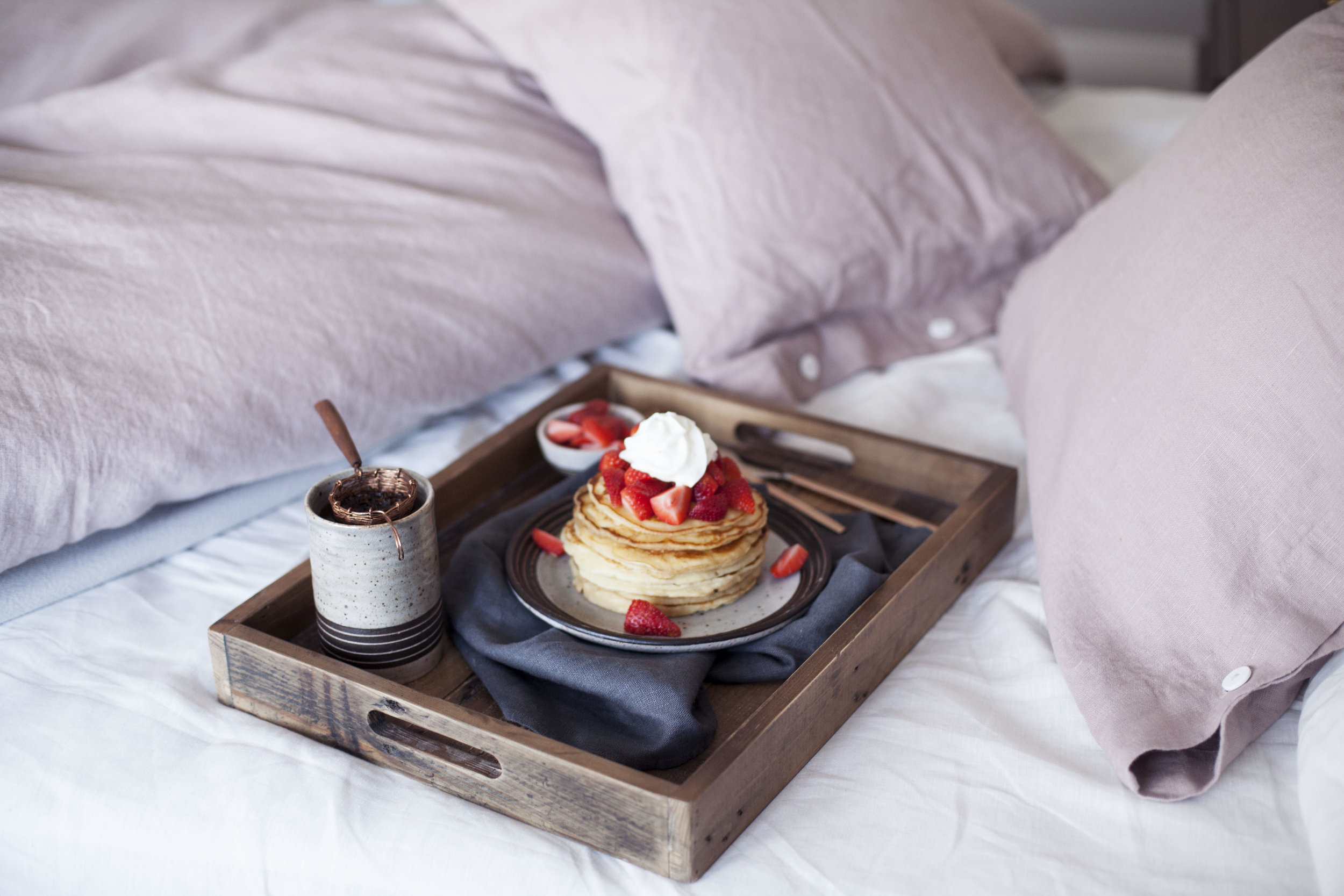
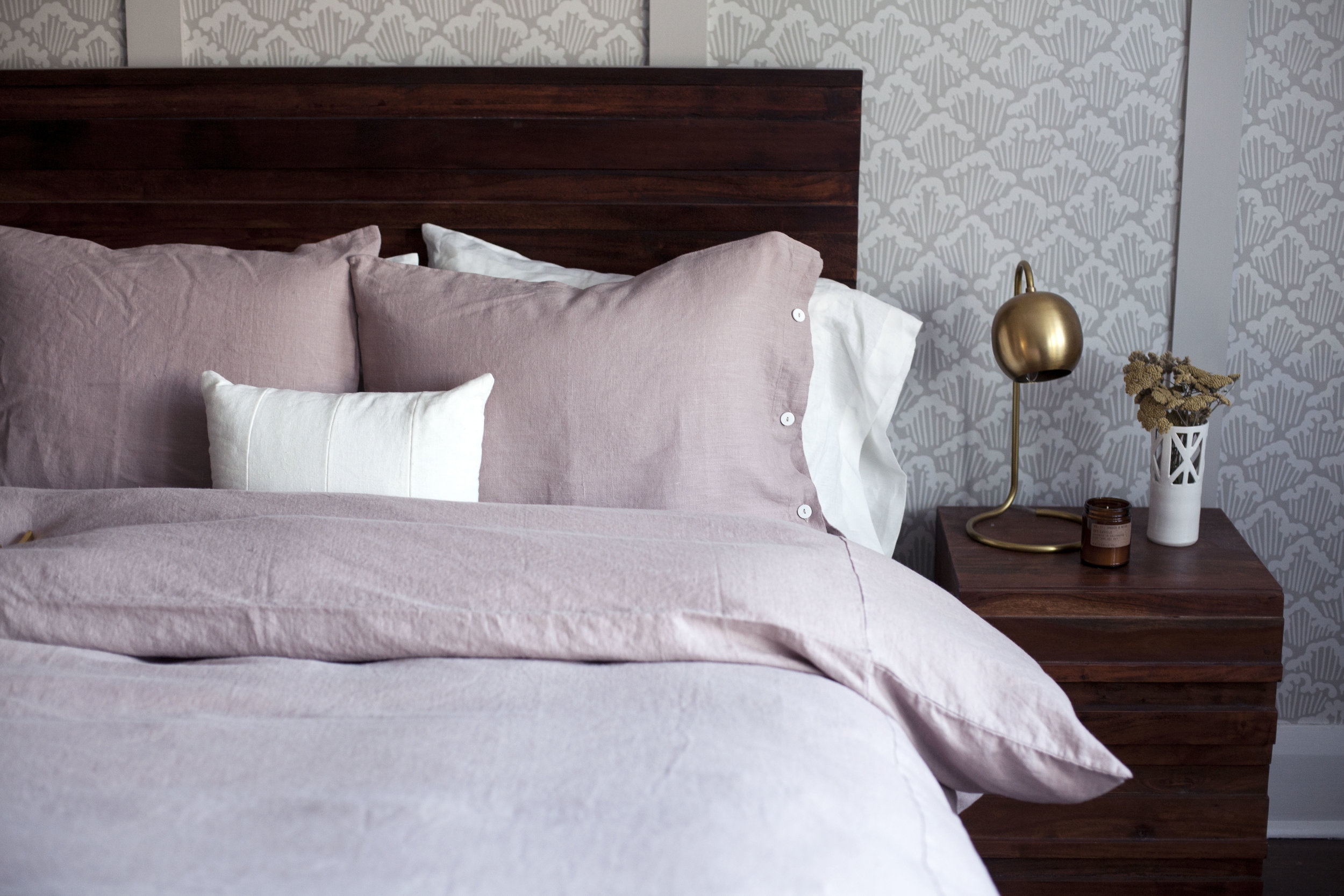
i chose the same rough linen bath makeover that i used in the powder room design. not to sound like a broken record, but i just can't get enough of rough linen's linen! the quality, the texture.. everything about it is perfect. trish (the owner) did such an amazing job sourcing the perfect fabric. featured are the "natural" coloured linens, but i think the grey would look just as amazing! i just saw they released linen baby blankets now too, i kind of want to get one for buddy. she is close enough to a little baby! maybe it would keep her out of my linen bedding every morning, but doubtful.

check out all the sources at the links below:)

modest (great) room


the great room is COMPLETE! okay, i'm not sure if this is technically considered a great room or just a living room but i like the term great room better. sounds more epic & i would say this room turned out just that. like i did with the powder room i am going to breakdown each design element for you! over all my goal with this room was to create a cozy, rustic, monochromatic all while keeping things a bit fancy. we decided not to turn this into a family room because the old features were way too classy for that. instead the family room is a work in progress! we are going to turn the third floor loft/attic space into the ultimate hangout zone. now let's get into the details of this room!

step one: the wallpaper & paint

putting in wallpaper here was a no brainer, just like the rest of the house. what started in just one room is slowly escalating to the entire house. i just love the charm it brings! for this room i wanted to do a subtle wallpaper, something i would never get sick of & that you only really notice if you look carefully. farrow & ball had the perfect print for that: amime. while this print is named after the space between netting inspired by japanese fishermen, i find it looks so woodsy! it goes perfect with warm woods & antler pieces. the actual colour of the wallpaper is farrow & ball's purbeck stone so it was a very easy decision to paint the rest of the room in purbeck stone. i chose farrow & ball's wevet for the fireplace + trim as it is a a bright white with the most subtle hint of grey. it makes for a clean, blank slate mantel for candle sticks, vases & of course a silver fox.

step two: textiles

there wasn't a whole lot of textiles to determine, mainly just the curtains, pillows & the rug. i chose simple white linen curtains from rough linen. they help bring in that old world charm while also providing the perfect amount of natural light & privacy. don't they just look so dreamy paired with that brass deer head curtain rod? secondly, i went with a mix of linen & mud cloth pillows from loom goods. i LOVE pillows so i added a lot to the room design & you can bet buddy has made every single one hers. she loves the down fill because she can shape it as she pleases. lastly... the rug! it was so hard to pick a rug that wasn't going to clash with the wallpaper. or so i thought! but the wallpaper ended up looking so simple that i was able to choose a rug that had a subtle design to it. this handwoven rug is the woodmere rug from rejuvenation. i love that it pulls in the whites, greys, black & even gold!

step three: the marble & brass

because this room is all pot lights thus doesn't allow for a bold light fixture, i really focused on the details of everything else. i added a marble fireplace hearth that i got custom made from a local stone shop, brass switch plates from rejuvenation, brass laterns, brass curtain rod & a brass table + floor lamp. the laterns & vases are from crate & barrel, the table lamp is from west elm (along with the couch/library chair) & the floor lamp is from restoration hardware. i saw a gorgeous coffee table from restoration hardware made from reclaimed wood, but justin & i cannot decide if we should splurge on it or not! the one featured here is a piece we made years ago when i found a brand new broken butcher block on the side of the road. the last little bit of detail i added in are the brass fireplace tools & long holder from crate & barrel. okay, so the fireplace doesn't ACTUALLY work at the moment. the previous owner closed off the chimney, so i can only imagine there is a major issue with it. one day we plan to get it back in use! for now the logs add a sense of warmth & coziness. while it sounds like i added in a ton of brass features, each is subtle & adds a touch of elegance to everything. i love bringing in golds without going overly gaudy. i also love a mix of old & new, i mean how perfect does that gold switch plate look next to the brass diamond door knob that is original to the house (as well as the french door)!

step four: wall art

i have the MOST trouble deciding on wall art. i never know what i should frame! but then i came across framebridge & it made everything so much easier. you get to custom frame your own prints & decide on all the details. naturally i framed a huge picture of buddy holly & judging by her face in all the photos she is pretty proud of it.

for a complete list of sources, check out the links below!

strawberry cheesecake pancakes in bed


happy friday!!! who is celebrating valentine's day this weekend? i have been hit with a nasty cold so it is looking like i will be spending the next few days watching netflix in bed. lucky for me, i have the comfiest bedding from rough linen to cozy up in! i never want to leave this bed on a good day. now i don't want to give away too much of our master bedroom design that is just about complete as i will be sharing a more detailed post on it in the near future, but let's talk a little bit about that bedding! while i usually gravitate toward different tones of grey, i couldn't pass up the "dusk" soft pink colour rough linen carriers. i opted for the queen bed makeover in dusk & white which comes with everything you need to set the bed! a duvet cover, top sheet, decorative shams & a summer cover. i filled it with a heavy duty down insert because our old house is quite cold, but i can only imagine how hot it will be in the summer so having the light summer cover will be a life saver. oh the joys of an old house! i am also so happy how well it goes with the farrow + ball wallpaper & paint i chose. the cloudy wallpaper is called aranami in grey, it is seriously the dreamiest. between the grey wallpaper, walls, doors & trim the dusk pink was a perfect subtle contrast to everything. but enough about the bed, let's get to what inspired it all.. strawberry cheesecake pancakes!

i love the idea of surprisingly your valentine with breakfast in bed & this one is fit for a king (or queen). i incorporated cream cheese & greek yogurt into the pancakes themselves, then topped them off with fresh strawberries & whipped cream. i opted to keep the pancakes simple, but if you wanted to stir a few fresh strawberries into the batter itself that works too! i remember making strawberry cheesecake pancakes for my mom on mother's day years & years ago. i used nigella's recipe which used cottage cheese as the base, but i like the tang of the actual cream cheese brings to these ones. plus, with all the chocolate & wine calories don't count on valentine's day! you can even top it with a strawberry pie filling if you have trouble finding fresh strawberries this time of year. so, you have all weekend to get the perfect breakfast in bed pancakes ready for your valentine, bonus points if you surprise them with this dream bedding too;)

xo

strawberry cheesecake pancakes

ingredients

  • 4 ounces full fat cream cheese, softened
  • 1 egg, room temperature
  • 2 tablespoons plain full fat greek yogurt
  • 1 teaspoon pure vanilla extract
  • 1/4 cup raw sugar
  • 1 tablespoon melted butter
  • 1 1/4 cup whole milk
  • 2 cups all purpose flour
  • 3 teaspoons baking powder
  • 1 pinch of sea salt
  • 1 cup fresh strawberries, sliced
  • 1 cup whippred cream, for serving
  • pure maple syrup, for serving

directions

  • using an immersion blender, puree cream cheese, egg, yogurt & vanilla until smooth.
  • stir in raw sugar, melted butter & milk.
  • sift in flour, baking powder & salt until a lumpy batter is formed.
  • heat an oiled griddle or frying pan over medium high heat. pour the batter onto the griddle, using approximately 1/4 cup for each pancake. * cook until both sides brown.
  • top with fresh strawberries, whipped cream & maple syrup!